Magento is downloaded about 5,000 every day. There are nearly 50,000 Magento website examples in the USA only. But the platform is considered expensive and complex, so why do some businesses pay about $100,000 per year to maintain the online stores on this platform? We have picked 19 top Magento sites of world-known brands from 7 industries and explain by their example what Magento is capable of.
Table of Contents
Beauty and Health
Cars
Clothing and Shoes
Food and Drinks
Hardware and Appliances
Home and Garden
Jewelry
Summary
Beauty and Health
The beauty and health industry dictates special rules for websites. They have to create a splendid online experience, for example, offering:
- Detailed product descriptions and photographs give as much information as possible through visual content, as customers want to be sure they buy the right product.
- Social media feed integration ensures a connection with potential customers via different channels. Most of the target audience from this industry are active users of Instagram, TikTok, and YouTube.
- Integration with other sales channels eases up inventory management for the shop managers. It is required because most of the online stores in this industry have brick-and-mortar stores too.
- Smart search helps customers find what they need, even if they enter just an ingredient of a health product they are looking for.
We’ve chosen several examples of the beauty and health companies that use Magento to create websites with robust functionalities.
Magento Development Services
Get a deeply customized webstore from the Magento-certified developers
Learn moreLashtrays
Lashtrays is an Estonian online store of lashes, glue, cleansers, and tools from different manufacturers. The owners pay extra attention to the high quality of the products, that’s why it managed to become one of Estonia’s best eyelash extension webstores.
Their site operates on Magento 2. A custom theme was developed for the site, improving UX/UI and providing a convenient shopping experience.
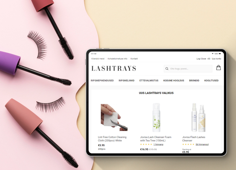
Among the Lashtrays website features worth highlighting are the following:
- Integration of reviews on the home page via the Repuso tool, as well as a block of reviews on the product on its page
- Recommendation of other products of the viewed brand on the product page
- Last-minute offers of discounted products when you go to the cart
The store uses a convenient 1-step checkout and has the option to pay via invoice, as well as choose regional shipping and payment companies. Customers can choose from Swedbank, SEB Bank, LHV Bank, Luminor Bank, and bank transfers as payment methods. Also, they offered various discounts.
When hovering over an item in the catalog, a magnifying glass icon appears, which, when hovered over, gives detailed product information.
Another unusual feature is that the information from the footer is displayed via pop-ups.
Byredo
Byredo was the first business to launch a Magento 2 website in the UK. The brand offers perfume, body and hand care, and accessories. The main goal was to create a global solution with different storefronts for every country. There are now several shops with various currencies and localized content for every region.
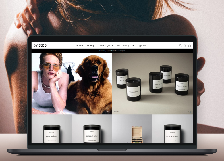
The website is light, full of quality visual and text content which is perfect for the industry. It’s also user-friendly. For example, the site is integrated with a smart search engine that connects with the user’s search and purchase history. It displays search suggestions taking into account this information.
The online store also gives an opportunity to buy a digital gift card and send it to any recipient address. Users just need to fill in the sender’s and recipient’s contact information, then pay for the card.
Lauftraining
Another example of Magento usage from this category is the Lauftraining website. This German company sells health rather than products. The company creates training and nutrition plans, helping users to stay healthy.
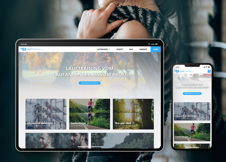
There are several interesting features on the site besides an appealing design.
- User and Coach interfaces – the website has two different interfaces. The user interface allows tracking users’ progress, paying for subscriptions, and entering the Media Library. The coach interface is for Lauftraining coaches. They can track their customers’ activity, change their plans and send them messages.
- Nutritional and training plan creation – the site collects and processes user data to create individual plans according to users’ parameters and goals. After the basic plans are created, they are available for users and coaches who can change them via their interface to offer a more personalized approach.
- The possibility to add groceries to the shopping list – users can see the nutrition plan for the next week and add the groceries to the shopping list in the required quantity.
- Integration with fitness watch – the website has an integration with the fitness watch so that the system can track the user’s progress during the run and exercise sessions.
- Email and message notification – there are several rules on the site that, when triggered, send a notification to a user reminding them of training, nutrition, etc.
Our Experience with Custom Magento Development
If you need custom functionalities, we can make it for you
Check out an exampleCars
The car industry ecommerce websites have their distinct features. They should be stylish, functional, and simple to use as the cars they represent. Even if the website itself sells related products and not cars or only allows you to see a catalog of models and their specifications. Besides great UX, there are several features that are frequently required on these sites:
- Rich content – the concept of rich content with informative pictures and selling copies that tell a story rather than just describe a product.
- Configurable products – most cars can be modified with various equipment and software, so configurable products are a must.
- Calculators – mostly, they are necessary to calculate the price of the car with all taxes and additional charges.
If the company sells spare parts or different brands, besides rich content, they have to provide users with smart search. It can find the parts or accessories for a specific car according to its model or even modification.
Land Rover shop
Land Rover has an official website, a part of which is an accessories and clothing store on the Magento platform. The site is a clear reflection of the brand’s identity. What is more, the online shop is pretty intuitive.
For example, one of the small things that enhance UX and show brand identity on the web store is preview pictures on the menu. Every category on the menu has a picture showing what products you’ll see on the page.
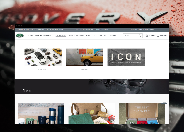
Also, there is a decent product preview on the catalog page – the product’s image changes when you hover over it. It allows users to see more pictures before going directly to the product page.
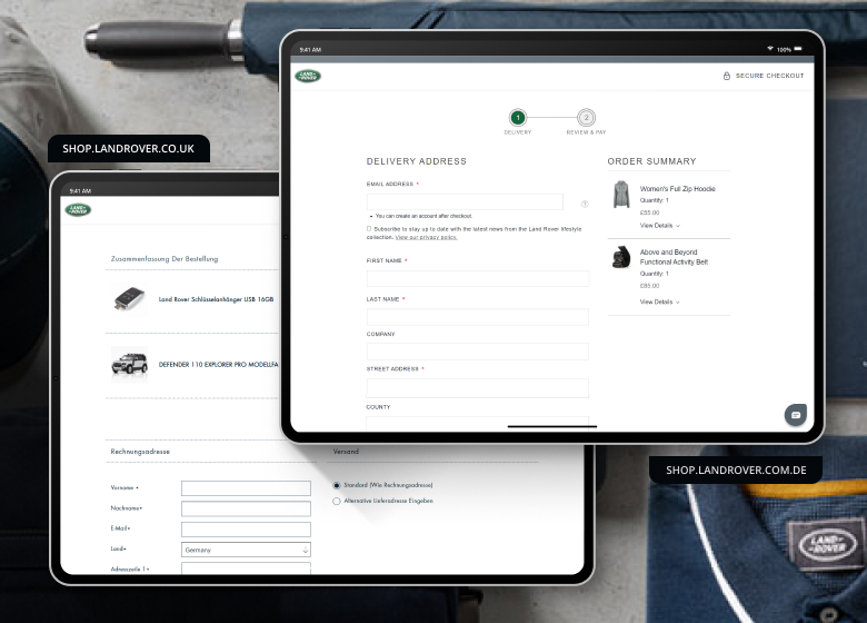
The website allows users to track orders and process returns. It is a multistore, so there are several storefronts for different regions. Each of them has its prices, product range, payment, and shipping methods. For example, the checkouts are different for German and British storefronts as well as payment methods and delivery.
Ekstralys
Ekstralys is a Scandinavian company that operates in four countries: Norway, Sweden, Finland, and Denmark. They specialize in selling LED lamps, automotive lighting equipment, and accessories.
The brand is a multistore of 6 stores, 2 of them are B2B, and 4 are B2C. The stores are aimed at different regions and have different prices and regulations applied to the payment and shipment of goods.
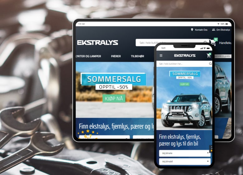
Among the features implemented on the site, we should mention the following.
- Klevu search engine integration. This AI mechanism makes it easy for the customer to use search. It analyzes user behavior in real time and displays products that match their preferences, such as brand or price range. Key product features, different prices for each storefront, and WordPress articles are added to the search results.
- Advanced search options. The search has a feature allowing users to enter the vehicle identification number (VIN) or its brand, model, and year of manufacture. A dropdown search will suggest all available parts suitable for the selected vehicle.
- Detailed menu and catalog. Users see product photos in the menu next to the categories to get a clearer idea of what they’ll find in each section. Users who hover over a product in the catalog see an additional photo. It allows learning more about a particular item without opening its page.
- Enhanced product page. It contains full information about the product: description, technical data, customer reviews, and informative videos. It also has a function showing the number of products left in stock.
- Klarna Checkout system integration. Checkout functionality varies among storefronts depending on the country.
- Free delivery notification. When you add an item to the cart, a pop-up shows how much is left before free delivery.
Clothing and Shoes
Fashion stores’ focus must be on visual content, the same as online beauty stores. It is essential for the conversion rate that users can easily find what they want and understand according to the pictures if the clothing fits them. Returns are also a must-have, as well as:
- Simple, clean navigation – it shouldn’t be difficult to set up filters and find the required category.
- High-quality imagery and video – visual representation is a must for the fashion industry.
- Reassuring policies – users must know that they can safely pay for the product, it will be delivered on time, and product return is available.
- Product reviews – the users’ reviews for the product increase loyalty and trust to the store.
- Cross-selling – it is a common feature for many online stores, but in the fashion industry, people are more likely to buy the whole outfit rather than one piece of clothing.
- Size guides – every brand can have a little bit different sizing, but customers must be sure that they are buying the right size. That is why it is important to add a size guide to every product page.
These features are basics for clothing and shoes online stores, but the websites we describe have more.
Helly Hansen
Helly Hansen is a well-known pioneering brand of sports apparel. Mainly they produce clothes for winter sports.
The brand was one of the first companies to use the Magento Enterprise Cloud edition, now called Adobe Commerce Cloud. The main reason to choose Magento was the need to expand their business globally. Now the company has more than 50 stores with different languages, payment, and shipping methods. At the moment, the brand site operates as a PWA.
The brand also wanted a platform that answered their mobile-first approach, giving their mobile users a nice experience.
The website itself is very user-friendly and appealing: the design has a lot of air, as well as reflects the brand’s identity.
The users benefit from a smart AI-powered search with drop-down results and a detailed menu.
It also has easily navigated product and catalog pages. For example, on the catalog page, the user can switch between colors in the product preview to see how it looks and if the cost is different for different colors.
Users can get all the information about the item they need on the product page. And choose a relevant size. The unique feature is that besides a size guide, the website offers a size calculator that recommends better-fit clothing according to height, weight, and body type. This functionality is called FitFinder. Interestingly, users don’t need to measure their waist or chest; they choose the appropriate description. The site then saves the user’s body type information and offers suitable sizes for every product.
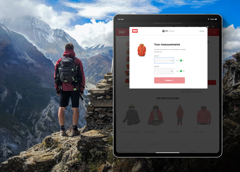
Another feature is the reviews on the product page. Users can sort them by the topic, choosing the tag they’re interested in, for example, size or color. Then the website sorts reviews and highlights the relevant parts of the review according to the tag.
The checkout page has only one step, meaning the address and payment information are located on the same page. As 60% of users make purchases via mobile, this type of checkout leads to a higher conversion rate.
The website is also integrated with marketing and selling platforms to enhance marketing campaigns and synchronize them in different channels. There are also several extensions that analyze customers’ behavior to find weak points that lower conversion rate.
Chic Wish
Chic Wish is an American fashion brand for the young generation looking for trendy and affordable clothing. The company operates in the United States, the United Kingdom, and Asia.
The site runs on Magento 2. The customized theme of the site is light, stylish, and intuitive, which fits perfectly with the fashion industry and the brand’s style. The site is adapted to all devices and screen sizes, meaning that the store doesn’t lose users due to the lack of responsiveness.
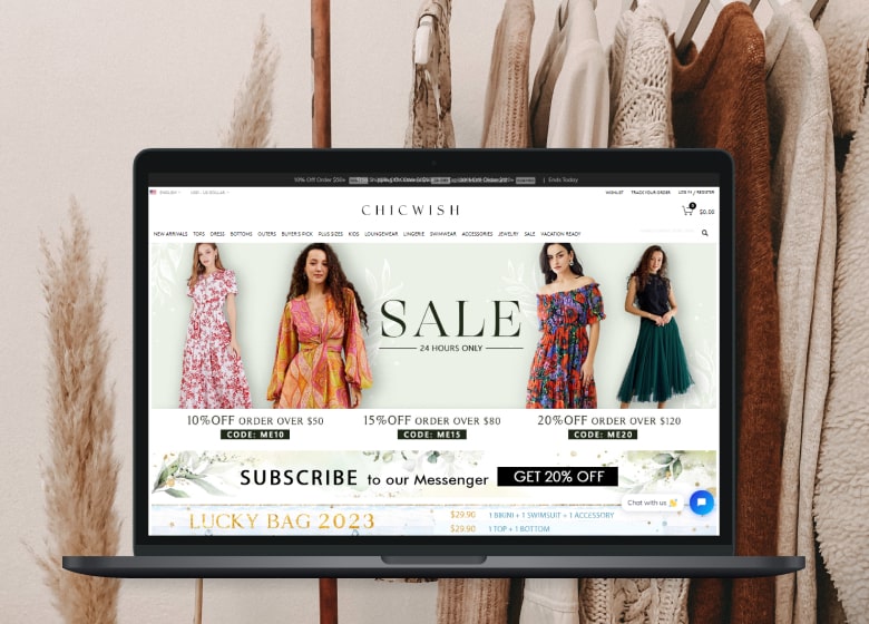
The store uses Kayako, a customer service software for managing emails, tickets, live chat, calls, and remote support. Also, Chic Wish has implemented a customizable one-page checkout.
The site has another convenient feature for customers: Find your size calculator. It determines the appropriate size based on age, height, weight, waist shape, body type, bust size, and fit preferences. In addition, if the particular item doesn’t fit, the site suggests items that do. Consumers are then offered products in that size. Prime AI powers the technology.
When an item is added to the cart, a pop-up shows how much to add to reach free shipping.
The site has an online chat service from TIDIO, enabling communication with users via instant messaging.
Savile Row Co
Savile Row Co is a luxury shirt tailor from London that is famous around the world. It needed a robust website to manage all the purchases from different countries.
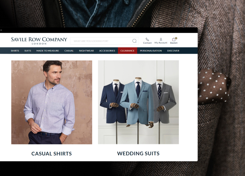
The main feature of the online store is the chance to order made-to-measure shirts and suits. The registered users can choose the style of the shirt, change any detail, and add their measurements to get a perfect-fit piece of clothing. Any ready-made shirt can also be changed slightly to the user’s taste.
The website has a custom checkout with 4 steps, and users can pay via their Amazon accounts, use PayPal, or Google Pay.
Savile Row Co stands for security. For example, while receiving a digital gift card, the user has to add its information to their account, thus ensuring that no one else will use it. This functionality is also integrated with the Savile Row Co ERP system, so the company can track users’ activity on the gift cards: when it was bought and redeemed.
Another interesting feature is the website integration with Trustpilot. While leaving a review to the product, the customer automatically leaves it in Trustpilot. The integration works the other way too. The website also configured the notifications from Trustpilot. After some time of using the product, Trustpilot sends users a notification asking them to leave a review on the company and the clothes they bought.
Magento Integration
Integrate any system with your website with experienced Magento developers
Visit the pageFood and Drinks
We cannot taste the product online. That is why food & beverage websites have to work with a content-based approach a lot. They have to show and tell their customers how great their products taste. A content-based approach means:
- Lots of pictures of how the product is used
- Videos of people enjoying it
- Recipes, ideas, and usage tips
And as most products expire, the webstore’ owners should be very flexible with delivery.
Coca-Cola
The Coca-Cola store website is a treasury of configurable products and gifts. It has a great UI and is made to engage users into the gift purchase.
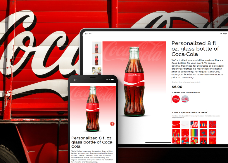
The company’s campaign Share a Coke went far beyond bottles with different names. Now on the Coca-Cola webstore, users can create a customized bottle or six-pack, as well as clothes, glasses, and other gifts. Every product is configurable in its own way. After designing, the customer can put it in the shopping cart or add it to the wishlist. The store is focused on the holiday season and gifts, so the shopping cart is a little bit different with the functionality to add a gift message to the purchase.
Caskers
Caskers is a New York seller of rare whiskeys and spirits. The website’s goal is to provide a VIP experience to its customers and make them a part of the community rather than buy a single bottle of whiskey. The approach explains all the features that the site has.
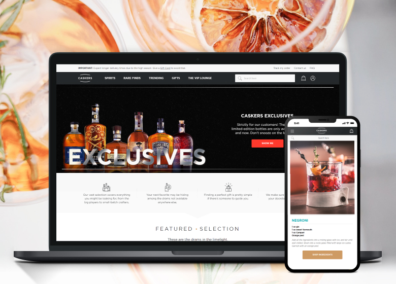
The product page gives complete information about the product: from the drink’s history to the flavor notes and customer reviews.
One of the most exciting functionalities is the Gift Concierge. This online feature helps to find a perfect spirit as a gift. Users take a quiz stating the type of spirit a receiver likes, the flavor they dislike, the occasion, and the price range. After that, the concierge generates suggestions for the spirits that fit as gifts for the particular person and occasion.
The site also has a loyalty program. For each order, you get up to 5% cashback. In addition, bonus points accumulate as you spend money in the store, which can be used as a discount on future orders. Members can also enjoy fixed-price shipping and seasonal offers.
The website also has a shipment tracking system and integration with its order fulfillment system to manage products.
Another convenient feature is the ability to review order details at the last stage of the checkout.
MuscleFood
MuscleFood is one of the leading health food retailers in the UK. Successfully helping people maintain good health and excellent physique, MuscleFood continues to increase its popularity.
The bright and intuitive custom theme provides a great user experience. User-friendly search displays popular suggestions, relevant categories, and products with brief descriptions and photos, even with just one letter entered.
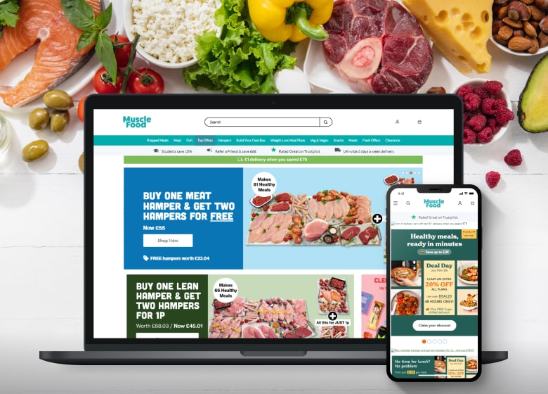
Multiple filters in the catalog make it easy to find the product. The store also has features such as “Customers who bought this item also bought:” and “We think you will love.”
One of the most exciting features of this site is the ability to build a custom food box. You can choose from four different kit options, varying in price and product range, and add items you’re interested in.
Another essential feature is the integration with Trustpilot, which enables the hosting user-generated content such as reviews.
Hardware and Appliances
Content is a king for Hardware & Appliances ecommerce websites. But besides good product descriptions and detailed guides, most of these sites should have:
- Smart search – users should be able to find a necessary product even when they are not sure what exactly the name of the product is.
- Focus on both B2B and B2C – most Hardware & Appliances companies have both types of customers.
- Focus on the product and not the design – unlike fashion or beauty websites, these online stores are more likely to sell a product rather than the lifestyle.
TechniekSpecialist
TechniekSpecialist is a seller of machine parts from the Netherlands. The company’s website is a good Magento store example for the Appliance industry. Besides selling aluminum profile systems and pipe connectors to individuals or DIY specialists, the company focuses on B2B.
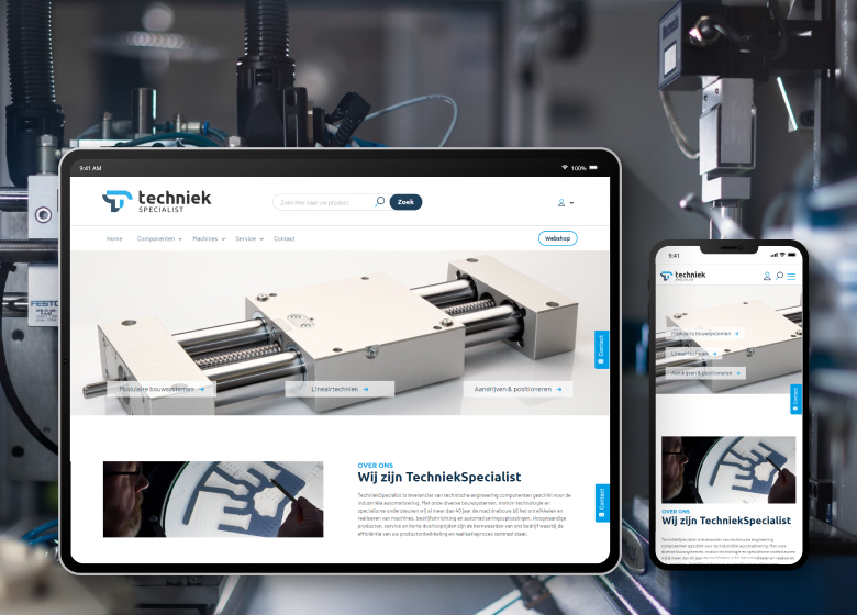
The B2B customers are one of the reasons why the company needed a robust platform that can be integrated with their order and fulfillment systems. But they also needed a user-friendly storefront for customers.
The TechniekSpecialist website is not just an online shop. It also contains guides, technical materials, and other helpful information about their products. The store is pretty simple: with a clear catalog page and all the necessary functions. Although it did miss a preview feature that allows users to learn more about the item without going to the product page.
The product page is also typical: you can choose the product configuration there and read more information about it. The website perfectly fits its industry – it offers technical documentation, contains a lot of information about the product, and has a simple yet intuitive design.
KAP Diagnostics
KAP Diagnostics distributes vehicle diagnostic equipment and software. It is located in the UK but is known all around Europe.
The company has an easily-navigated website with a simple design, the purpose of which is to focus on the product and services the company offers. It is responsive and looks as logical on mobile devices as on the desktop.
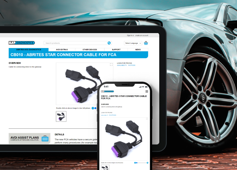
The company targeted its website at the B2B audience, so the catalog page is simple with minimum information. But users can learn more about the product by hovering a mouse over it, and seeing the dynamic preview of product details. Such dynamic output of the information allows users to get basic details without overloading the page with text.
Another feature is that the KAP Diagnostics site uses the system of a Customer ID. It means that after the registration, each user is assigned with a personal ID number. All information on the purchase history is saved in the system under that number. Based on this information, the system sends them relevant, helpful information about their products, and the users can check their purchase history at any moment.
As the company is focused on B2B users, the customer ID system allows them to have different managers’ accounts under one ID, so they can have a mutual purchase history to avoid confusion while buying equipment.
The website is also notable as it has a huge knowledge base with videos, guides, and helpful materials.
Better Batt
An Australian company Better Batt sells a wide range of batteries, chargers, and grips. The company has a nice positioning: “Technology should make our lives easier, not make us less human.”
The interesting part of the website is that its first and main block of the homepage are search bars, allowing users to find what they need without going to the menu.
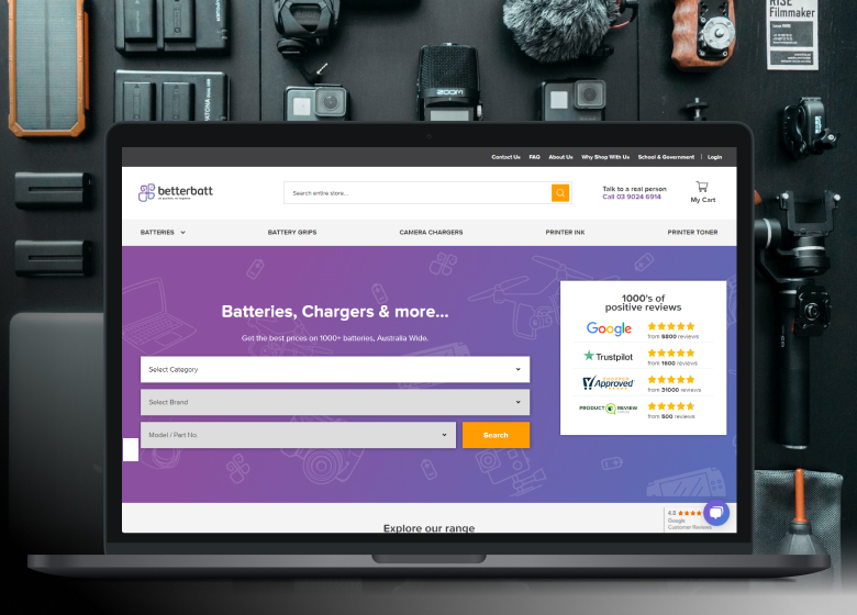
As with most ecommerce sites, users have to log in to enjoy some features such as automated newsletters, back-in-stock notifications, track purchase history, and existing orders. The account is created automatically when you place your first order.
The online store is able to handle returns, different delivery, and payment methods such as credit or debit card, PayPal, Bank Deposit, cheque, and money order. The checkout has one step only, meaning users can place all information about them on one page.
Home and Garden
As with the case of fashion websites, home and garden online stores must be visual:
- Lots of aesthetic high-quality pictures,
- Decor ideas
- Integration with Pinterest or Instagram feed.
Yet usability and simple navigation are also a must, as the main goal of the website is to sell by showing the product rather than just admiring beautiful furniture.
Cox & Cox
Cox & Cox is a furniture and textiles retailer based in the UK. They have decided to migrate their Magento 1 website to Magento 2 in 2017. The focus was on the platform that offers multiple functionalities, as they also wanted to integrate their online store with the ERP and warehouse systems.
The result is a stylish and comfy website packed with visual content. With the focus on nice pictures, the site also gives users an opportunity to share their products on Pinterest.
One of the things you notice first on the website is a simple yet informative drop-down navigation menu that gives a clear image of what you will find on the category page.
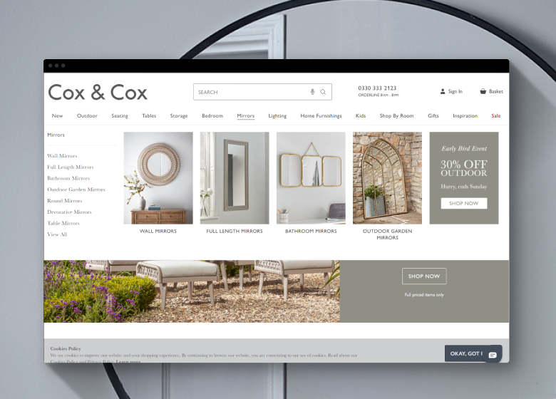
The product page is decent. Besides many beautiful product photos and details, they integrated a buyer’s note with a beautiful description of the furniture and useful tips on choosing the right product.
To make the checkout process easy, the website is integrated with the Klarna system. It has a two-step checkout where you can choose shipping and payment methods, including a credit payment.
Tom Dixon
Tom Dixon website is very stylish, just like the product they produce, which includes lighting, furniture, and accessories.
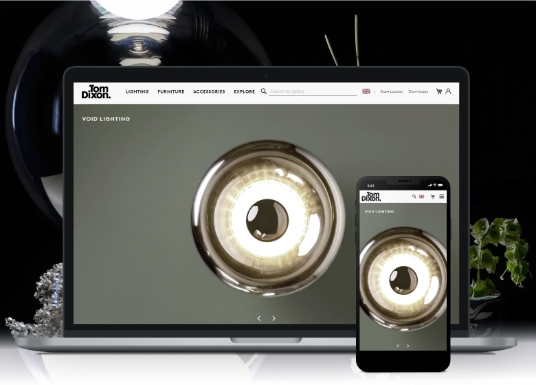
It has an unusual category layout. The product page is clean, with only the necessary information that leaves a lot of space for stylish, high-quality photos. There are also informative materials on the product page that users can download, including press releases, pictures, and technical specifications.
The website has a large amount of information: texts, pictures, and videos about the products, their story, and usage.
There is also a page integrated with the Instagram feed. If the author of the picture gives permission, the brand shares the picture on the page and adds its price.
The website tells a story of the brand instead of just selling furniture pieces.
Blaha Gartenmoebel
Blaha Gartenmoebel is an Austrian outdoor furniture retailer with a long history going back to 50 years ago.
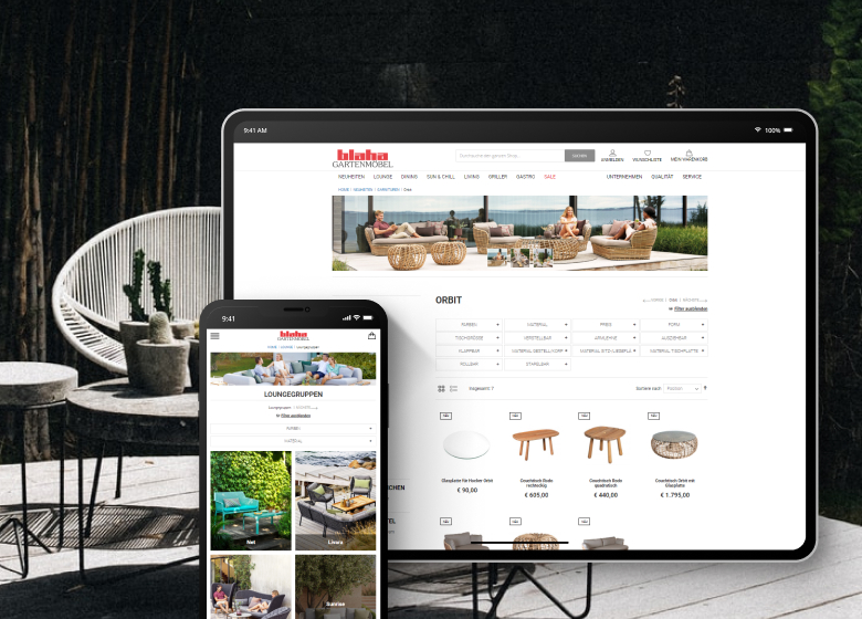
The website is integrated with the ERP system used in brick-and-mortar stores to create one system with offline and online sales channels. It also has such custom features as automatic delivery cost calculation. This feature allows users to automatically calculate the delivery cost according to the distance between the warehouse and the shipping address.
The brand also thought of its mobile users, so the design is fully responsive. And on the checkout, there is one step only, to make it quick for users.
Jewelry
Selling jewelry online is not that easy, as people tend to see and try it on before buying a pricey product. That is why online jewelry stores must be both appealing and trustworthy. Some common features of the jewelry stores are:
- PageSpeed load – these websites contain a lot of visual content, including videos, but users should be able to see it quickly
- Inventory software – the product is expensive, so inventory management must be very transparent and integrate offline and online stores.
- About us and terms and conditions – these pages are a must to increase users’ trust and ensure them their data is safe with you.
- Various payment methods – standard card payment, PayPal, Amazon account, and also credit payment. You need to provide all methods your customers can use.
Add-A-Pearl
An American jewelry company, Add-A-Pearl, gives the opportunity to buy and customize pearl necklaces, adding different pearls and changing the type of the chain. The products are viewed mostly as gifts for children.
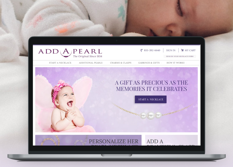
The website is simple and intuitive. It has:
- Configurable products – every product on the site is configurable. You can choose the chain for your necklace, number, and type of pearls.
- Integration with email marketing platforms – the company performs a strong content-based marketing campaign, and the website is rich in videos, text, and pictures. They focus on those clients who want to add one more pearl to their necklaces on every birthday or anniversary. This is why it’s important to set up some notifications for the users. So an integration with email service is a must for the brand.
- Custom checkout – the checkout is different from the Magento default one. All the stages are combined on one page, making it comfortable for users to fill.
Catbird
Catbird is a Magento website example in the jewelry industry. It’s an American company that was founded in 2004 as a small business and is now known worldwide.
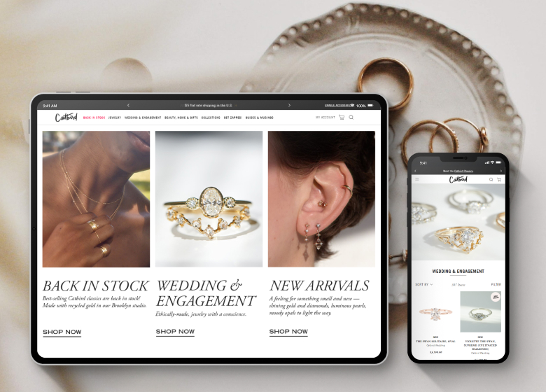
The website has several features that make it comfortable for users and the owner.
- Integration with an Instagram feed
- Guest wish list for unregistered users.
- Integration with Klarna checkout system.
- Marketing tools like abandoned cart recovery and lead generation service.
This online store is also very stylish. It shows the brand’s identity in every picture. It has good preview pictures that change when users hover a mouse over them. The product page is decent and has lots of information about the jewelry. The two-step checkout allows users to pay via bank card, PayPal, or take interest-free credit.
Summary
Most brands choose Magento for their ecommerce business when they need a store with custom features or a website with different storefronts. Magento offers flexibility on this question and basically allows building any feature you think of.
But while making your site unique, don’t forget that there are industry standards that users expect to see. So the perfect combination is a website that complies with best practices and uses custom features and integrations the competitors do not have.




Nice information & i am always happy to reading your posts!