Every aspect of an online store is essential for a smooth and enjoyable customer shopping experience. Checkout is the final step when users finalize their purchase payment, making it one of the most important.
A well-designed checkout process enhances user satisfaction, significantly boosts conversion rates, and reduces cart abandonment. This article will explore the best practices for ecommerce checkout flow, offering actionable insights for high-converting checkout pages to optimize your online store and ensure a smooth, user-friendly transaction journey.
Table of Contents:
The Importance of Checkout Design
Top 10 Checkout Best Practices
B2B Checkout Features
Wrapping Up
The Importance of Checkout Optimisation
Why is it so important to think about the checkout process? At first, checkout UX may seem to be one of the simplest parts of an ecommerce website. But this is not at all true: this process plays a critical role in determining the success or failure of an online store.
Here’s why a well-thought-out checkout is essential and the potential consequences of neglecting this crucial step:
- Enhanced User Experience. An optimized checkout process guarantees customers a smooth and pleasant shopping experience. A complex or unclear checkout can frustrate users, leading to cart abandonment.
- Elevated Conversion Rates. The impact of a simplified checkout process on conversion rates must be balanced. By reducing friction and facilitating customer purchases, more visitors can be turned into paying customers.
- Reduced Cart Abandonment. A poorly designed checkout flow is a critical reason for cart abandonment. According to the statistics, the average cart abandonment rate is about 70.1%, depending on the industry. Many users leave an online shop because of poorly designed checkout or complicated / too long checkout process. For example, if you have 90% cart abandonment, the checkout optimization will help reach regular numbers for this criterion. The average cart abandonment rate can be 82.87% for Beauty & Personal Care, 38.16% for Food & Beverage, etc.
An ill-designed checkout process can have severe consequences. When customers face uncertainty, high purchase abandonment rates often occur, resulting in significant revenue loss. A poor checkout experience decreases customer loyalty, making it less likely for them to return. Over time, the lack of checkout process optimization can lead to a lower average order value, as customers may lose the desire to add items to their cart.
Revamp Your Store’s Design for Increased Traffic
Learn how to optimize your online store's design, drive more traffic, and reduce costs through an improved user experience.
Learn moreTop 10 Checkout Best Practices
We have collected the top 10 features you must remember to ensure the best ecommerce checkout experience in your online store. It’s great if you have them, but if not, then here are some growth points for you on the checkout page.
Guest Checkout Page
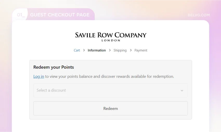
Just imagine: a user spends time on the site selecting the right products, is inspired by the purchase, and would rather pay for it and wait for delivery. The potential client goes to checkout, and a popup appears: “Don’t have an account? Register now!” In this case, most users close the site for good reason.
Users don’t want to waste time creating passwords, confirming their email, etc. According to statistics, 26% of users noted that mandatory account registration is one of the main reasons for cart abandonment. Visitors of guest checkout websites are more likely to stay on the website and continue purchasing.
Give the client a choice: register or purchase without registering an account. You can also highlight the benefits of creating an account on your site by offering a discount.
Social Login Option
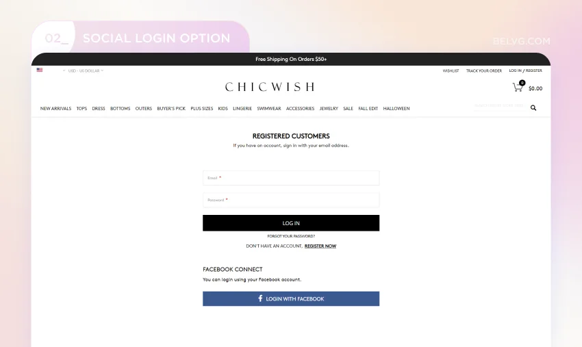
This point is closely related to the previous one. When users register or log into an account on your website, allow them to register or sign in using their social network, such as Facebook, Twitter, Google, or email address. This approach offers added convenience and flexibility and significantly reduces the time required to complete the registration or login process. Users can effortlessly access your platform by incorporating social network authentication, encouraging higher engagement and retention.
Estimated Shipping and Arrival Date
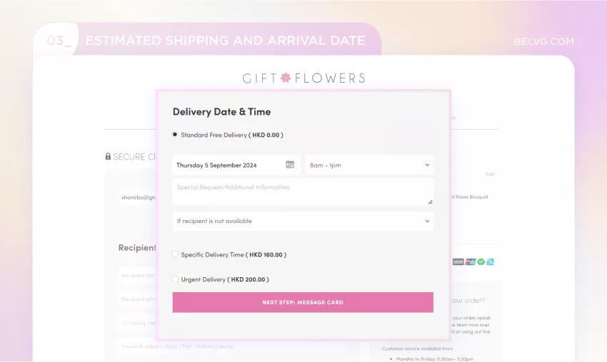
When customers have trouble finding the estimated delivery date for an order, it can lower their trust in your store and ultimately lead to order cancellations. Highlight delivery terms, pricing (especially if delivery fees apply), and delivery dates for a smooth online checkout process to minimize this risk.
This critical information should be easily visible and understandable to all users. It will reduce the likelihood of order cancellations and foster trust and satisfaction with your store.
Showing the Final Price for the Order
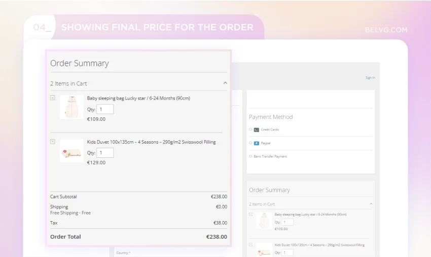
It’s essential to avoid surprising customers with unexpected price changes, as this can lead to their loss of trust in your store. Customers need to know the total cost of their purchases before checking out, with the final cost of the product listed separately from shipping costs, taxes, and other expenses. Also, update the price of the entire cart when a new product is added, not just at checkout but also in the product cart.
How to Get More Than 5 Pages per Visit?
Check the details on the example of our work with Zizzz.
Learn moreConsider adding a field after the cost where customers can enter promo codes for their purchases. This will help them remember to use any available discounts, significantly enhancing their satisfaction and loyalty. The most effective checkout pages provide immediate feedback by updating the total price in real-time when promotional codes and discount coupons are applied.
Upsell or Cross-sell Products
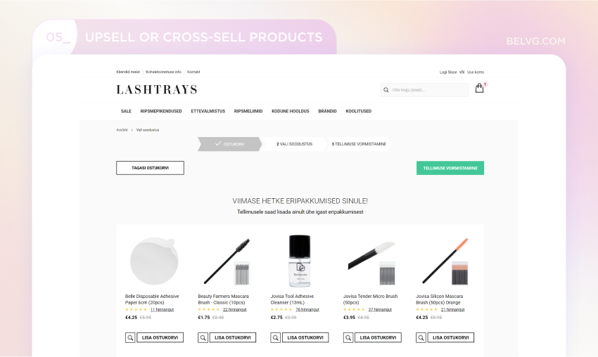
Upsell products are higher-priced items similar to those already chosen by the customer. Cross-sell products are complementary items that can enhance the customer’s existing selections.
When implementing upsell and cross-sell strategies, offering only a few high-quality options based on customers’ choices is crucial. Whether used in the checkout process or on the product page, this approach can significantly increase sales and provide customers with more expensive items. Remember that the key is to avoid overwhelming buyers with too many choices, which can detract from the overall shopping experience.
Different Payment Methods
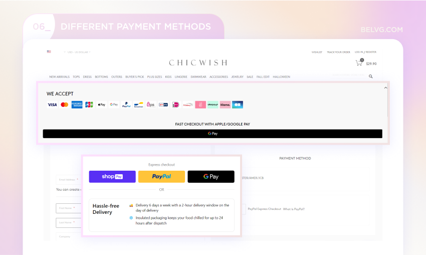
Trust and security are crucial in payment methods, which vary by country and region. Stats show that the lack of a suitable payment method is a key reason for cart abandonment. Customers need to trust the site with their credit card info, and the absence of alternative payment methods can make them leave the site.
Ensure the checkout offers popular payment methods used in the regions where you operate. These methods should be sorted by popularity, from the most used to the least. Additionally, it’s essential to include options in the online checkout such as Apple Pay, Google Pay, Amazon Pay, and PayPal. These payment methods can help you reach a larger audience if your business expands globally. Here are the payment page design examples of how different approaches can look like:
Mobile-friendly Checkout
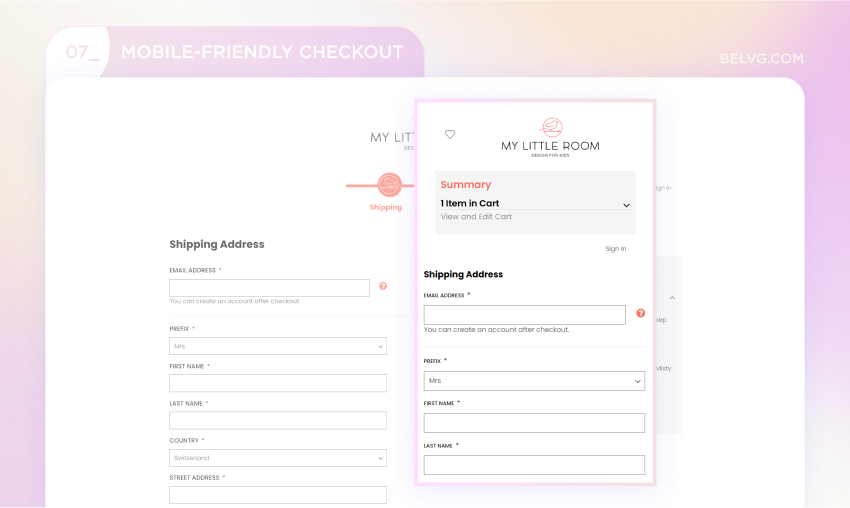
In 2023, approximately 80% of shoppers used smartphones while shopping. Most users will only make purchases if the mobile version is convenient. That’s a good reason to pay attention to mobile ecommerce best practices.
As a business owner, web developer, or marketer, you have the power to make the checkout page design for mobile devices more user-friendly. By optimizing the checkout process for small screens and making navigation a breeze, you can significantly enhance the user experience. The comfort and appropriateness of button sizes are key factors in this, and by making these adjustments, you can help customers complete their purchases more quickly and easily.
Add Support for Customers
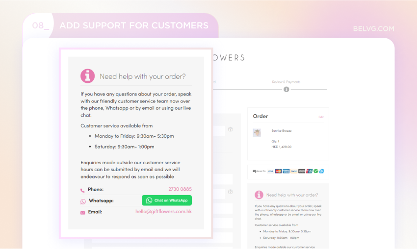
Customers are more eager to trust your website with their payment info if they see that there is someone to talk to if things go wrong. Adding a visible and easily accessible icon for live chat support on the checkout page is one of the e-commerce best practices. It will provide immediate assistance and an opportunity to address customer concerns, enhancing the overall experience and building trust in the brand.
An Order Summary
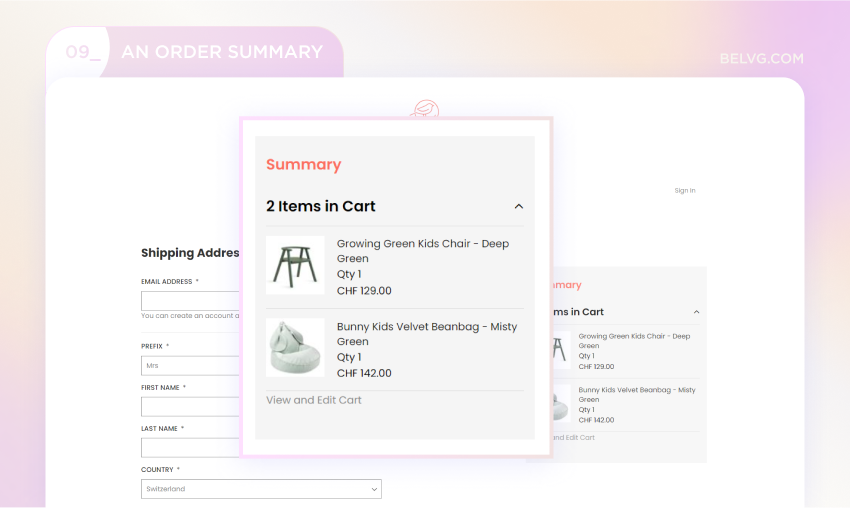
When making a purchase, buyers should clearly understand the ordering process and access to detailed information about their purchases. At the checkout stage, they need to be able to review and confirm the size, colour, and quantity of the items, as well as the customer’s address, contact information, and chosen payment method. This level of detail ensures that customers can confidently manage their purchases without the need to repeatedly review their cart and check for any errors.
Using multi-page or one-page checkout
Some stores use one-page checkouts, while others have multi-page checkouts. The choice between the two types depends on the store’s specific needs. It’s essential to consider the nature of the business to determine which checkout option will work best.
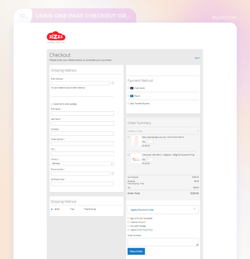
One-page checkouts are not just efficient and fast, but also ideal for specific types of businesses. They are particularly beneficial for stores selling low-cost products or digital services. Users can quickly review and correct any mistakes in the information they enter. Since all the information is on a single page, the checkout loads rapidly, and users can complete the process without navigating to different pages. You can find one-page checkout examples in many stores, for instance, on our client’s website:
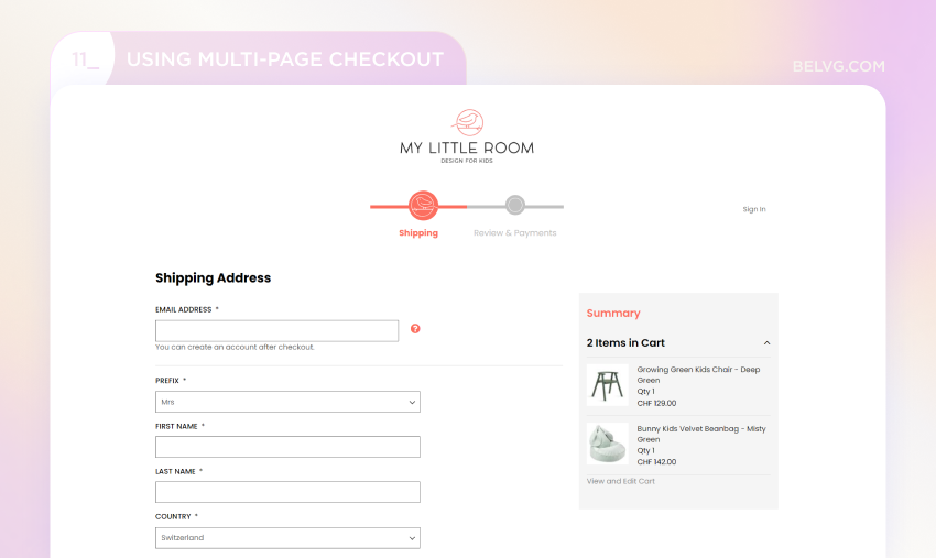
Multi-pages, with their user-friendly ecommerce checkout page design, also have advantages. User information is split into sections such as address, contact details, and payment method, allowing a visual progress indicator to show users how much more information is left to add and improve ecommerce checkout flow. Additionally, as a site owner, you gain more comprehensive customer information. With a multi-page checkout, users feel more comfortable as they can review each section before moving on to the next step, providing a sense of control and comfort. This checkout type is suitable for high-value purchases that require careful information input.
Reduce Cart Abandonment with a Design Audit
Audit your store’s design and eliminate the barriers that lead to cart abandonment, improving user experience.
More DetailsB2B Checkout Features
The B2B checkout process should accommodate the unique needs of business buyers. Unlike B2C transactions, B2B purchases often involve:
- Bulk orders
- Multiple users from the same organization
- The need for detailed invoicing and account management
Besides, you need to consider several more best practices for such users.
Detailed Invoicing and Flexible Payment
Flexible payment options, including credit accounts and invoice-based billing, can significantly enhance the user experience. Check if invoices are detailed and can be downloaded as a PDF file, providing all necessary information, such as purchase order numbers, itemized costs, and tax details.
Approval Workflows
Many B2B purchases require approval from multiple stakeholders. Incorporating approval workflows within the checkout process can ensure that all necessary approvals are obtained before the order is placed, reducing the risk of delays. Also, put a VAT ID number field in the checkout to check if buyers are real businesses.
Customizable Shipping Options
It includes freight shipping, less than truckload (LTL), and full truckload (FTL) to handle large orders. Businesses can ship to multiple addresses within a single order and select preferred carriers and delivery times. This flexibility ensures that shipping aligns with their logistical needs and schedules.
Wrapping Up
The checkout page, being the final stop for users before they make a purchase, plays a crucial role in their journey. It’s important to make it intuitive and user-friendly. By optimizing the checkout process, you can create a positive impression, increase customer retention, and ultimately drive more sales.
Our actionable tips for improving the checkout process can help you increase website traffic and conversions, provide a seamless and pleasant experience for your customers, and ultimately reduce cart abandonment rates.
