
Eco-friendly bedding for babies
Hyvä theme and long-term support for Zizzz multistore
About Zizzz
Zizzz is a family-owned Swiss brand that manufactures and sells sleeping bags, blankets, and duvets mostly for children. The idea to improve our sleep was born together with the founders’ first child in 2012. Since then, this small company has focused on providing quality products at reasonable prices. They sell pure 100% natural materials like bio-cotton and Swisswool. The company delivers organic products designed to give the best night’s sleep both to kids and their parents.
Project Overview
The BelVG has been working with the Zizzz company since 2018. The client had a multistore on Magento 1, and they were ready to upgrade with our help. In the first year of cooperation, BelVG migrated a multistore to Magento 2 and enhanced its web design. After that, Zizzz trusted us with the ongoing development and support of their website. The latest interesting tasks include:
- updated Magento to the latest 2.4.5 version
- developed a new website theme based on Hyvä
- optimized website performance
- installed and customized third-party modules
Client
ZizzzCountry
SwitzerlandIndustry
Home goodsPlatform
Magento 2 Hyvä themeServices & notable features
- Magento 1 website to Magento 2 migration
- Magento upgrade
- Hyvä theme development
- Fixes of module compatibility issues
- UX audit and design tweak implementation
- Website performance optimization
- Long-term support
Migration to Magento 2
When Zizzz came to us, they had already owned a Magento-based shop. Back then the multistore worked had 5 different language versions, 3 currencies, tax systems, and 2 stock locations. Being familiar with this ecommerce platform, the company decided to remain faithful to it and updated its webstore by moving to the Magento 2 version.
BelVG helped Zizzz to manage its migration to Magento 2. Our general goal was to go through the migration procedure with no data loss and keep the core functionality of the webstore. We transferred all the data, analyzed and migrated the extensions needed, and re-configured all rules in the different storefronts.
Now, they have steady annual revenue growth and can improve their website further.

Let’s connect
Have a project? Fill out the form and we’ll reach out to you. Get a free proposal now.
Magento upgrade and Hyvä theme development
In 2022, a question about the website upgrade arose. The client wanted it to be more performance-oriented and fast. So they laid their eyes on the Hyvä theme and Magento version 2.4.5. The client’s focus was on the time of update, they wanted to implement the changes as soon as possible.
The team first configured the update of Magento and then switched to the Hyvä development. The technology is built using TailwindCSS and AlpineJS instead of RequireJS, Knockout, and UI components. It means the Hyvä theme uses fewer resources when website uploads, leading to better performance and Google Page Speed ranking.
The Hyvä theme is resonably new. It means that only a small number of Magento modules displayed on the frontend are compatible with Hyvä. So, the challenge of the team was not only to develop and adjust the theme but also to make all modules compatible with Hyvä.

Compatibility module installation
The thorough work was conducted by our developers in terms of website module compatibility. The team made a list of all third-party modules on the project and checked each one for the compatibility solution.
Time was a priority for the client, so if some extensions were not compatible or didn’t provide a ready-made compatibility module, we looked for alternative solutions that go with Hyvä. Among interesting modules are:
- Magefan module for a blog. We integrated it instead of another blog module and migrated all the blog posts
- The MagePlaza Reward Point module. It required complicated data migration if changed, so we have written our compatibility module for it.
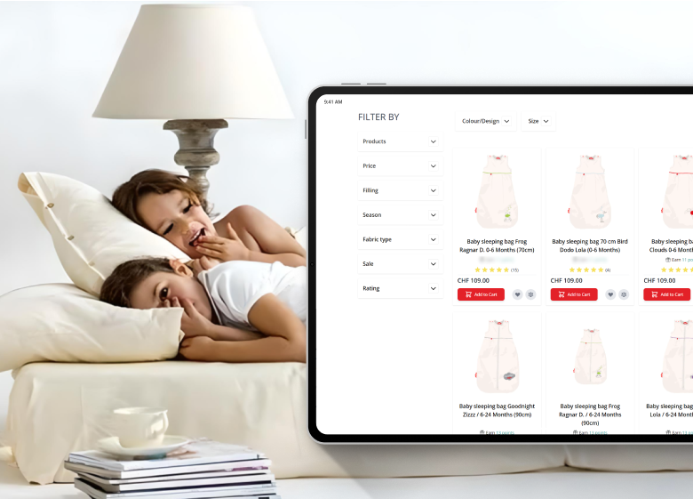
Checkout configuration
While working with Hyvä, the developer might individually think over the checkout configuration. It is one of the most sensitive tasks.
By default, the theme doesn’t have any built-in solution, you need to configure it separately. You can choose among Hyvä checkout for an additional price, React checkout, and a fallback module. Read more about it in our Hyvä review article.
We used the last option, called the Fallback module. It allows distinguish the list of routes where we do not want to use Hyvä and switch to the Luma or Blank theme at the checkout. After we set up the fallback module, we also installed and configured the Amasty One-step-checkout currently used on the website.
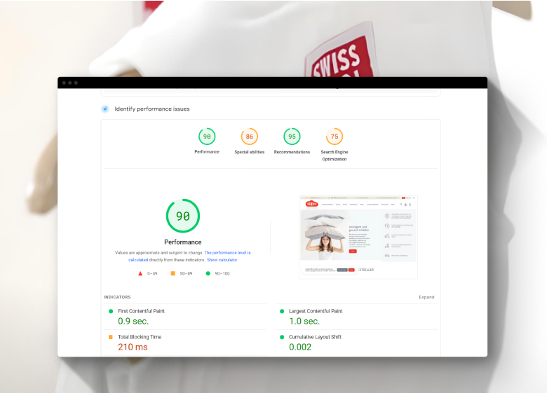
Standard website optimization for Magento
After the upgrade, we did additional tasks to optimize the website.
- Adjusted the varnish cache
- Converted images to WEBp format
- Implemented the Lazy load module
These tasks are standard speed optimization tweaks to ensure a good Google Page Speed score, that is as a result reached 90 points.

Contact us to learn more about Hyvä for your website. Tell us about your website and get a free estimate.
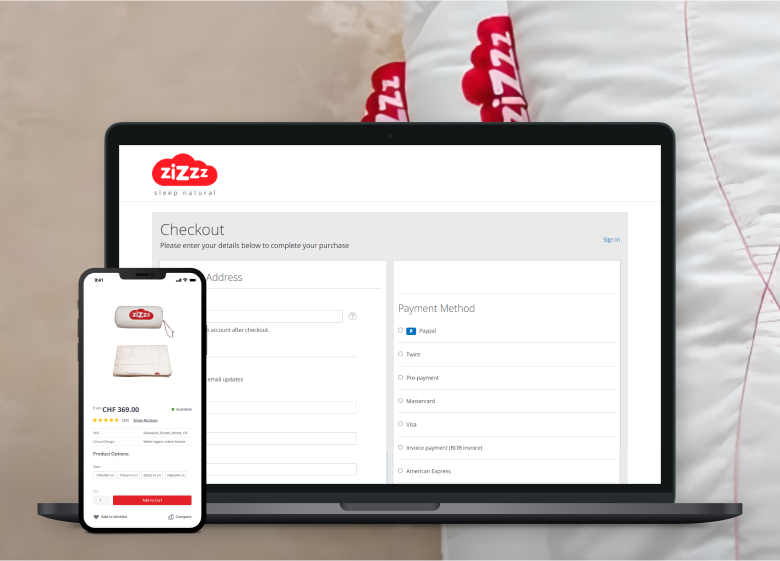
Magento Webdesign
During the Hyvä website development, the client requested to make a UX and UI audit for their website. We made a few changes that, along with other work around the store, helped increase the number of pages per visit to 5.77.
Checkout
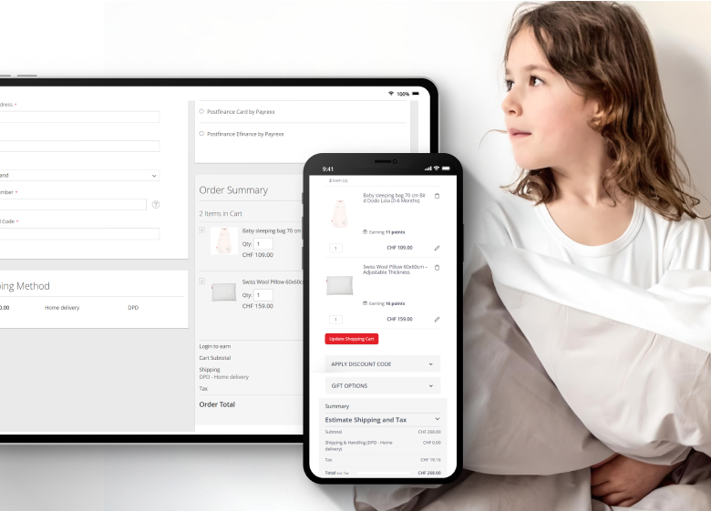
We have relocated the points tab to a distinct Spend Your Points section, making it easier for users to locate. This section now appears upon logging into the site. Additionally, the team has adjusted the stylistic parameters and organized them all in one place at checkout.
As for the cart page, the team has added payment icons and highlighted the discount code and gift options. Additionally, we have altered the style of the pop-up fields on the site.
Product page on mobile
Previously, the user had to scroll the page to find basic information about the product, such as price, reviews, and availability. Now, it is located on the first screen. We also have improved the layout of tabs on the page.

Home Page
After the audit, our designer concluded that the main page looked good, except for some unusually placed elements. These elements distracted the user’s attention from the main goal – studying the product and brand, as well as making a purchase. Therefore, we made the following changes:
- First screen. Social icons have been transferred from the main banner to the footer, as it’s the first place where users expect them to be. We have updated the style of the call-to-action button and slogan on the main screen.
- Featured product screen. We enlarged the size of the product cards on the homepage and emphasized the block displaying the product name. We also added the number of reviews next to the product picture for more transparency and increasing user trust.
- Reviews block on mobile. For easier reading of reviews on the mobile version, each is made as a card, and the user can scroll through them.
- Footer. We have made changes to the subscription block and the button: added a small name and emphasized the discount information in bold.
Blog
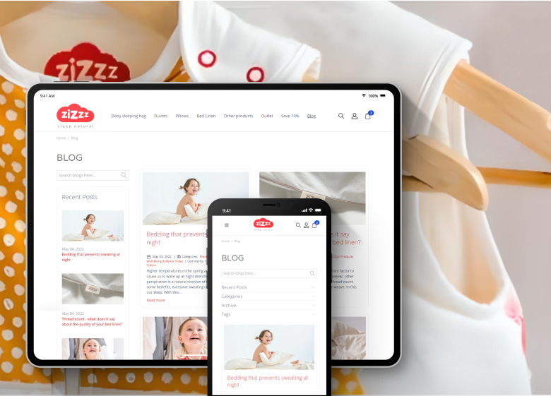
The problem with the blog was the lack of air on the page and the excessive abundance of text. It made it harder for users to navigate and focus attention on specific posts. There were also problems with the mobile version, as it seemed chaotic.
The designers and frontend developers solved the problem. For mobile users, the most recent news is now displayed in extra blocks, and categories and tags are hidden in tabs.
On the desktop, our team downsized article cards and shortened text previews. As a result, the page has more space now.
Project Results
The Magento 2 platform allowed Zizzz to achieve their goals. Our designers worked in tandem with frontend developers and created a webstore that met all the client’s requirements. Here are our main results so far:
Business Growth
Migration to Magento 2 with the right development agency became the significant reason for Zizzz's constant annual revenue growth of $1-2M per year.
Impressive Website Performance
The transition to the Hyva platform caused an increase in Google Page Speed up to 90 points and the opportunity to further site optimization.
Improved User Behavior
Thanks to the UX analysis and the implementation of the recommendations, the browsing depth increased to almost 6 pages, and the visit duration reached 40 minutes.





Let’s connect
Have a project? Fill out the form and we’ll reach out to you. Get a free proposal now.


