The design and functionality of your shopping cart can significantly impact your sales. It’s important to not only attract customers to your site but also to make sure they complete their purchases.
A good cart page design is crucial to user experience, customer satisfaction, and conversion rates. Implementing best practices in ecommerce cart functionality can help create a smooth, user-friendly process. It reduces friction, lowers cart abandonment, and can increase sales. This article will discuss the essential strategies and shopping cart page design elements. Every online store can incorporate them optimize their shopping cart for success.
Table of Contents:
How Damaging is Cart Abandonment
Why People Abandon Their Carts
Types of Shopping Carts
10 Shopping Cart Best Practices
Conclusion
How damaging is cart abandonment
Cart abandonment is one of the most significant challenges in ecommerce, directly impacting a store’s bottom line. On average, about 70% of online shopping carts are abandoned, leading to billions in lost revenue annually across the industry. The impact of cart abandonment extends beyond just lost sales, affecting various aspects of an online business:
- Distorted Metrics: High abandonment rates can skew conversion rates, making it difficult to accurately assess the effectiveness of marketing and sales strategies.
- Increased Costs: Businesses often incur additional expenses through retargeting campaigns, email reminders, and other recovery strategies to return customers to complete their purchases.
- Customer Trust Issues: Abandonment often signals problems such as complex checkout processes, unexpected costs (e.g., shipping fees), or concerns about payment security, which can erode customer trust.
Effective shopping cart design ideas can help minimize the abandonment of your store. Here, creating a more seamless and trustworthy checkout process plays an important role. Let’s examine the reasons people leave an online store without completing a purchase.
Also read: Ecommerce Checkout Best Practices
Why People Abandon Their Carts
By focusing on the most common obstacles, businesses can implement solutions to encourage more customers to complete their purchases. Here are five common problems with shopping carts contributing to cart abandonment and how they can be mitigated:
- Unexpected Costs. Hidden fees like shipping or taxes revealed at checkout often cause shoppers to abandon their carts. Transparent pricing from the start can help avoid this.
- Complex Checkout Process. Lengthy or complicated checkout steps frustrate customers. Simplifying the process and offering guest checkout can reduce cart abandonment.
- Security Concerns. If a site doesn’t feel secure, shoppers may leave. Displaying trust symbols like SSL certificates can reassure customers.
- Lack of Payment Options. Limited payment methods can deter shoppers. Offering a variety of options guarantees customers can pay in their preferred way.
- Website Performance Issues. Slow loading times or errors during checkout can frustrate customers. Optimizing website performance is crucial to keeping them engaged.
Focusing on creating a transparent and user-friendly design, you can boost conversion rates. This also reduces the chances of abandoned shopping carts and turns more potential sales into actual revenue.
Reduce Cart Abandonment with a Design Audit
Audit your store’s design and eliminate the barriers that lead to cart abandonment, improving user experience.
Learn moreTypes of ecommerce shopping carts
There are various types of shopping carts, each designed for different users and business goals. Here’s a look at the five primary types of shopping carts used in online stores:
Pop-Up Cart
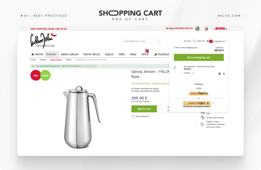
The pop-up cart is a common choice for many ecommerce sites. When a user adds an item to their cart, a small window or overlay appears on the screen, displaying its contents. This cart type allows users to review their selections without leaving the current page. Pop-up carts are convenient for a seamless shopping experience. Here is an example of this type of shopping cart.
Modal Cart
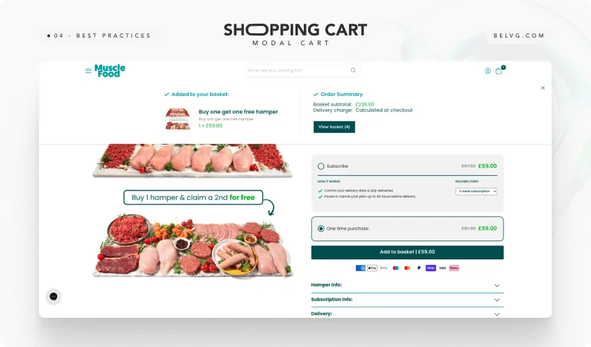
The modal cart, a refined version of the pop-up cart, offers a user-friendly presentation. It appears as a centered overlay on the screen, often dimming the background to focus the user’s attention on the cart. This cart shows details like descriptions, quantities, and prices without leaving the product page. The modal cart is less disruptive than a traditional pop-up. It is famous for its clean and user-friendly presentation.
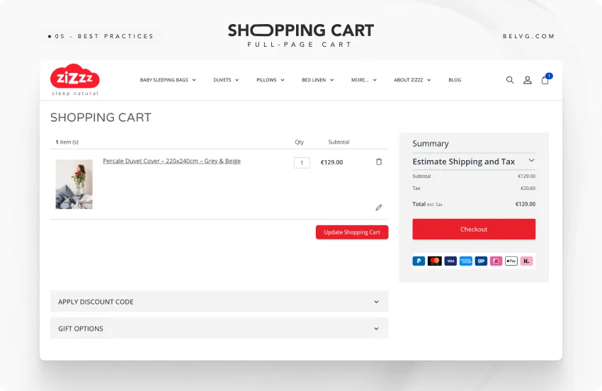
Full-Page Cart
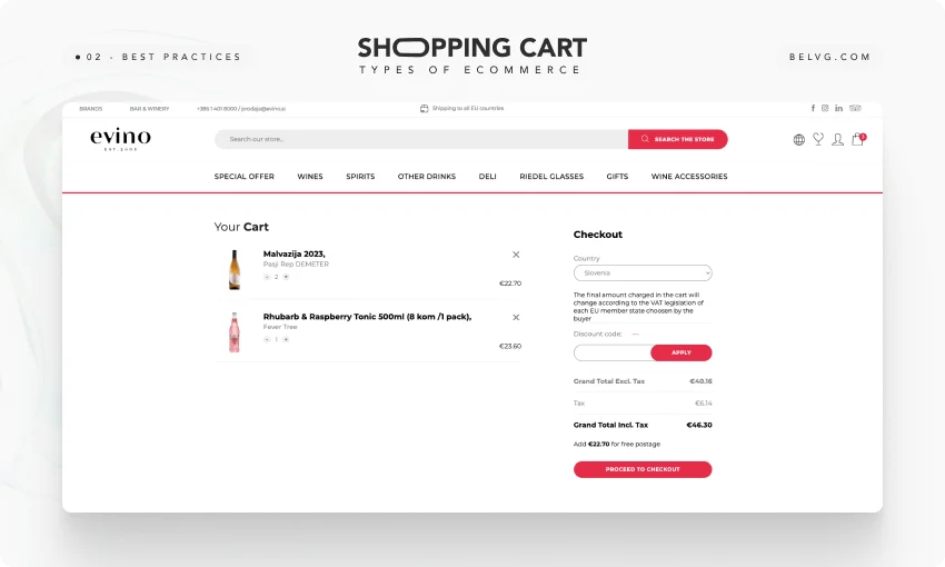
The full-page cart redirects users to a dedicated cart page to view details of their selected items. This cart type is ideal for users ready to checkout. It shows the order with product images, descriptions, prices, and totals. This approach offers clarity but may interrupt users who want to keep browsing before buying.
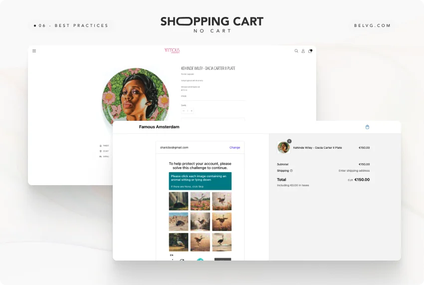
No Cart
Some modern ecommerce sites, particularly those offering quick purchases or single-product sales, choose a “no cart” approach. In this setup, users don’t go to the traditional cart but proceed directly to the checkout after selecting an item. This simplified process shortens the buying journey, ideal for businesses targeting impulse purchases.
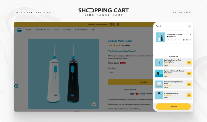
Side Panel Cart
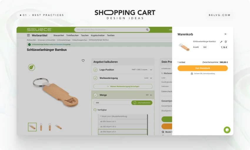
The side panel cart is a modern and non-intrusive solution that slides in from the side of the screen when a user adds an item to their cart. This cart lets users see their items without leaving the page, keeping their shopping flow intact. Side panel carts are popular for balancing visibility and user convenience. It provides a quick overview of the cart without being too disruptive. This type is well-suited for mobile users, where space and ease of navigation are critical.
Each cart type serves a purpose, and the choice depends on the store’s nature and customer behavior. Understanding each type’s strengths and limits helps ecommerce businesses optimize carts, improve user experience, and boost conversions.
| Pop-Up Cart | a small window or overlay appears on the screen, displaying its contents when a user adds an item to the cart |
| Modal Cart | pops up as a centered overlay on the screen, often dimming the background to focus the user’s attention |
| Full-Page Cart | shows the details of selected items such as including product images, descriptions, prices, and totals |
| No Cart | absent as a basket in the classical sense, a product card has a “Proceed to Checkout” button |
| Side Panel Cart | allows users to view their cart contents without leaving the current page |

How to increase the revenue of your store?
Check the example of our partnership with Chicwish for more details
Learn More10 Shopping Cart Best Practices
The best online shopping carts share many features. We have collected the most common ones and shown them using our projects as examples.
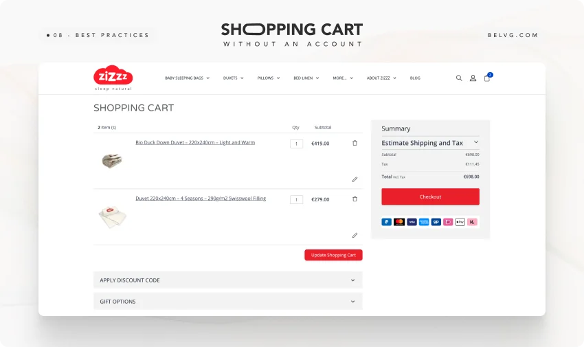
1. Adding the products in the cart without account creation
Making customers create an account before adding items can slow the shopping process and increase cart abandonment. Shoppers prioritize speed and convenience, and if account registration seems too slow, they often look for alternatives.
To resolve this, users can add products to their cart without an account. This smoother process minimizes interruptions, improves user satisfaction, and boosts purchase completion rates. A guest checkout option lets customers complete their purchase quickly. They can create an account later if they want to.
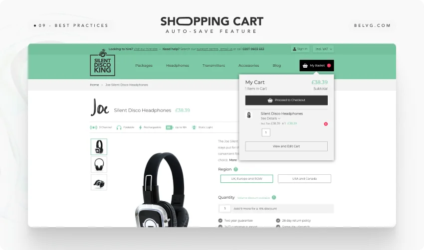
2. Add an auto-save feature for items in the cart
Сustomers can leave a site or close their browser accidentally or just because they want to continue shopping later. When a user doesn’t have an account in your shop, the products saved in the cart may be lost. This can frustrate users, as they may not want to reselect items, especially if they’ve found great options.
An auto-save feature can prevent this, as items added to the cart are preserved even if customers leave the site. This lets shoppers return to their carts without losing their selections and boosts the chances of a later purchase.
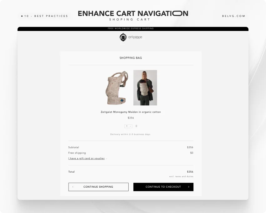
3. Enhance Cart Navigation
Navigation between the cart and product page must be easy. If it’s difficult for them to move between these pages, they might spend less time browsing, and the average order value may decrease.
Provide clear links or buttons that allow users to return to product pages, encouraging further browsing quickly. Offering both “Continue Shopping” and “Continue to Checkout” options in the shopping cart is helpful. This shows that you understand and respect your customers’ needs and preferences.
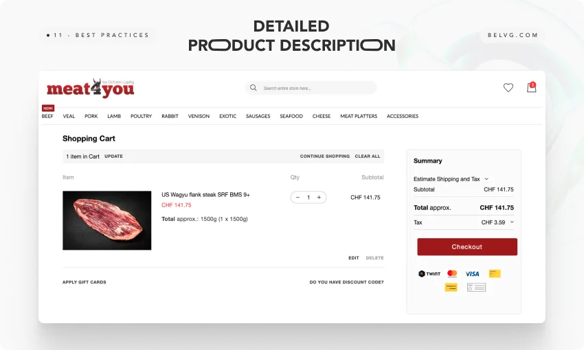
4. Provide a detailed product summary
Without a clear and detailed product summary in the cart, customers may feel uncertain about their choices. It can cause confusion, errors, or hesitation to complete the purchase. This uncertainty can result in a poor shopping experience and reduced trust.
Include a clear product summary in the cart with details like names, quantities, prices, sizes, colors, and any customizations. This transparency lets customers review their choices, reduces errors, and improves the shopping experience.
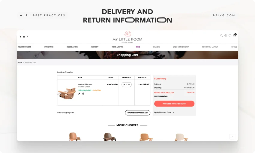
5. Display explicit and detailed information about shipping and returns
Providing more precise information about shipping and returns is crucial. It reduces uncertainty during checkout, which can lead to frustration and cart abandonment. Customers unsure about additional costs or the return process may hesitate to complete their purchase. Clear information reduces uncertainty and increases your confidence for a smoother checkout.
You can display detailed information about shipping costs, delivery times, and return policies directly within the cart and checkout pages. Providing clear details helps customers understand the total cost and terms of their purchase. It also helps boost their confidence and leads to a smoother checkout experience.
Decrease in bounce rate up to 40%
Learn more about how our web design services can help you to increase conversion rates and get positive user experience.
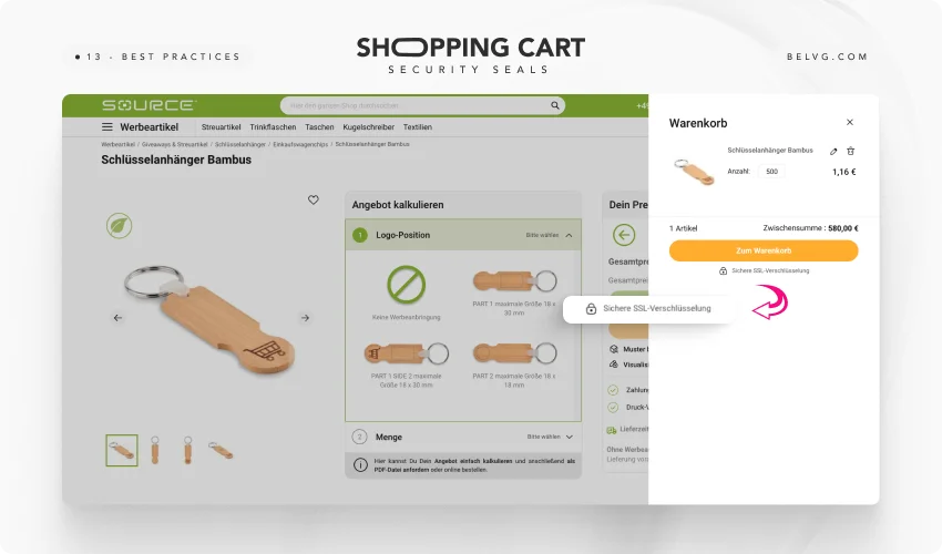
Check it out6. Show security seals and reassuring elements
Visible security seals help customers feel confident in their purchase. Anxiety and hesitation can lead to higher cart abandonment because of concerns about fraud or security.
We recommend displaying security seals and reassuring elements clearly on the cart and checkout pages. Security badges and clear encryption details boost customer confidence and assure them their purchase is safe. This approach reduces anxiety, fosters trust, and decreases the likelihood of cart abandonment.
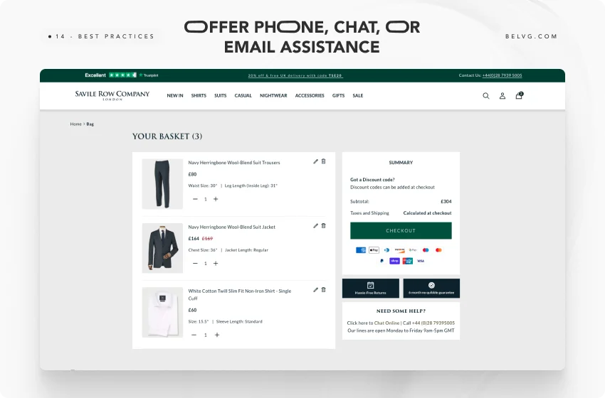
7. Offer phone, chat, or email assistance
Customers often need help with questions or issues during the checkout process, and the absence of immediate assistance can leave them feeling unsupported and frustrated. This lack of support can lead to increased cart abandonment, as customers may need help to resolve their concerns or uncertainties promptly, resulting in lost sales and diminished customer satisfaction.
Here, you can offer multiple channels of assistance, such as phone, chat, or email support, which are directly accessible from the cart and checkout pages. Providing these options ensures that customers can quickly get answers to their questions or resolve any issues they encounter.
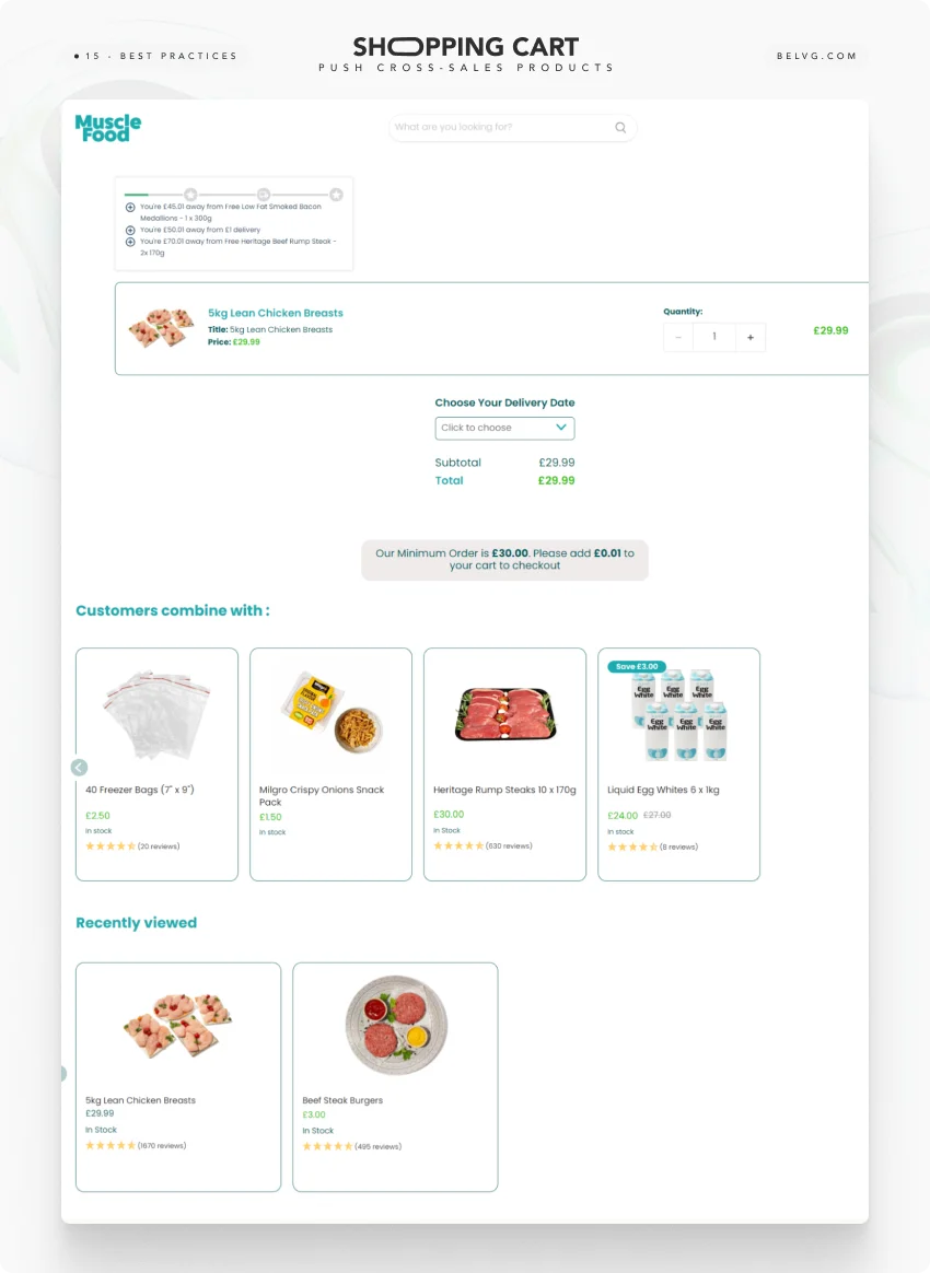
8. Push cross-sales products
Online stores must effectively promote cross-sales products during checkout to guarantee they get opportunities to increase the average order value. This oversight can lead to lower sales and reduced profitability, as customers may need to be made aware of complementary items that could enhance their purchase.
You can strategically push cross-sales products in the cart pages. By recommending relevant and complementary items, such as accessories or related products, you can encourage customers to add more to their cart, increasing the overall transaction value.
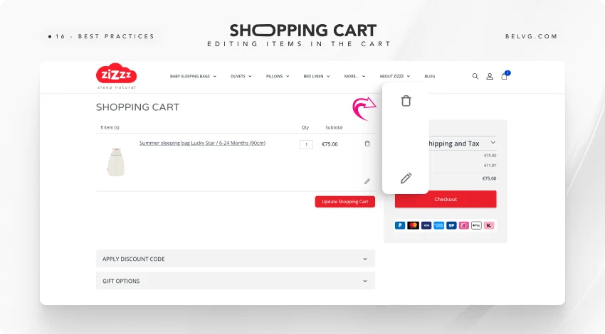
9. Allow shoppers to edit items in the cart
Customers who cannot modify items in their shopping cart, such as changing quantities and sizes or removing products, may become frustrated with the inflexible checkout process. This frustration can result in more abandoned carts, as customers might choose to leave their purchase instead of starting over or making corrections in a cumbersome manner.
We suggest enabling customers to easily edit items directly in their cart. By offering simple options to adjust quantities, change product variations, or remove items, you can create a more user-friendly shopping process for your customers, reducing frustration and making sure that customers confidently proceed to checkout.
10. Place the shopping cart icon with the number of items in the top right corner of the page
If the cart icon isn’t visible or the item count is missing, customers may struggle to track their selections. It can lead to clarity and a cohesive shopping experience. The lack of visibility can result in users losing track of their intended purchases.
Place it in the top right corner of the page. This location is intuitive and familiar to most shoppers. Also displaying the number of items in the cart makes it easy to check their cart and navigate to it when they are ready.
Conclusion
Recognizing the key features of a shopping cart and integrating them into your store can contribute to achieving your sales and performance objectives. It’s also crucial to be mindful of 5 red flags of an online cart to minimize associated risks:
- Lack of Mobile Optimization
- Slow Page Load Times
- No Cart Saving Option
- Unclear Security Features
From straightforward navigation and detailed product summaries to security assurances and flexible checkout options, each best shopping cart solution plays a vital role in guiding customers smoothly through the purchasing process. Whether it’s a B2C or B2B shopping cart, remember that the ultimate goal is to remove barriers and build trust, ensuring that customers feel confident and supported at every step.

