We continue publishing and comparing the list of well-known brands running on Prestashop. Drawing a parallel between various web stores, we find out pros and cons of every shop to provide you with gimmicks that enhance your business and solicit more customers.
Today product page is considered as a topic for discussion. Let’s see the product page of which brand can be named as iconic.
Abanico-chocolat.com
Abanico is a famous chocolatier which gets dessert men worldwide satisfied. The company is experienced enough to provide clients with a pleasant adventure where they can taste and savor chocolates that suit any occasion. Focusing on the product quality, Abanico prefers combining traditional handcraftsmanship with contemporary techniques by working with selected cocoas.
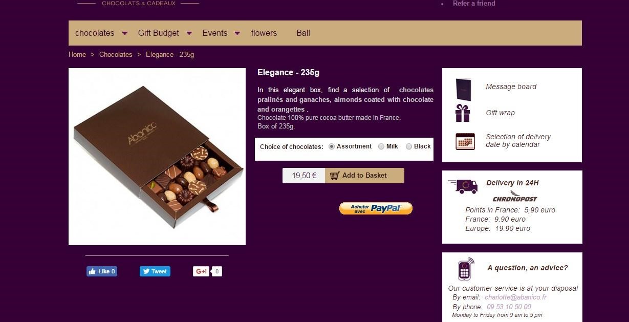
The product page where chocolate is presented is quite simple. It consists of a product image and information. First off, the most significant point that compels attention is an image. There’s only one picture where the product is shown. It can’t be zoomed in or looked in details. Probably, it doesn’t have any sense to post more photos of such a product, as these are not clothes, but, nevertheless, additional pictures won’t go amiss. To the right of the image, there’s a short product description containing the size of the product, its price and the possibility to select a type of chocolate. Moreover, charge type is determined, so a client knows how to pay an order in advance.
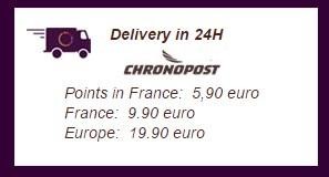
The web store guarantees a delivery in 24 hours, despite the fact you’re situated in France or in Europe. Though the delivery area is restricted, delivery is much-in-demand. Besides, prices are shown as well.
There’s a customer service providing customers with support or any advice. There are two ways to ask for a help. The first one is by email, the second is by phone. Besides, you should pay attention to the time when they are available. It is limited as well.
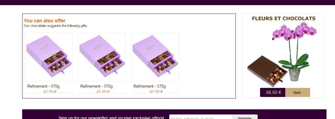
There’s a block of related products where a client can choose one more item in case he is interested in it. The idea is supposed to be useful, but there is a drawback. In order to see the block, a customer should scroll down the page. So at once when opening a product page, you can’t see the separate blocks.
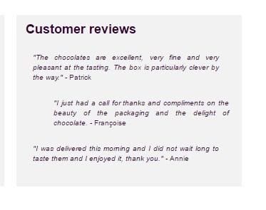
One more significant point is customer reviews. On the web store it is placed at the bottom of the site, so it’s quite difficult to find the block with customer’s feedback. In addition, the block is clickable, so you need to click to see more references, and a new page is opened.
As you can see, the web store is rather simple without contemporary trends applied. Sometimes when trying to find a needed block with service, a client should spend much time and, as a result, hasn’t found necessary data.
Designandfurniture.com/fr/
The web store doesn’t need any explanation as its name expresses the main idea. The web store provides furniture and design which are to anyone’s liking.
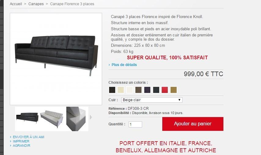
The product page seems rather comprehensive, as it covers all necessary data. First of all, there are product images that are presented in various ways to display a product in-depth. The main picture shows the general view of the product, meanwhile, there are thumbnails that are zoomed in when hovering over. It doesn’t need to click on the images, that simplifies the process.
At the right side, you can find a product description including such important features as dimensions and weight. In order to get more information, you should click on the line “more details” placed below the description.
Before purchasing an item, you can select a color, type of leather and quantity. Having taken a look at the product, you can choose whether to buy it or not.
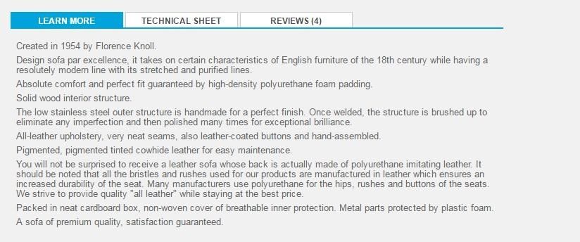
Then you’re presented a block of additional data on a product, which consists of 3 sections. The first one is dedicated to product quality and its creation process. The second one is called “Technical sheet” where dimensions are written: height, width, weight, depth, volume. The third section is customers’ reviews, where clients who have already purchased a product leave their feedback. The section is believed to be rather useful, as focusing on users’ experience, you may determine easily if an item is worth purchasing or not.
On the whole, the web store contains all relevant information that helps customers choose a product. It is easy to navigate and find a needed block. Despite the benefits the web store has, there are no such blocks as related products, data on delivery or customer service.
Harryfay.co.uk
Harry Fay is a boutique where silver jewelry can be purchased. They specialize in the design and creation of earrings, necklaces, rings, and pendants. All the products are created of the highest quality sterling silver.
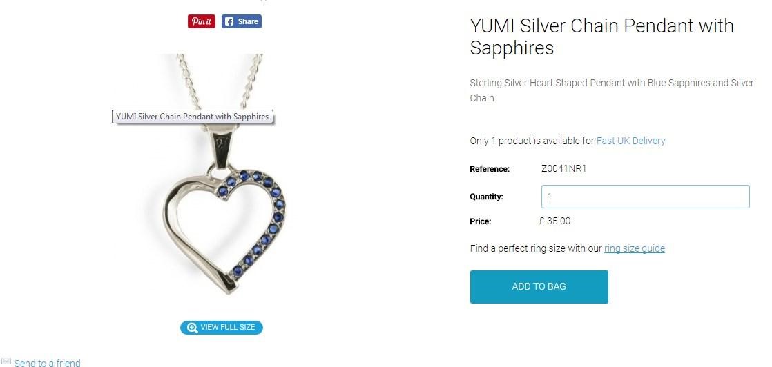
Let’s have a closer look at the product page of the web store. The first thing that attracts your attention is an image. There is only one product image. In order to view full size, you should click on the line “view full size”. At the right, there’s info on the product represented on the page. It contains a short description, reference, price. There’s an option where you can select quantity before purchasing. Moreover, you can find a perfect ring size with the help of the guide placed below the price. The only thing you should carry out is to click on the line.
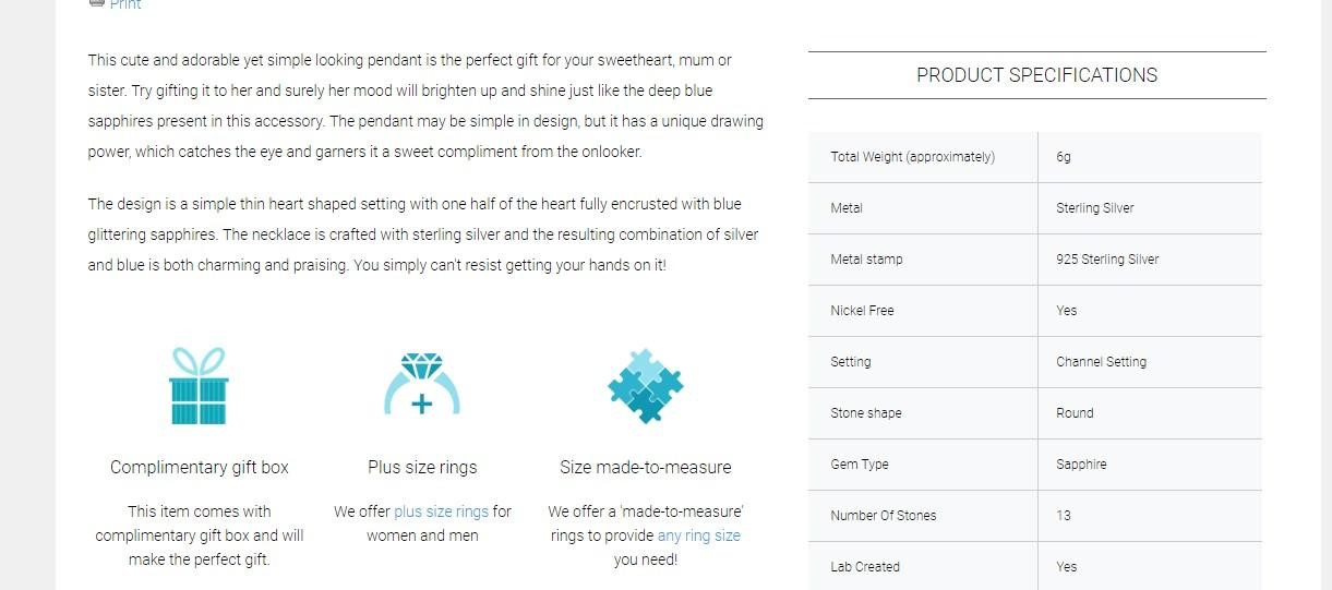
Then a lot of additional information relating to the product is provided. It includes the description as well as some product specifications. In case if you’re a meticulous client, such information gets you satisfied as you can find any answers to your questions.
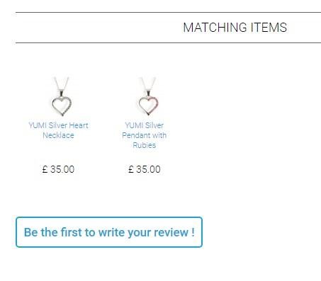
There’s a block with matching items, looking at which you can find on more product that suits your taste. Besides, this is not an image of an item, but the price and little information are included.
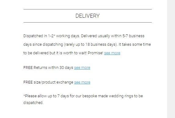
The block containing the most significant data is delivery section. Since this is a web store where you can order any item sitting at home, the delivery data should be stood out. In this case, the section is well-designed with a comprehensive explanation.
Customer reviews is a section which includes all feedback left by customers who have already purchased products. The first five reviews are presented on the product page. In case you want to see more, there’s an opportunity to see more by clicking on the line “see all feedback we have received”.
Within this in mind, the web store can be considered as one the contemporary stores that meet customer expectations by providing high-level service.
Salling.dk
Salling.dk is a huge department store where any type of products can be ordered starting from baby toys and finishing with wine glasses. The web store is created with Prestashop by BelVG.
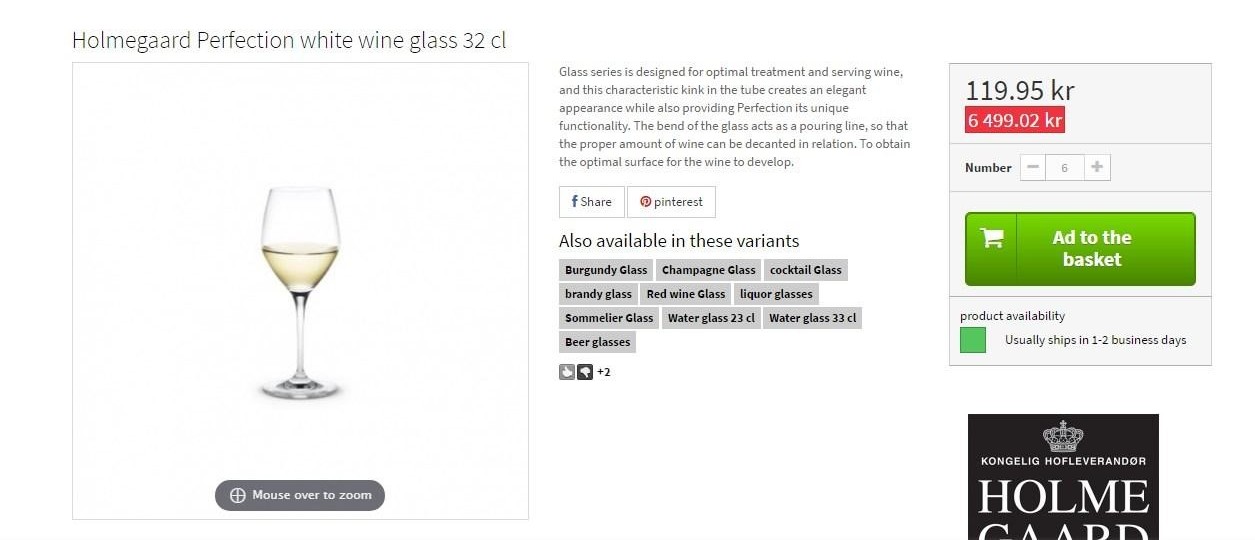
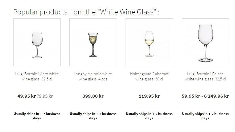
The product page contains a lot of information necessary to make a purchase. The first relevant point is an image. In fact, there’s only one product photo which is middle-sized. In order to see the bigger picture, you should mouse over the image. At the right, you can see the data on the product. Besides, you’re proposed to choose another alternative that is available. By clicking on suggested variants, you can change your mind and choose another item. The price and number of items you need to select are provided as well. Below the button “add to the basket” there is a line with important information concerning delivery time.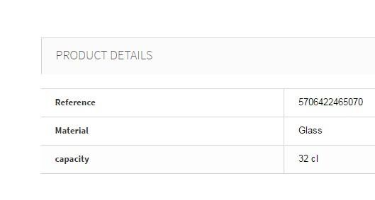
The section contains product details that seem rather significant for a client.
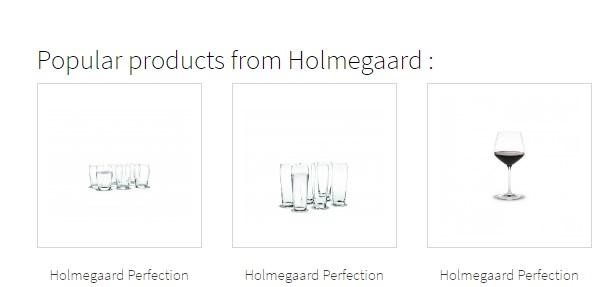
There is a block with various products of the brand you’ve already chosen.
Here is a block with related items. You can buy more products in case you’re interested in it. The block presents product images as well as data on them.
Having analyzed the web store, it should be mentioned that the web store is quite up-to-date with all relevant features that get customers satisfied with the shopping experience. The only drawback is the lack of delivery data.
Kinousses.com/en/
Kinousses web store is a great shop where you can buy baby sleepsuits including sleepsuits for a baby girl, sleepsuits for a baby boy, and unisex.
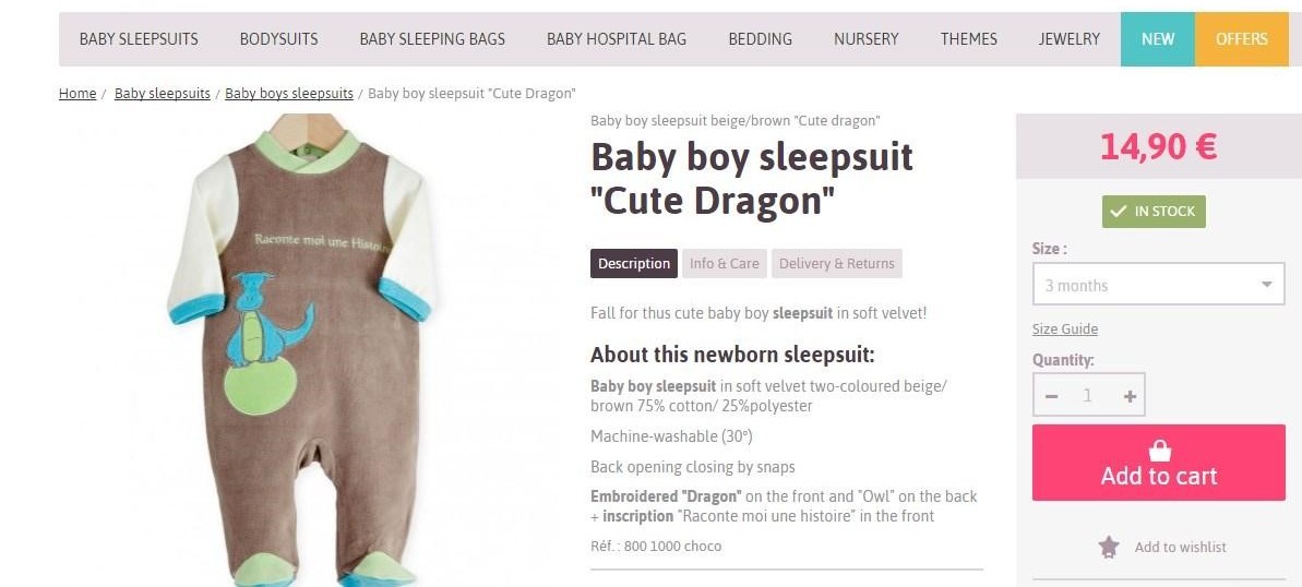
The first point worth attention is a product image. It contains two product photos that can be zoomed in when hovering over. There’s information on the product including product description, info on care and delivery data. All the information mentioned above is useful for a customer and helps estimate the product. At the right, there’s a block with price, product availability, quantity you can select and button to add a product to cart. All in all, the information provided for a customer is enough.
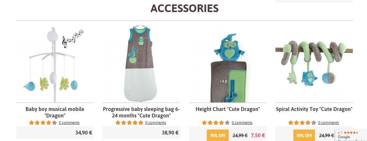
There’s a block with related products or just various items that can be ordered as well. These accessories are presented with images as well as short description and prices. It seems quite useful in order to have a quick look at interesting products.
Moreover, there’s a block with the relevant features the web store possesses. Here you can find payments, shipping, money back guarantee policy. Besides, you can ask for a help if you need.
As for feedback that customers leave after making orders, there’s no feedback at all. Probably, the reason is nobody wants to leave reviews, because there’s a special section where you can write references.
On the whole, the web store is completed with all necessary features that help provide top service and get clients satisfied with their experience.
The cases described above are some visible examples containing beneficial and negative impacts. In order to choose a good fit for your ecommerce website, you need to look at the latest design trends which are explained in the articles “Predicting Ecommerce Web Design Trends 2018”, “The Best Ecommerce Website Navigation Gimmicks – Pt.1, Headers”, “The Best Ecommerce Website Navigation Gimmicks – Pt. 2”.

