In the article, I’m going to consider navigation specifications. Moreover, some advice how to design a header is handed out.
To begin with, about 23% of users’ attention is paid to a header, as it is considered as the first part the browser loads. In such a way, a header gets one of the crucial navigation elements of the ecommerce website.
In this case, you’re suggested to abide by the Hick’s law: the time a person needs to make a decision is directly related to possible choices.
What’s the bottom line? From web design’s point of view, you can enhance conversion rate by restraining a user’s choice.
The first point where you can apply the law is a navigation bar. Don’t put so many links here, otherwise, a user can be no more interested in it.
Besides, you should think of all possible solutions a user should find on the website and cut it fine. There are some examples of questions a user is asking himself while surfing your website:
- use a navigation bar or web page scrolling?
- what articles choose for reading?
- is it worth downloading a lead magnet/ sharing a post on social media/ leaving feedback/etc.?
- make a purchase after reading a product review or scroll down the site?
This is the beginning of the possible choice list a user should make. Probably, it will be difficult for you to comprehend which solutions should be removed, but there’s a handy way to apply the Hick’s law.
All you should carry out is to put a full-screen greeting on the main page. The page will be filled with a call to action (CTA), so a user should make only one decision. If he wants to learn more choices, he needs to close the window.
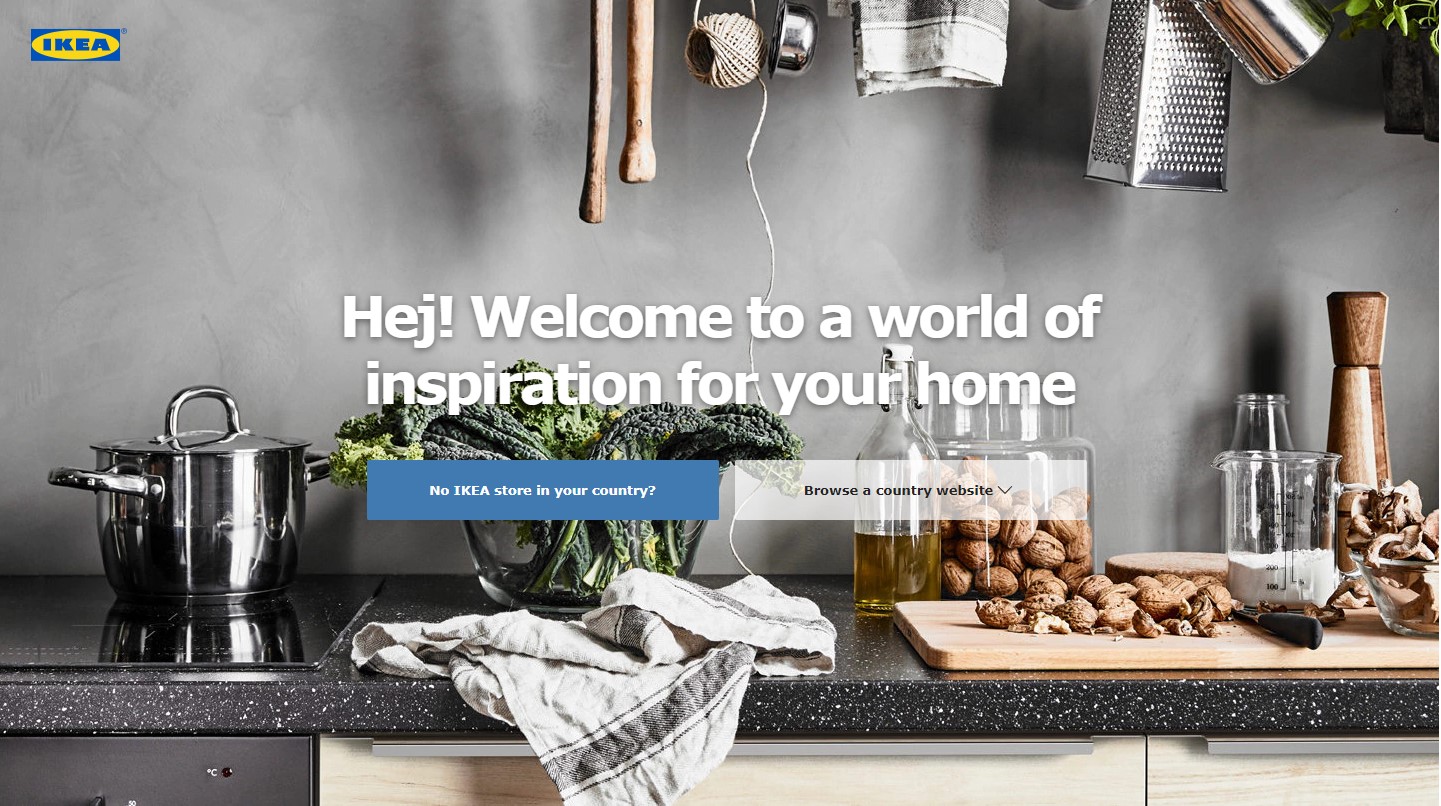
 A good example of a full-screen greeting with CTA
Website navigation: tips for designing effective header
When a user comes to a website, he(she) instantly evaluates the header area and his look is moving on the right to left direction (from the logo). And exactly at this moment, the user’s look should catch the certain element, that will attract the attention and will make the user trust this website and enhance conversion as result.

 How to increase the efficiency of a header? Put there the main offer or important information.
Clean design, simple navigation, color palette, bright headlines are the key features that are a recipe for success.
As a rule, a header includes such points as:
- search bar;
- cart icon;
- quick access account;
- additional data (support contact, store locator, best sellers).
In order to define if to implement additional features, you should inspect users’ conduct and review search criteria. For some web stores, it’s necessary to apply for a sales promotion in the header, for other, it’s important to have a live chat and a store locator.
Note! It’s important to remember that there’s lack of space in the header, that’s why when changing navigation, do AB tests and analyze Google Analytics data.
For example, asos.com emphasized essential sales promotions as well as a block with a free shipping worldwide.
The web shop 6pm.com is focused on a special offer and free shipping for some items.
Besides, for regular customers, you can apply the section “daily deal” which allows reviewing the most favorable offers without looking through all categories and search menu.
Even elements rearrangement can influence your sales. The retailer of fabric trimmings M&J Trimming found out that sales have increased by 19% due to navigation enhancement. Amazing result, right?
What’s next?
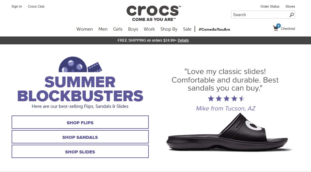
Maximally simplify a page view for a user. Develop a header that takes into account user’s needs and wishes. Whatever you do, don’t forget to test it before developing a new strategy. For example, the statement “All orders of 24.99$ and more qualify for FREE Shipping” can lead to sales increase by 90%. Try it yourself!
See also: The Best Ecommerce Website Navigation Gimmicks – Pt. 2


