We go on exploring the ecommerce world full of ends and outs. Make sure you’ve already checked the Part 1 of this article. The subject of discussion is navigation specifications essential in ecommerce. In a perfect world, your customers can find any item they’re looking for with no product page use. That’s why search menu should be given a special consideration to while being simple and easy to navigate.
Get search menu visible
Visitors of your web shop should be provided with a possibility to find search menu fast and easy.
Place your search menu at the top of the website and make it clear.
The main priority should be the way the home page looks like on a mobile phone. Moreover, in the search field put the example of the query in order to draw attention and incite customers to use search menu.
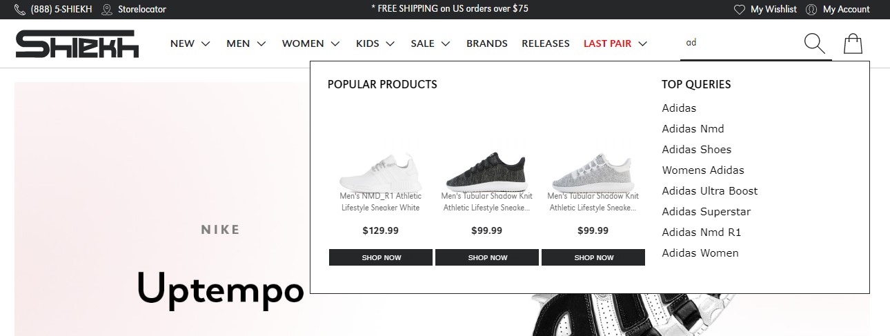
Use autocomplete
A user doesn’t want to waste time looking for a product, especially on a mobile phone. Help customers find they need by applying search query auto-complete. Customers can perform search faster, reduce problems caused by misspelling while you provide them with a necessary item twice as fast.
Benefits bar. They will definitely buy your product
Your web shop suggests free shipping, more than 200 items to purchase, 24/7 support. You’re the web shop people trust according to Google rating where you get 4.9 out of 5.0. Besides, you’ve designed an excellent header including the most relevant information. Everything looks perfect, but there’s more to come. For best optimization, you should put benefits bar which contains some benefits for customers just after the header. With the help of the benefits bar, you provide customers with unique offers that can’t leave them cold. The benefits bar is considered as a credit block for those customers who hesitate whether to buy a product of an unknown brand or not.
Clear category hierarchy
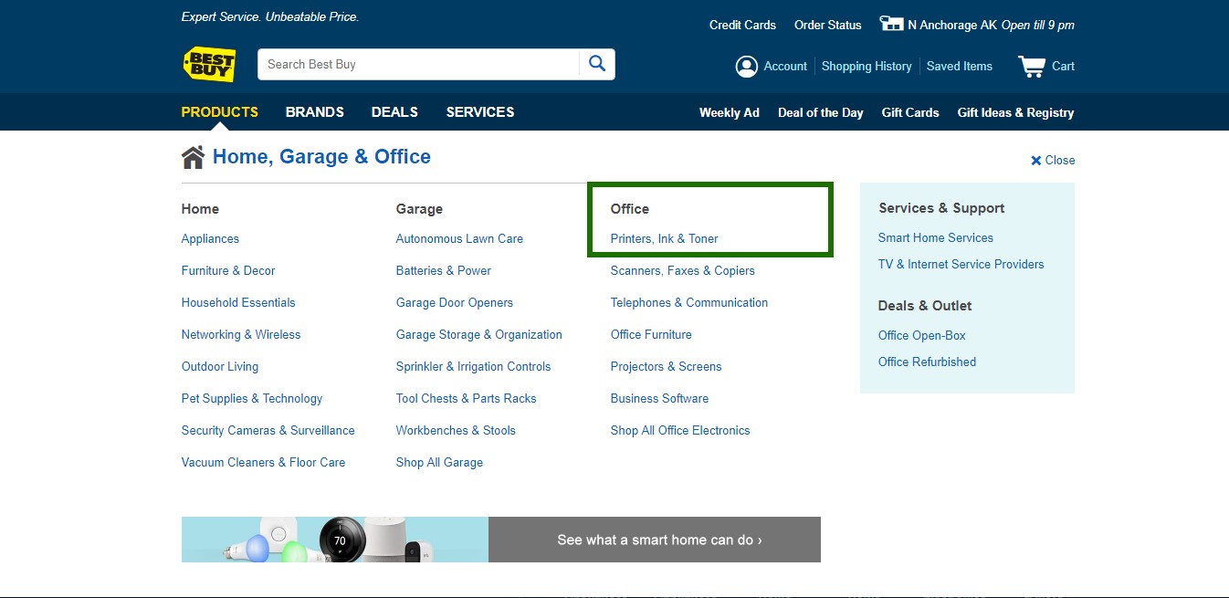
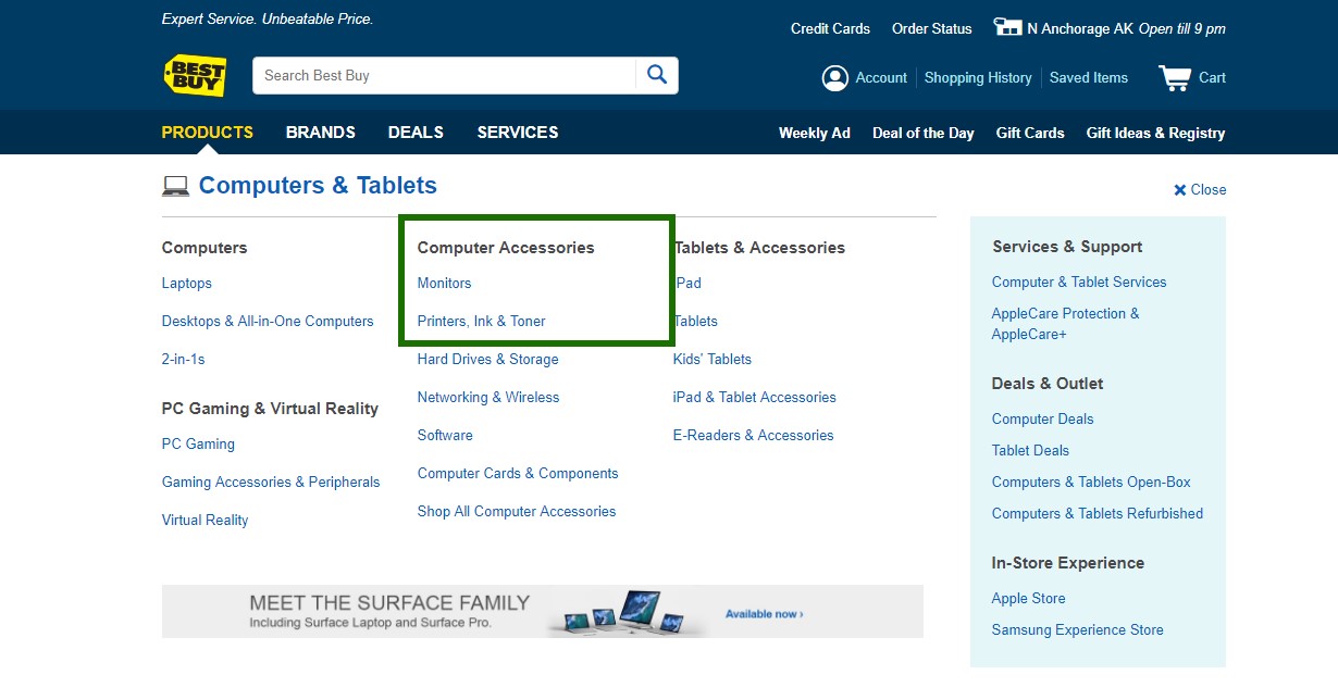
One of the significant points for improving navigation on the website is product classification or information architecture. Having grouped all the elements together, you afford your customers an opportunity to find a necessary product faster. Moreover, they are allowed to review and compare products of similar characteristics. As for hierarchy, there’re two types of categories: parent categories and subcategories. Parent categories are the group of subcategories with names describing features of the group most accurately. Subcategories include definite product types. If you can’t decide which category a product should belong to, you should conduct usability testing when users think out loud. Sometimes people try to find an item in the wrong category, although it is placed in another one. That’s why some products should be doubled in different categories.
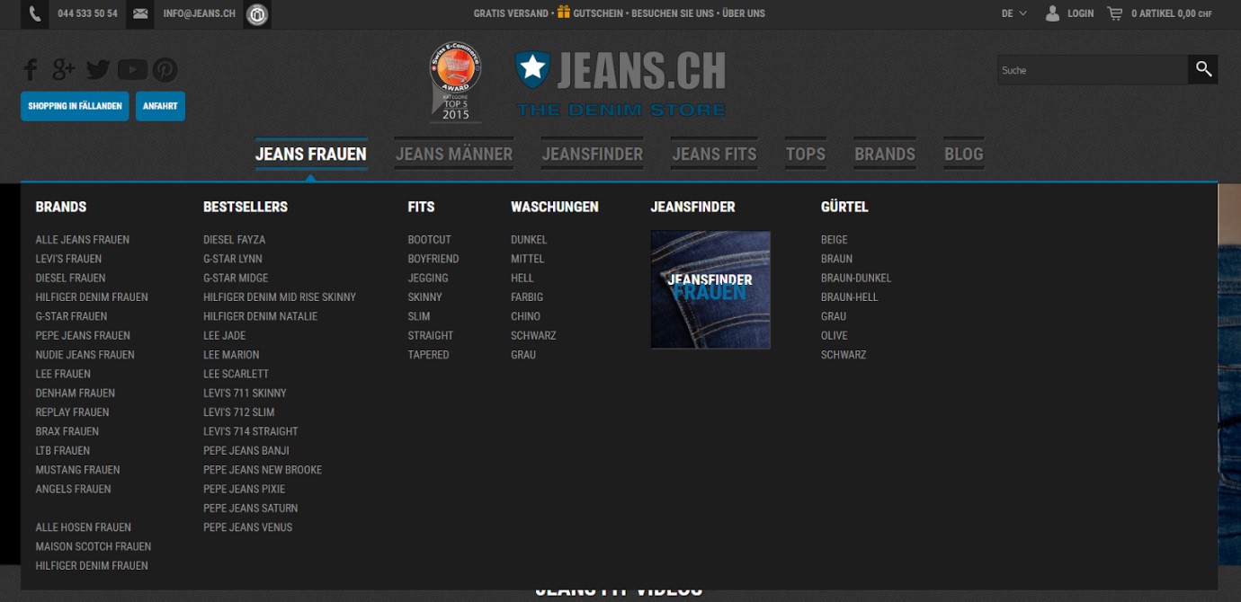
Subcategories grouping in the drop-down menu is rather relevant as it is easy to navigate, readable and intuitive. The problem of many websites is that they use text icons which are not clickable at all, but any user wants to click!
Clear and simple icons are assumed to be the most efficient. Don’t forget that first 10 sec browsing the page is the most important time period. If a user can’t find a printing device in the category “Printers”, he goes away. If he doesn’t understand the name of the category, he also goes away. If subtitles are not clickable, a user goes away.
How to represent information in a comprehensible and clear manner? Megamenu comes into play. Currently, this is the best solution for categories display.


