Released in 2007, PrestaShop has become one of Europe and Latin America’s most popular ecommerce platforms because of its flexibility and wide range of out-of-the-box features. About 220,000 sites worldwide choose it as the right platform for their businesses.
2022 became a milestone year in this platform’s history: PrestaShop released a major version 8. The previous version, PrestaShop 1.7, came up in 2016.
Discover the key optimizations in PrestaShop 8. Our article highlights its new features and updates, compares them to previous versions, and helps you decide if upgrading is worthwhile. If you’re considering upgrading to the PrestaShop latest version or just curious about what’s new in this release, read on!

Table of Сontents:
A Quick Overview
PrestaShop 8: New Features
Prestashop 1.7 vs 8
Migration from PrestaShop 1.7 to 8.2
About PrestaShop 8.1 and 8.2 versions
About PrestaShop 9
Wrapping Up
A Quick Overview
In December 2021, PrestaShop announced on its official blog that a new version was coming soon. In August 2022, the audience learned about the PrestaShop 8 Beta.
In October 2022, the creators notified that PS 8 is now officially available for download on GitHub.
But why is it not PrestaShop 1.8? This was mainly due to general changes within the brand, such as the introduction of its new logo and website.
PrestaShop 8 is also the first company-neutral version, which means it’s free from built-in commercial products and services. The Addons Marketplace is no longer a part of the project, but it’s possible to install it independently.
Now, let’s examine the reasons for upgrading your online store from PrestaShop 1.7 to version 8.0.
PrestaShop 8: New Features
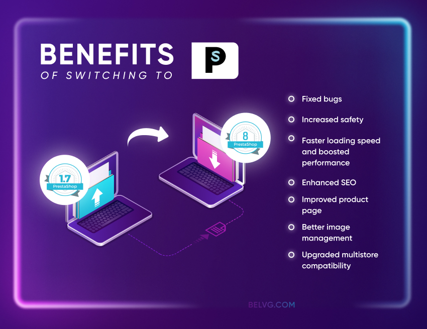
PrestaShop current version has brought many bug fixes, a better user experience, and a faster loading speed.
BelVG developers have already had a chance to test all the advantages of the new PrestaShop edition and share some thoughts about it. Below are the main benefits of upgrading to PS 8 and the system requirements you should know before testing it.
You can see a complete list of implemented features via the link.
PHP 8.0 and 8.1 Support
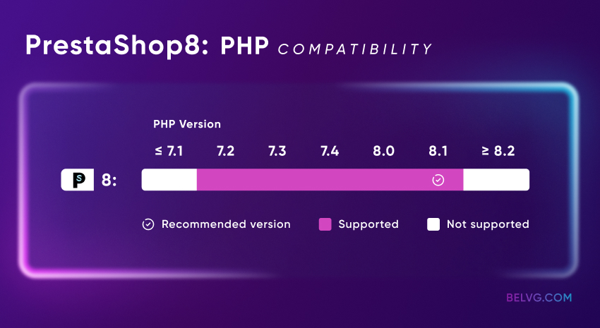
PrestaShop 8 is compatible with a minimum of PHP version 7.2 and supports PHP 8.1, which will be supported until December 2025.
Meeting PrestaShop PHP requirements is essential, as each PHP version update improves security and performance. This ensures your PrestaShop setup is compatible with the latest PrestaShop 8 PHP version.
Below, we have listed the PrestaShop PHP compatibility chart for different versions.

Symfony and Library Updates
Symfony 4.4 usage provides a high-security level and improved performance.
The creators of PrestaShop 1.7 started a revolution when they switched to Symfony. It was compatible with Symfony versions 2.8 and 3.4, and version 4.4 is now available in PrestaShop 8. The version was supported until November 2023.
PrestaShop also provides a new caching engine for online stores to increase website speed.
Security Features
PrestaShop 8 offers more frequent security updates than PrestaShop 1.7. This is part of a broader effort to enhance the platform’s security. PrestaShop 8 also includes improved protection against SQL injection attacks, so you won’t have to worry about your data.
PS 8 also introduces a new password policy management feature.
- Users can now see their password strength when registering
- Administrators can configure the store’s password policy (from simple to complex)
- Store administrators can view users’ session history and turn off their sessions remotely
These innovations ensure that transaction processing is secure. Simplified checkout reduces the risk of credit card fraud and other malicious activity.
Modern Image Formats Support
The 8 version of PrestaShop supports the popular WebP format for products. Compared to JPEGs and PNGs, WebP guarantees better compression at equal image quality, and smaller file sizes speed up page loading.
These changes are available on the tab Design->Image Settings.
PrestaShop developers have also added support for the popular SVG format for the store logo (available on the tab Design->Theme Logo).
Product Page Features
The product page has been upgraded compared to the PrestaShop version of 1.7.8. Besides, the combination management and bulk edition have been noticeably improved.
The product page is disabled by default because it doesn’t yet include all the features of the standard product page. However, you can activate it under Advanced Parameters > New & Experimental Features > Experimental Features.
SEO Features
The new edition includes several SEO features that PrestaShop didn’t have before.
- SEO Text Integration: optimized text can now be integrated into category pages to enhance visibility in search engine results.
- 410 Gone Status: administrators can use 410 Gone status for items discontinued from sale.
- Meta Tags with Page Numbers: the ability to add page numbers to meta title tags improves site structure and search engine readability.
- Real-Time Character Counter: a real-time character count is available to maintain the description limit.
It’s supposed to help sites to rank higher in SERPs.
Multistore
Several back-office pages have been redesigned to support multistore functionality. This allows merchants to select specific fields to update within an online store or group context.
Installation
Some features have been added to install PrestaShop easier and make it more user-friendly:
- Module and theme choice. You can choose what you need to install together with the shop itself.
- Distribution customization. Unless you choose otherwise, any PrestaShop modules and themes will be automatically installed during the shop upgrade. This feature allows integrators to create personalized PrestaShop setups.
- Installation Error Details. When you turn debug mode on, a full stack trace will show if something goes wrong. It will help developers to identify the root cause of the issue.
- Installation Process Extension. Now, all modules have a callback postInstall(). This opens up new developer options, such as adding extra setup steps or preloading assets.
Webservice
The status and URL of your shop’s web services are now prominently displayed at the top of the page under Advanced Parameters > Webservice. This feature helps new users identify and resolve common issues.
Additionally, webservice endpoints now support partial updates using the PATCH method. This allows integrations to modify specific fields within an entity without updating the entire record.
DKIM Signatures Support for Emails
It decreases the risk of your online store’s emails being marked as spam. You can configure it under Advanced Parameters -> Email.
Media Versioning
Developers can now use multimedia versioning to prevent loading outdated javascript files and stylesheets from the browser cache.
A version parameter has been added to the registerJavascript and registerStylesheet methods, enabling browsers to fetch updated assets when the version changes.
Typescript Usage
All Symfony-based page scripts are now written in TypeScript. It supports many language features not included in Javascript, the most vital among them being strong typing. Strictly typed code reduces the percentage of errors that remain unnoticed and negatively affect site performance.
This change is supposed to improve the code, delete bugs, and enhance the project’s long-term maintainability.
PrestaShop 1.7 vs 8
Should you upgrade Prestahop 1.7 to 8? The differences between these two versions are significant, with the latter offering a more advanced and user-friendly experience for ecommerce businesses.
For store owners seeking better performance, improved security, and new features, upgrading to PrestaShop 8.0 is the best option. However, the 1.7 version of PrestaShop remains stable and has more ready-made modules and settings.
If your store relies on necessary modules or themes that are not yet compatible with the latest version of PrestaShop, or if you need more time to prepare for the transition, it may be wise to remain on version 1.7 of PrestaShop for now.
Recommendations for Choosing a Version: PrestaShop 8 vs 1.7
PrestaShop 8 is a solid choice for both new and existing stores. High-traffic or large-scale ecommerce projects will benefit from greater scalability, faster load times, and better SEO.
However, stores heavily reliant on custom modules or older themes should prepare for potential additional costs to guarantee compatibility during the transition.
For smaller shops with minimal traffic and customization, the upgrade can be approached gradually, focusing on long-term growth.
Migration from PrestaShop 1.7 to 8.2

PrestaShop claims that transitioning from version 1.7.8 to version 8.2 will be much easier than from version 1.6 to 1.7. The 1.7 themes are supposed to remain compatible with the latest version, and many modules are expected to continue working as is.
Let’s see how our BelVG developers describe the experience of migrating to the 8th version of PrestaShop.
The BelVG Team’s Experience: How to Update Your Site to Prestashop 8 Successfully
There’s an auto-upgrade available. However, after trying it on several projects, the BelVG developers’ opinion stands for a manual PrestaShop download, which is better for highly customized sites. Here are some PrestaShop requirements to avoid system incompatibility:
- First, it’s necessary to upgrade the PrestaShop under PHP 7.4 and then apply PHP 8.1.
- There may be compatibility issues with third-party modules and/or overrides and PrestaShop default classes with PHP 8. We recommend manually checking all modules before migrating to the newest version of PrestaShop to ensure they work correctly.
- There are very few changes at the theme level, but it is necessary to check everything once you’ve applied the upgrade to a development copy.
- We recommend contacting your hosting provider first if you’re considering the PrestaShop update. They can provide you with an environment compatible with PrestaShop 8. You can move your site there, apply the upgrade, and then review the impact.
How long will it take to upgrade to the newest version of PrestaShop? It’s impossible to say for sure because the complexity of the process depends on the specifics of the PrestaShop store. Creating a copy of your site on a new web server and checking the update’s impact will take 4-8 hours.
The final cost of migrating to a new PrestaShop version will depend on how customized your site is, which theme and modules you use, and how expensive your developer’s hour is.
“PrestaShop 8 provides new tools for managing modules. It determines whether the module has a new version to update. PrestaShop also boosts performance and security, but check your modules’ compatibility before upgrading. The good news is that moving from PrestaShop 1.7 to 8 is much simpler than moving from 1.6 to 1.7 because there are fewer differences in code.” – Konstantin Suborev, Developer, BelVG
Real Use Case
Our team has an example of PrestaShop 8 migration. One of our long-term clients, Artipoppe, asked to upgrade their website to PrestaShop 8 to avoid using outdated technologies that are no longer supported.
We understood that the upgrade should be done manually instead of auto-upgrading for a customized website like Artipoppe. Here are the steps we took:
- We contacted the hosting provider to ensure they provide an environment compatible with PHP 8.1 according to PrestaShop requirements.
- Manually checked the module compatibility with PrestaShop 8, as some of them are incompatible with PHP 8.
- Upgraded the PrestaShop and then PHP to 8.1
Find out more details about our collaboration with Artipoppe and what changes we made to their PrestaShop website. As a result, we helped the client decrease the bounce rate to 42% from 67% and increase annual revenue by 10%.
Migration Checklist
You can safely upgrade your PrestaShop store using specified modules or manually.
Remember to create backups before upgrading to prevent data loss with just one click. Also, remember to check the compatibility of your setup and test the PrestaShop version upgrade on a test server before moving it to a live website.
You can use the 1-Click Upgrade module for PrestaShop upgrades. First, choose the PrestaShop version using the module. To avoid errors, the module then shows a checklist to help you verify all the necessary PrestaShop system requirements, such as the PHP version and web server memory. You can learn more about this variant here.
An alternative way to upgrade the store is to use the Command Line Interface (CLI) module. The detailed steps for updating the Prestashop store to the latest version are available via the link.
PrestaShop Tools and Resources
Several links to reliable resources are available to help you work with PrestaShop effectively. The official website offers downloads, free and paid themes, and additional modules.
The developer documentation provides setup and customization guides. The GitHub repository allows access to the source code and issue reporting.
For community support, visit the forum and stay updated via the PrestaShop blog. The Developer Hub provides migration guides and release notes.
About PrestaShop 8.1 and 8.2 versions
After PrestaShop released the 8.0 version, minor updates to the 8.1 and 8.2 versions were available to download. PrestaShop 8.1 was released in June 2023. Learn more about this version and its patches here.
The latest version of Prestashop is 8.2. It was developed and released in September 2024 instead of the PrestaShop 9 version. The 8.2 version includes a few developer features and bug fixes. You can check the details here.
About PrestaShop 9
The PS 9 Alpha 1 version was finally released in June 2024. Although it’s still in the early stages of production, the company has already shared with us some essential features that have been added to the new version:
- The minimum PHP version requirement has been increased to PHP 8.1, with added support for PHP 8.2 and 8.3.
- Symfony framework has been updated to version 6.4, designated as a long-term support version.
- The login page for the back office has been migrated to Symfony.
- A completely new API has been introduced and built on the API Platform.
The installation process remains the same as for previous versions. The tutorial link allows you to install and test the new API for PrestaShop.
Wrapping Up
In conclusion, if your web store runs on an older version of the PrestaShop platform, it’s time to install the latest version. However, if your store has many customizations, make an informed decision and don’t rush the upgrade.
Before making any changes, you should consult with a developer experienced in PrestaShop. They can analyze whether there are all the PrestaShop 8 requirements, make feature descriptions, and determine how they can be added to the PrestaShop store. That way, you understand that you have taken all necessary steps and can resolve any potential problems quickly if they arise.


