Here you will learn about checkout process in Magento 2 – its basic and more advanced customization capabilities. We also list the differences between Magento 1 and Magento 2 checkouts and share proven-to-work tips about checkout optimization and A/B testing.
Checkout in Magento 1 vs Magento 2: What are the differences?
How to customize Magento checkout: Add an extra step
Magento Checkout A/B Testing
Best Marketing Tips: How to Optimize Your Checkout Process
Checkout in Magento 1 vs Magento 2: What are the differences?
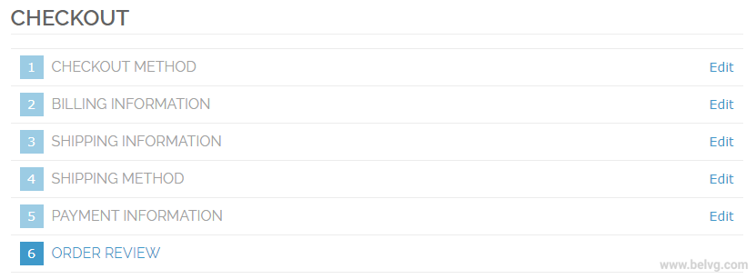
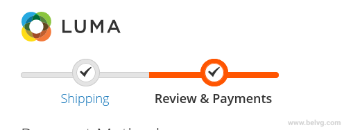
The checkout process in Magento 2 has been significantly improved compared to Magento 1. Now, user navigation is much easier – instead of six steps that a user had to go through in Magento 1, the second version offers a simple Magento two step checkout.
Before:
After:
There is also a Magento guest checkout available now (if Yes is selected in website settings). Besides that, Magento 2 can automatically search for the existing registered clients, analyzing their emails. The optimization of order-making process and the use of popular payment gateways allowed speeding up the checkout process by 38%.
So, the overall opinion is that in Magento 2, the checkout process has become simpler, faster and more user-friendly.
On top of that, Magento 2 offers higher scalability. More up-to-date technology stack allows the platform to process about 250,000 orders per hour which is 117% more than Magento 1 could possibly process. The newer second version is also able to handle over 2 million catalog views per hour.
Migration to Magento 2 can reduce cart abandonment rate due to the shorter and simpler checkout as well as provide you with an access to some useful modern features, including:
- Non-use of outdated PHP versions
- Extended SEO capabilities (Meta tags, canonical urls, mobile-friendly interface)
- Extended search capabilities, including the use of Elasticsearch
- Additional payment gateway features
Migration to Magento 2
Take your online store to the next level with BelVG Magento Migration
Migrate todayHow to customize Magento checkout: Add an extra step
There are a variety of third-party modules that assist in checkout process customization and help make it simpler and more convenient for the end user. Most of these modules allow creating a Magento one step checkout. You can find some of the ready-made solutions at the official marketplace.
You can also add an extra custom step manually. This step should be implemented as a UI component. To ensure compatibility, easy updates and simple maintenance, you should not edit Magento code which means that an extra step should be implemented as a separate module.
Step #1. Let’s create a view part for implementing a new checkout step:
1. First, it is necessary to create a directory for modules – all the user modules should be stored there. For correct work, the new module should have a dependence on the Magento_Checkout module. You should not use Ui as a part of the name of the custom module as the use of %Vendor%_Ui may cause an error.
2. You need to create a .js file that implements the view module.
3. Then, you need to create an .html template for a component.
Here is a more detailed instruction of Step #1:
Add a JS file that implements a new step
New checkout step should be implemented as a UI component which means that its JS implementation should be a JavaScript module. Another important point is that this file should be located at the <your_module_dir>/view/frontend/web/js/view directory. <your_module_dir> here shows the path to the module directory from the root directory. It will be either app/code/<YourVendor>/<YourModule> or vendor/<yourvendor>/module-<module>-<name>.
For example, <your_module_dir>/view/frontend/web/js/view/example-step.js:
|
1 2 3 4 5 6 7 8 9 10 11 12 13 14 15 16 17 18 19 20 21 22 23 24 25 26 27 28 29 30 31 32 33 34 35 36 37 38 39 40 41 42 43 44 45 46 47 48 49 50 51 52 53 54 55 56 57 58 59 60 61 62 63 64 65 66 67 68 69 70 |
define( ['ko', 'uiComponent', 'underscore', 'Magento_Checkout/js/model/step-navigator'], function( ko, Component, _, stepNavigator ) { 'use strict'; /** * * example_step - is the name of the component's .html template, * <Vendor>_<Module> - is the name of your module directory. * */ return Component.extend({ defaults: { template: '<Vendor>_<Module>/example_step' }, //add here your logic to display step, isVisible: ko.observable(true), /** * * @returns {*} */ initialize: function() { this._super(); // register your step stepNavigator.registerStep( //step code will be used as step content id in the component template 'step_code', //step alias null, //step title value 'Step Title', //observable property with logic when display step or hide step this.isVisible, _.bind(this.navigate, this), /** * sort order value */ 15 ); return this; }, /** * The navigate() method is responsible for navigation between checkout step * during checkout. You can add custom logic, for example some conditions * for switching to your custom step */ navigate: function() { }, /** * @returns void */ navigateToNextStep: function() { stepNavigator.next(); } }); } ); |
Add an .html template.
At the module directory, you should add an .html template for a component. It should be located at the <your_module_dir>/view/frontend/web/template directory.
For example, example-step.html:
|
1 2 3 4 5 6 7 8 9 10 11 12 13 14 15 |
<li id="step_code" data-bind="fadeVisible: isVisible"> <div class="step-title" data-bind="i18n: 'Step Title'" data-role="title"></div> <div id="checkout-step-title" class="step-content" data-role="content"> <form data-bind="submit: navigateToNextStep" novalidate="novalidate"> <div class="actions-toolbar"> <div class="primary"> <button data-role="opc-continue" type="submit" class="button action continue primary"> <span><!- ko i18n: 'Next'-><!- /ko -></span> </button> </div> </div> </form> </div> </li> |
Step #2. Add your step to checkout page layout.
To make your new step visible on the page, you should declare it at the checkout page layout which is defined in checkout_index_index.xml.
That is why you need to add an extensible checkout_index_index.xml file here: <your_module_dir>/view/frontend/layout/checkout_index_index.xml
checkout_index_index.xml example looks like this:
|
1 2 3 4 5 6 7 8 9 10 11 12 13 14 15 16 17 18 19 20 21 22 23 24 25 26 27 28 29 30 31 |
<page xmlns:xsi="http://www.w3.org/2001/XMLSchema-instance" layout="1column" xsi:noNamespaceSchemaLocation="urn:magento:framework:View/Layout/etc/page_configuration.xsd"> <body> <referenceBlock name="checkout.root"> <arguments> <argument name="jsLayout" xsi:type="array"> <item name="components" xsi:type="array"> <item name="checkout" xsi:type="array"> <item name="children" xsi:type="array"> <item name="steps" xsi:type="array"> <item name="children" xsi:type="array"> <!- The new step you add -> <item name="my-new-step" xsi:type="array"> <item name="component" xsi:type="string">%Vendor%_%Module%/js/view/example-step</item> <!-To display step content before shipping step "sortOrder" value should be < 1-> <!-To display step content between shipping step and payment step 1 < "sortOrder" < 2 -> <!-To display step content after payment step "sortOrder" >2 -> <item name="sortOrder" xsi:type="string">2</item> <item name="children" xsi:type="array"> <!-add here child component declaration for your step-> </item> </item> </item> </item> </item> </item> </item> </argument> </arguments> </referenceBlock> </body> </page> |
Magento Checkout A/B Testing
To evaluate the effectiveness of the implemented changes, you can use A/B testing. The whole point of it is in classifying website visitors into segments randomly. One of the segments will see no changes – it is a control A segment. We will evaluate the effectiveness of the implemented changes based on the data from this segment. Website visitors that belong to the B segment will see the adjusted website version.
Then, you need to decrease the influence of external factors by making sure that the users see pages at the same period of time. It is also important not to mix up the segments.
A/B testing works well for the following cases:
1. Magento Guest checkout vs. Member checkout
Member and guest checkouts are quite different. When website visitors sign up, they gain some advantages, including order history and simpler checkout process in the future. Also, the user can get various notifications, for example, about good deals. It seems attractive but there is also one disadvantage – one more checkout step. Doesn’t it scare off potential customers? Thanks to A/B testing, you can find out and compare conversion rates with guest or member checkouts.
2. Trust and security signs
With the help of A/B testing, you can evaluate how trust and security signs influence conversion rate. A user may assume that particular signs on a checkout page mean that the data will be stored safely. It can encourage this user to order a product from the website without hesitation.
3. Remove any point of friction along the checkout way
If you delete elements that can distract a user from the checkout process, it may also raise the number of successfully completed orders. For example, you can test whether a navigation panel or live chat influence the number of people that complete the checkout process.
4. One step vs Multi page checkout
It can also be useful to find out how changing the number of checkout steps influences whether people complete the order or not and when they leave the page if they do.
5. Calls To Action
CTAs are used to navigate website users and encourage them to perform a specific action: to read, download, share, buy or others. The main goal here is to make your CTAs clear. If you simply add Continue or Send buttons, it may not make any difference for a user. You can experiment with colors, icons, their sizes and button locations to find the best combination.
Best Marketing Tips: How to Optimize Your Checkout Process
- No surprise costs
Your potential customers may not become actual ones if they encounter extra costs by the end of the checkout process. Shipping costs, taxes and fees are one of the most common reasons for checkout abandonment. The statistics prove this point – 61% of users that leave the order incomplete, do it due to the high extra costs [1]. So it should become your first step in checkout optimization process.
- 6-8 fields maximum
Too long checkout process discourages 26% of potential shoppers. If you keep it simple for any website visitor, it is likely to increase your conversions among those who value their time too much to waste over 5 minutes to complete a single order.
There is a proven-to-work way to reduce the number of unnecessary fields that make your checkout way too long. First of all, you can create a single Name field instead of First Name and Last Name. Secondly, you can set the billing address the same as the shipping address by default. But be careful with this point, you should still leave an opportunity for a user to change this default option.
- No distractions, no other products, no sale ads
It may come across to be a good idea to showcase some of your best-selling products to a person who is about to purchase something else. However, in most of the cases, it won’t work out well or increase your average cart value.
Let’s imagine a situation – you sell shoes and a person who wants to purchase a pair from you sees other nice sandals at the checkout page. Then, your potential customer may leave the checkout page to take a look at this other pair more in detail. It makes customers go back – further from the final step – actual checkout.
So, you’d better not showcase random or the same items. However, there is chance that you could actually more, placing a correct product on a checkout page depending on the customer’s initial interest. But you need to approach this strategy smart and learn more about up-selling, cross-selling and related products. Consult our guide here.
- Capture the user’s email address as early as possible
In case a customer leaves the checkout page anyway, you will have an opportunity to remind them of a product they used to be interested in. But – only if you get customers’ email before they leave. Following up a potential customer with an abandonment email has several advantages.
Firstly, you know for sure that the person was or still is interested in the product. Secondly, there is a chance that they forgot about the purchase because they simply got distracted. So, if you remind them of it, they will just complete the order. Another important advantage is that email marketing in general is not really resource-intensive in terms of both money and time. The email sending programs are not that expensive to install and maintain and a lot of work there can be put on automation.
- Multiple payment gateways
Any user will feel like home at your checkout page when they see a familiar payment method. This step is especially important for your checkout optimization journey if you ship internationally. You should carefully consider what payment gateways are most commonly used in a country which market you target and offer different options like PayPal, Authorize.Net, Braintree, Klarna or any other.
Wrapping it up
Checkout page is where it all begins and ends. Your goal as an online merchant should be to design and build this page in such a way that your customers will never want to shop anywhere else. Consult our guide and all the steps described above to reach a desired result and deliver user-oriented shopping experience. Thank you for reading! In case you want to learn more about other payment gateways, different online store customization options or get some Magento development tips, stay tuned with our ecommerce development blog.

