Modern development market is full of ideas that can be applied to any business including small and large ones. According to their major characteristics, the type of the platform, on which a web store is based, is defined. As a rule, small and mid-sized businesses give preference to the Prestashop platform while large business chooses Magento. In fact, Prestashop helps create attractive and functional online stores that meet up-to-date requirements. Moreover, Prestashop is easy to use and characterized by fantastic running. That’s why a new article is dedicated to the web stores known worldwide and run on Prestashop. We’ve decided to choose two features such as menu header and search menu and compare its functionality. Let’s see how it shakes out.
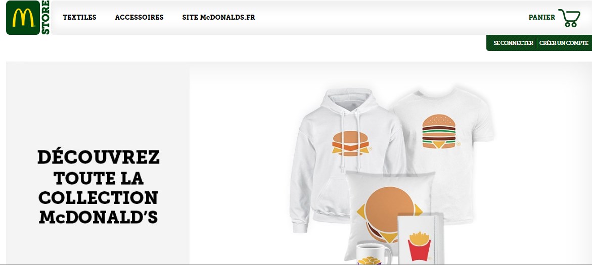
The best known American hamburger and fast food restaurant chain McDonald’s has one of the sites running on Prestashop. Focusing not only on the quality of products but also on marketing strategy, the site provides customers with items to purchase. So, it is of a great importance to determine if the main features coincide with needs.
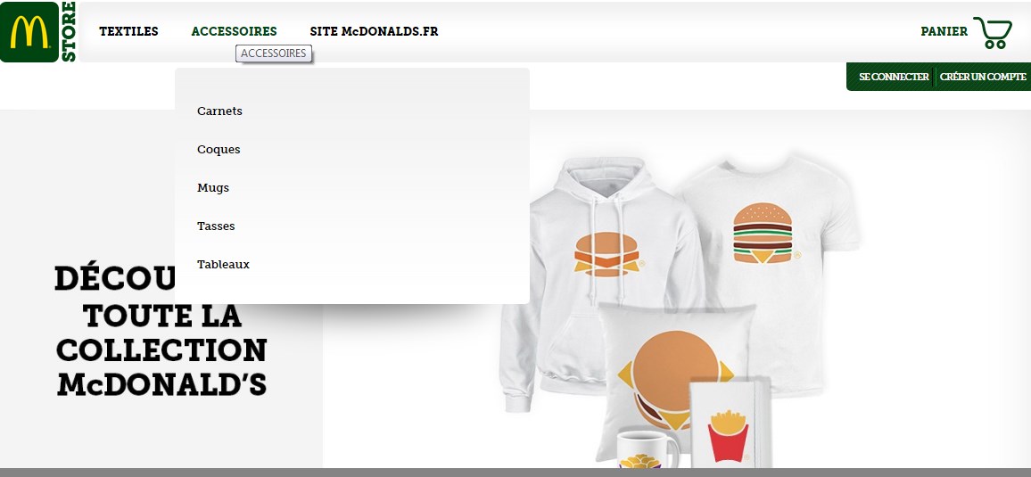
As for MacDonald’s website, there’s a menu placed on top. The menu consists of three sections called “textiles”, “accessoires”, “site MacDonalds.fr”. The third section is clickable. After clicking, a new page with products is opened. Menu headers “textiles” and “accessoires” are not clickable, but when hovering over, you can see the subpages.
On the one hand, the menu is rather convenient, as you don’t need to scroll down to scan the subpages, rather, it is appropriately sized that makes it easy to navigate. Having the subpages that are distinguished according to the theme is pretty nice, as the menu gets more comprehensible and clearer for a visitor. On the other hand, the modern trends allow using pictures placed on the menu to provide visual perception and attract customers. In this case, there’s no even hint to make the menu more attractive and eye-catching. On the whole, the menu is rather simple and easy to navigate without additional gimmicks.
As for the search menu, there’s no search menu at all on the main page. Probably, the web store can’t boast of the variety of items they sell and has decided there’s no need to put it on the website.

PrestaShop Development
Take your online store to the next level with BelVG PrestaShop Development
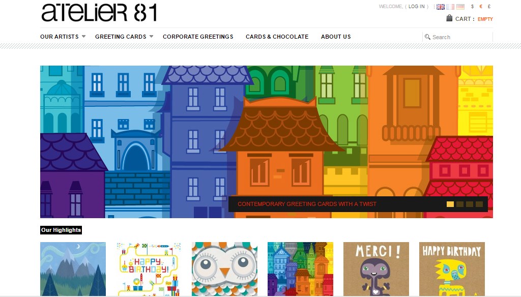
Visit the pageAtelier81 is a well-known web store that provides customers with modern exclusive greeting cards created by excellent artists. Having a lot of ideas, they convey them by painting amazing cards that fit any occasion. In such a situation, the web store is focused on the availability of cards and ease to navigate. Let’s check it.
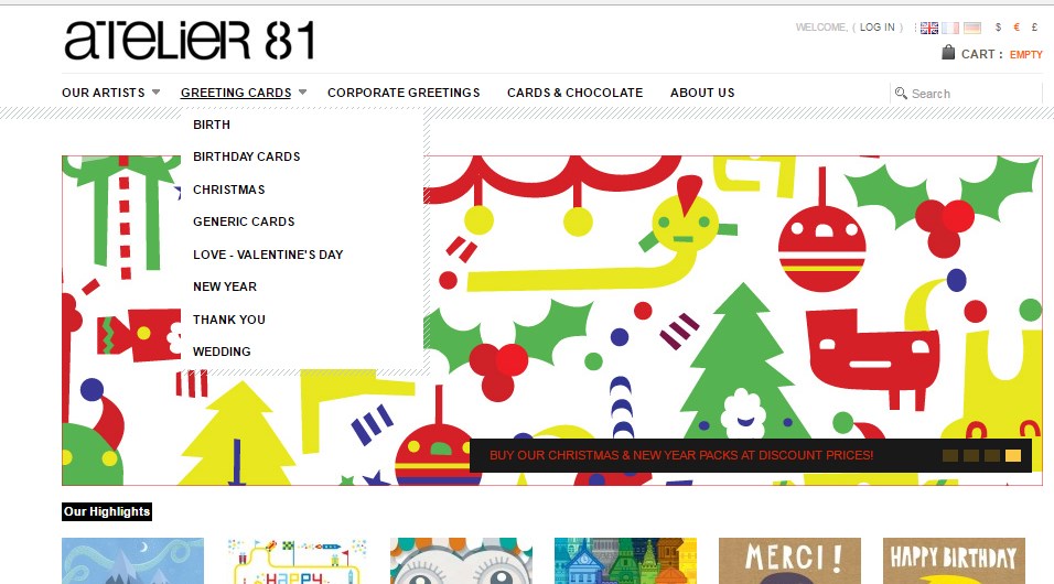
The menu is placed on the top of the website and contains five sections distinguished by themes. Every menu header has its name. Besides, the first and second sections are not clickable, but when hovering over, drop-down menus that include submenus appear. The rest sections are clickable and opened as new pages. In fact, the menu is considered to be quite convenient and easy to navigate. Moreover, the size of the drop down menu is suitable, so there’s no need to scroll down in order to see all the elements placed. So, it doesn’t take much time to find a necessary product. All you need is just one click. At the same time, there are no pictures arranged on the drop-down menu that attracts attention. If focusing on this idea, the web store does not follow trends.
As for the search menu, it is placed at the upper right corner and seems visible. To find a needed item, a user should enter the name in the field. Unfortunately, there’s no pop-up tip containing the suggestions according to the query. Probably, it is not necessary to have such tips when the variety of items is arranged in a simple and clear manner, so the search menu is not used.
Pop-line.com is a French concept store that supplies interior design items and gifts for children. Focusing on various quality products, the web store contains the vast variety of items that meet customer needs. Having such diversity, it should be managed in a right manner to get customers excellent shopping experience. That’s why menu plays the key role.
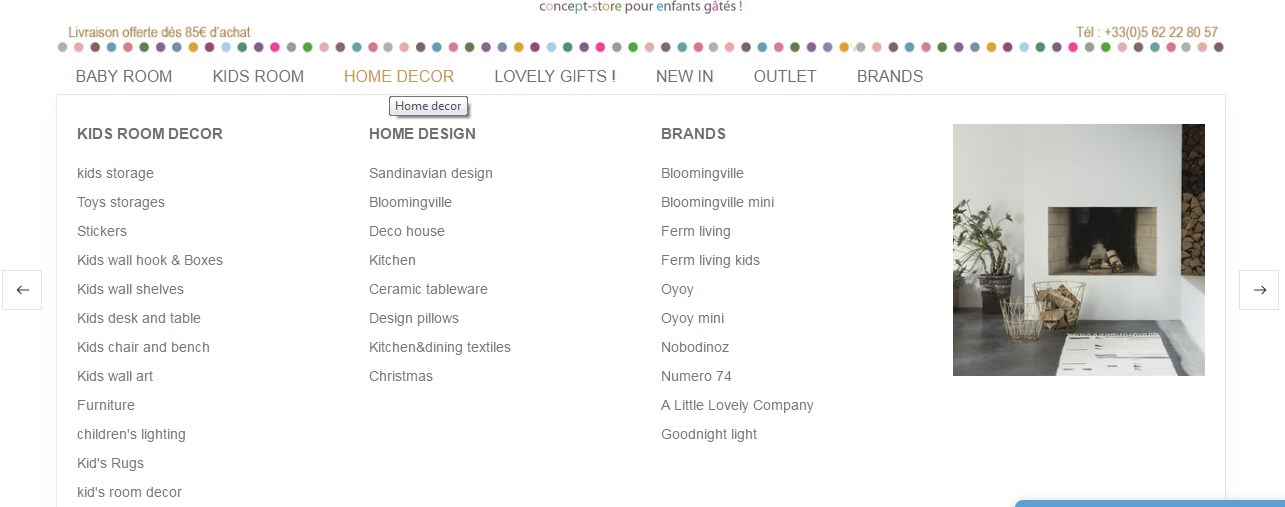
The menu of the web store Pop-line.com is distinguished into seven themes, that’s why it is represented by headers which include additional submenus. Actually, most of the sections are not clickable, so drop-down menus appear after hovering over. Each submenu contains a lot of data, so it requires scrolling down to see all the elements placed. It seems rather inconvenient. It might have been designed in such a way because of the item variety that has been mentioned above. In fact, it could be categorized differently. On the whole, the menu is not difficult to navigate, but it is not convenient as well. Besides, pictures are not used at all, though the menu is completely full of information.
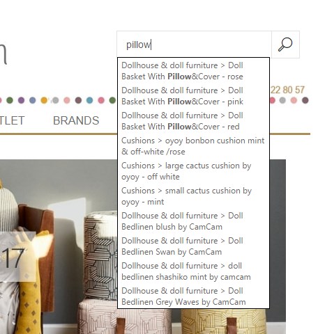
In regards to the search menu, it is in the standard design. The search field is placed at the upper right corner. A user should enter the item that is being looked for. The significant element of the search menu is pop-up tips that help to find an appropriate item before the results are shown. So it saves time to reach the ultimate result that is supposed to be an advantage.
Kinousses has one of the most appealing site appearances, as the web store is dedicated to kids. The web store contains all necessary kid products and provides customers with excellent product quality.
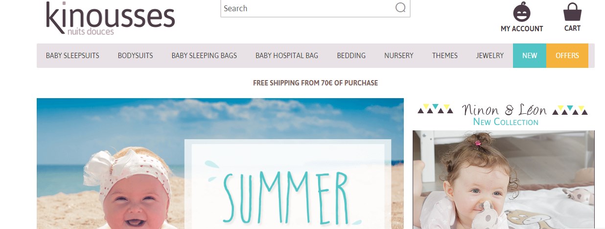
The menu is placed at the top of the site and represented by nine sections that are distinguished according to the topics. The unique feature of the web shop is the sections called “new” and “offers” that draw customer attention by providing special offers. It should be considered as a great benefit. As for the rest menu, the headers are not clickable, so you can see submenus after hovering over. At the same time, you don’t need to scroll down to scan the submenus, rather, it is appropriately sized that makes it easy to navigate. The only exception is the “new” section, that is clickable and opened as a new page. But actually, such section as “new” can’t have a drop-down menu. Moreover, there are pictures placed in the menu that improve visual perception. All in all, the web store follows trends and meets customer needs.
PrestaShop Theme Development
Take your online store to the next level with BelVG PrestaShop Theme Development
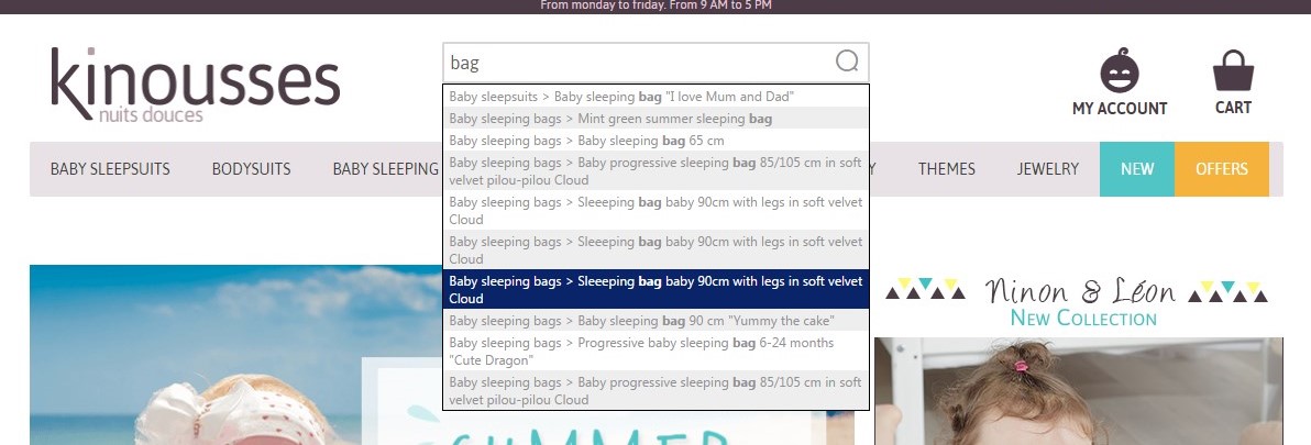
Visit the pageThe search menu is at the top of the site, so it’s easy to use. To find a needed item, a customer should enter the field. While entering, the popup tip appears to simplify the search. So it doesn’t require much time to reach the ultimate result. The process is quite simple and gets customers satisfied.
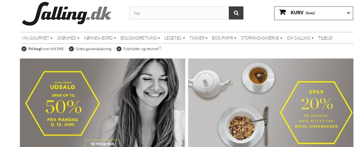
Salling.dk is one of the biggest web stores in Denmark which supplies the variety of goods from an extensive selection of wines from around the world to interior design items. Being the all-in-one solution, the web store is considered as a favorite for many customers by providing an excellent shopping experience.
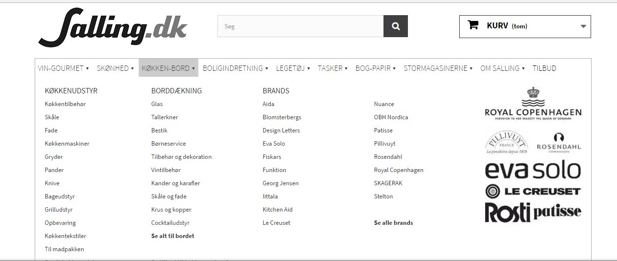
The menu divided into sections is placed at the top of the website. The sections are represented by main product categories each of which contains subcategories. When hovering over, dropdown submenus appear and suggest choosing a needed category. After clicking on the category, a new page with existing items is opened. It’s not surprising that such menu is used, as it is caused by a vast variety of products. Besides, images that can be placed on the menu for better visual perception are not applied because of lack of space. In fact, the menu is easy to navigate and rather simple. In addition, while opening the menu, you don’t need to scroll down it, as it is appropriately sized. Of course, you’ll not be able to find a needed item in one click, but for the web store containing so many products, the menu has been designed properly by the BelVG company.
In case if you’d like to find an appropriate item quickly, you should use search menu which is placed at the top of the web store and quite visible. While entering a needful product, pop-up tips appear simplifying the process. The tips consist of the alternative items list as well as their images. So, it is supposed to be a gimmick that facilitates more pleasant shopping experience. Moreover, the most appropriate way to find an item in the enormous web store is to use search menu. All in all, the web store has been designed according to modern trends and certainly fits customer needs.
PrestaShop Modules
Take your store to the next level with PrestaShop modules from BelVG
Visit the store
