You can not judge a book by its cover, but you can judge the site by its design. Do you follow trends that dictate how your website should look like? To remain popular, the design of the site must change in accordance with the latest tendencies. Understanding the way the market moves makes it easy to find your own original solutions.
However, even a good trend can become bad and, as a result, harm the user experience. That’s why we must use them carefully, select them meticulously and, if necessary, edit. In this article, we’ve listed web design trends for Magento templates, which may play against you. Analyze and make conclusions – it’s not so easy to stand out from the crowd, but the effort will pay off. And if you are a beginner in ecommerce learn how to create an online store from scratch.
Bright colors
Small details
Animation
Experimental layouts
Tiny typography
Navigation
Endless scrolling
Background video and music
Bright colors
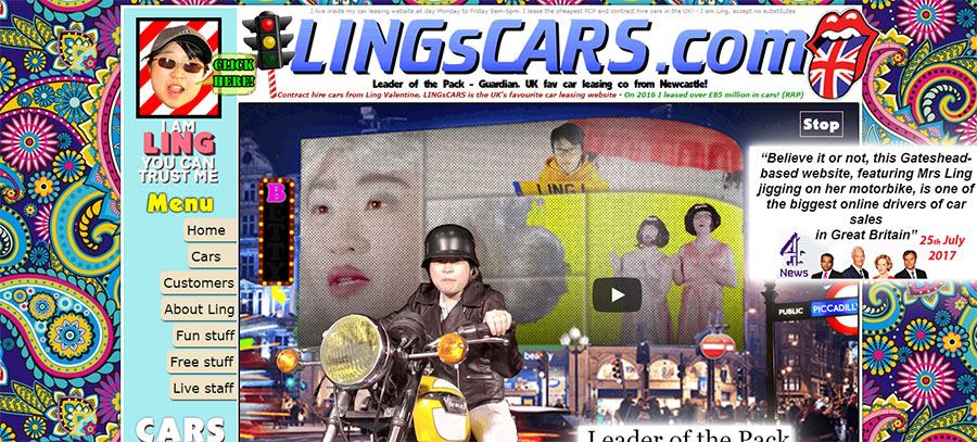
As we all know, colors can convey emotions, and they can be strategically used in brand and user interface designs. Bright colors, as a rule, attract our attention and create more positive emotions than dark or neutral colors. Bright colors are always cheerful, energetic and bold, while pastel ones are more relaxing and discrete. 2018 is an exciting year, start-ups and new products are shooting up like mushrooms, everyone is fighting for their place in the market. Color is a good way to attract our attention, which is why bright, full of life colors are becoming more popular. But in addition to the fact that this trend can be attractive, it can also lead to unpleasant consequences and interfere with the user’s work.
Large brightly colored surfaces or a lot of adjacent bright colors can make our eyes “bleed”. Not literally, of course, but they will surely hurt them. Eyes that hurt, will close or leave the page, while you want them to stay. First of all, the reason is that you used all these blinking colors. Pay attention to the screenshot below – it’s like a lesson in what not to do. Avoid using bright colors on large surfaces or as the primary background color.
(Source: www.lingscars.com)
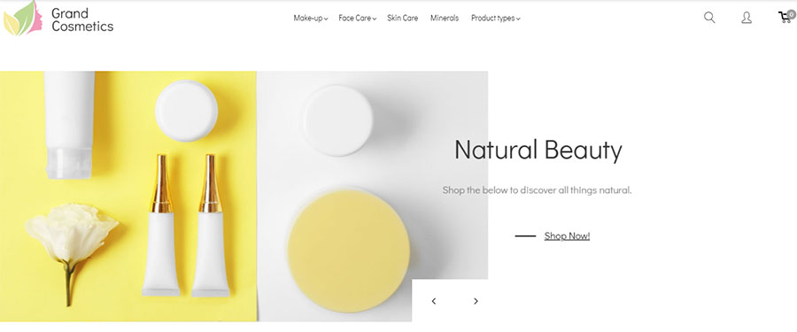
Keep balance of bright colors with large pieces of darker or more neutral colors. A good example for this is a cosmetics store Magento theme equipped with all necessary for e-commerce store features.
(Source: GrandCosmetics Template)
A few more tips:
- Use bright colors as a detail to attract attention and guide the user.
- Use bright colors to emphasize and promote content or interactions.
- Do not use too many bright colors on one page or on adjacent pages.
- Do not use bright colors near important text.
- If the company has corporate colors – use them.
- Adhere to more relaxed and versatile combinations of colors.
Small details
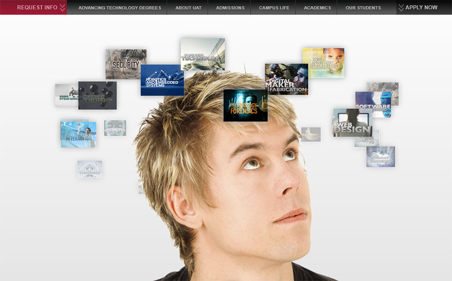
Decorative icons, geometric shapes, and fragments are becoming more popular. Although they do not perform a particularly important function, they can perform different functions: for example, serve as delimiters or pointers to content. But going crazy with small details will worsen site usability. Small details can be useful for attracting attention and admiration of users, but they can compete with navigation and content. Too many details can severely disrupt the hierarchy, and rather confuse than help users navigate the site or view content. Shouldn’t be the University of Advancing Technology site more inspiring and harmonical?
(Source: www.uat.edu)
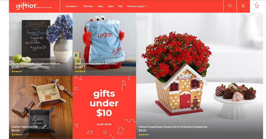
Keep balance of small details by means of their minimalistic and skillful arrangement. That’s what made in bright and attractive gifts store Magento theme.
(Source: Giftior Template)
Advice:
- Using small details as a decoration, watch the readability of your site.
- Try adding context to the details, which makes them relevant to the content.
- Do not use small details on pages that are overloaded with content.
- Avoid random details that have no purpose.
Animation
Animation is a tool for the creative transformation of the site design. This is a powerful visual trigger that improves storytelling and engagement. But excessive use of animation leads to site congestion and confusion. Excessive amounts of animation increase the page load time. So, the user is less satisfied and reduces the number of clicks. Just look at Yale University School of Art site (Yale?!) and its psychedelic doggy animation – don’t do so!
(Source: www.art.yale.edu)
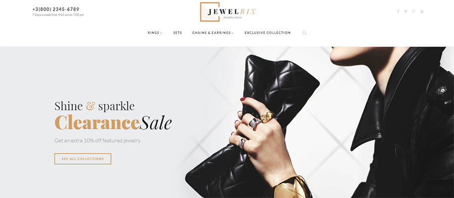
Add right accents, where necessary and use animation wisely. As is it done in this elegant and stylish example.
(Source: Jewelrix Theme)
Extra web design tips:
- Do not combine multiple effects at the same time.
- Animation should be smooth and refined.
- Track the number of popup elements.
- Apply conditional animation. Reinforce its use by objective reasons, rather than a simple wish to add several moving elements to the site.
Experimental layouts
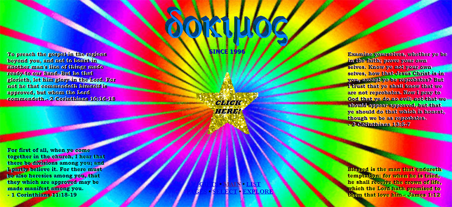
Deviation from standard layouts brings a certain variety to the design of the site. Such layouts are more attractive and interesting to users. However sometimes, the user can not understand the structure, and the elements may overlap each other and create chaos. Unbalanced playfulness in the layout can easily harm the convenience of viewing and understanding the information on the website. Which is what happened to Dokimos.
(Source: www.dokimos.org)
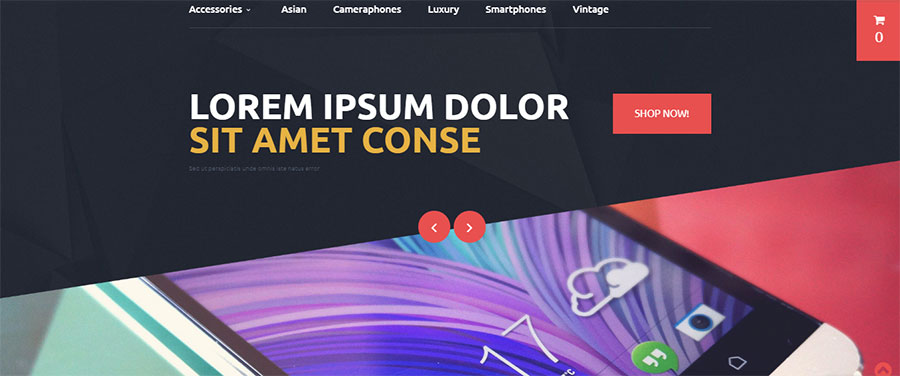
Do not use experimental layouts on pages overloaded with content. Keep the grouped elements in close proximity and clearly separate the various pieces of content. You can see a good example of Magento theme non-standard layout below.
(Source: Mobile Phones Template)
Some tips:
- Add contrast to the elements that overlap each other. Large typography can also help.
- Separate semantic blocks clearly. For example, with different background colors.
- Do not scatter elements all over the page.
Tiny typography
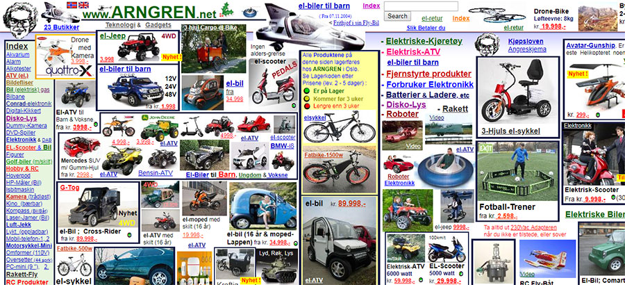
It looks stylish, attracts attention and allows the eyes to move freely. Correct use of small fonts makes it possible to create contrasts. Otherwise, they can make it difficult to navigate and view the content. The Norwegian analog Amazon is called Arngren. Apparently, Norwegians do not like to spend time navigating the site.
(Source: www.arngren.net)
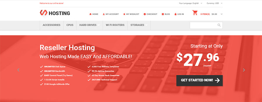
Use small typography with caution – only in short paragraphs. Full spectrum of efficiency – this is what the example below demonstrates.
(Source: Hosting Template)
Typography advice:
- Avoid fonts smaller than 13pt.
- Choose right contrasts for highlighting small typography. Outline headlines, subtitles, and key phrases.
- Highlight the main object from the text by indentations so that it catches your eye.
Navigation
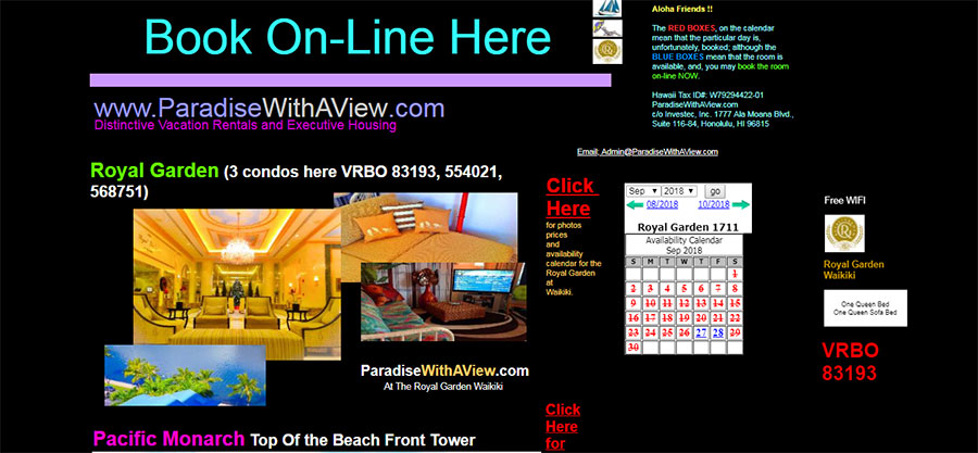
Experimental navigation templates are becoming increasingly popular. Different navigation styles can make small sites with less content more interesting or they can help users navigate in a certain way. They can be delightful and useful if they are intuitive enough so that users can interact with them. On the other hand, we must understand that such styles are not suitable for every design or for every audience. Look at this booking site Paradise (though, the look of the site makes you think in another way). In addition to not user-friendly navigation options in the middle of the home page, you will see a bunch of design mistakes.
(Source: www.paradisewithaview.com)
And compare it with a clear example of navigation offered by this electronics store Magento theme.
(Source: StartElectro Template)
More tips:
- Check the usability.
- Make it available on each page.
Endless scrolling
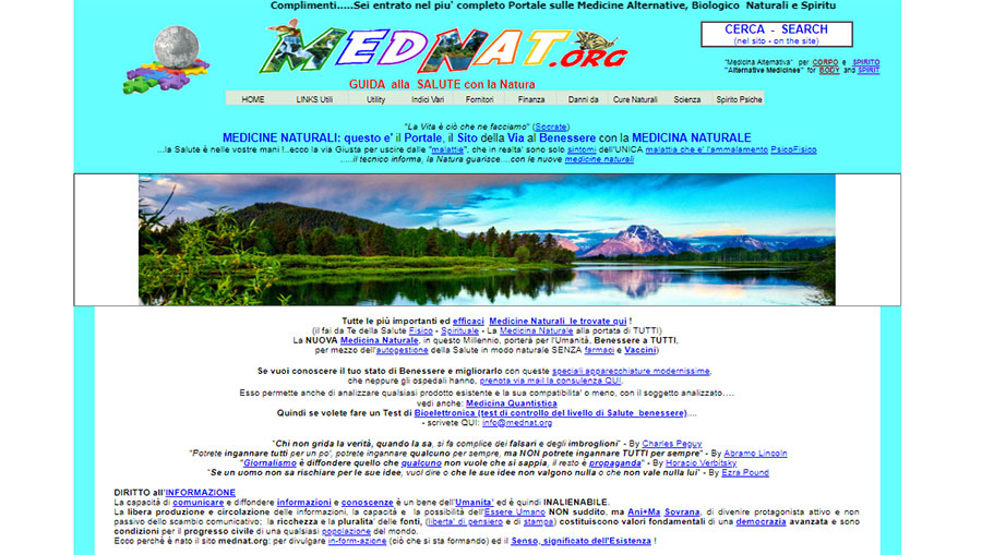
Endless scrolling has gained popularity due to mobile devices, from which it is easier to flip through. In this way, it provides endless content downloads, while increasing the involvement. But there are users who prefer to get to the end of the page without endless scrolling. Especially from desktops. And you can give him/her such a choice. Scrolling the Mednat site, at first we were interested at seeing the end of the page, then tired and finally a little bit angry. Well, you can try yourself.
(Source: www.mednat.org)
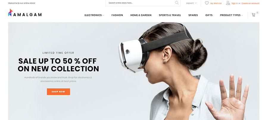
Scrolling should be unobtrusive and effective. Like in the wholesale Magento theme below.
(Source: Amalgam Template)
Navigation tips:
- Let the user choose how to view the content. Use CTA and tooltips.
- Highlight navigation options. A “sticky” header or menu works well.
- Test the effect of various scrolling techniques on the behavior of your users and opt for the appropriate option.
Background video and music
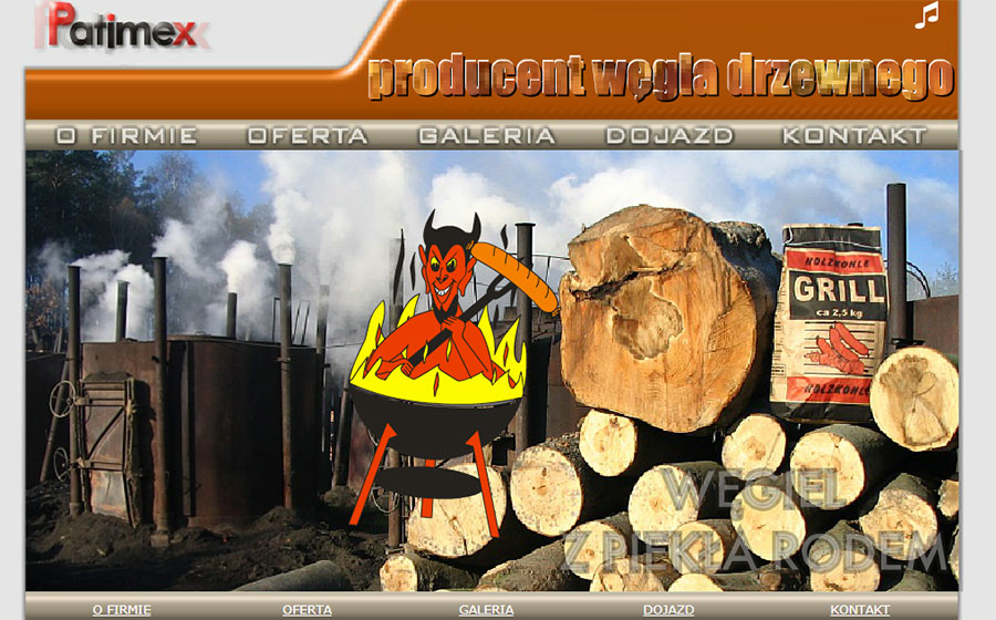
Unexpected music can simply scare visitors away. Automatic video playback annoys users. They do not like long videos, intrusive sound and poor quality of content. They want to choose when and what to watch/listen. And how do you feel about Patimex website annoying and even scaring background music?
(Source: www.patimex.com)
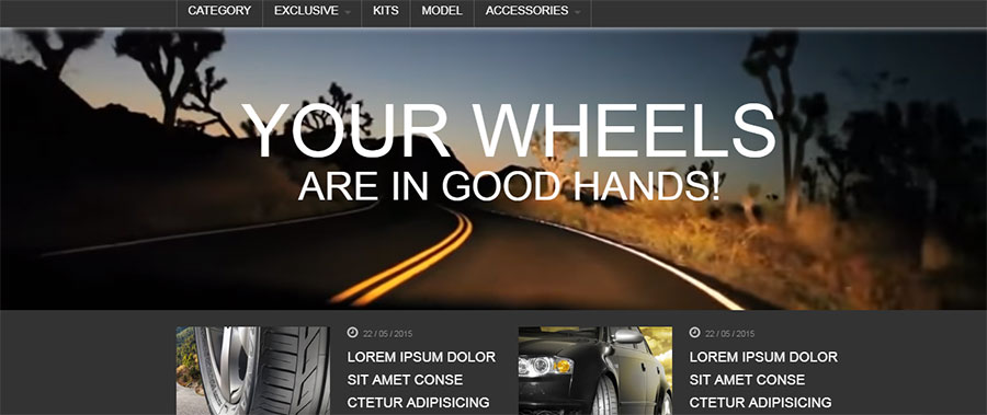
Do you agree that it is much more pleasant to visit the site, where all the effects are appropriate? Such one as car wheels online store Magento theme with stunning background video.
(Source: Tyres Template)
Tips for background effects:
- Give users control.
- Shorten the video.
- Set the music to silent mode by default, but allow users to turn it on by clicking.
- Create play and pause buttons.
Last word
In the sea of websites and products, designers try to keep their projects fresh and relevant, following the trends of design. But trends can be dangerous and should not be a panacea. It is important that we use them wisely, depending on the content, audience, and goals that we are trying to achieve. Do you agree with the listed tricky trends, or maybe I missed something? If you have what to add to this article, leave your comments – we all will be interested in this.

