The audit of any site helps to identify its weaknesses and find the reasons that affect the efficiency of the network. During an audit, the resource is analyzed for compliance with technical requirements and convenience and attractiveness for users. An audit helps not only to identify the errors and weaknesses of a site but also to get recommendations on how to fix them.
Normally, an audit includes:
- Technical review
- SEO analysis of the site
- Analysis of the site’s interface in terms of usability
- Marketing review
Today we are taking a closer look at the audit of a site usability.
Usability is the simplicity and convenience of using a site. In other words, your site should be intuitive, easy to learn and attractive to users.
Usability audit allows you to detect the issues that interfere with the effective interaction of site users with the published content and working functionality and is aimed at increasing conversion.
Remember that a visitor spends on average less than half a minute on one page. This means that during this time he must understand where he is, why you are unique and where he should move on to achieve his goal. Your task is to attract attention to yourself and make a visitor stay on the site for as long as possible. If this does not happen, you will lose the client.
Let’s look at an example of usability issues that can impede the effective use of a product and review the solutions that can help to increase conversion.
Here is what you should pay attention to first of all while analyzing the usability interface:
- How convenient is the search on the site?
- How easy is it for users to find the information they need?
- How intuitive is the user interface?
So, let’s get started.
Homepage
Header
Issues: The header occupies too much space (pic. 1)
Solution: It could be made more compact (pic.2)
Pic. 1
Pic. 2
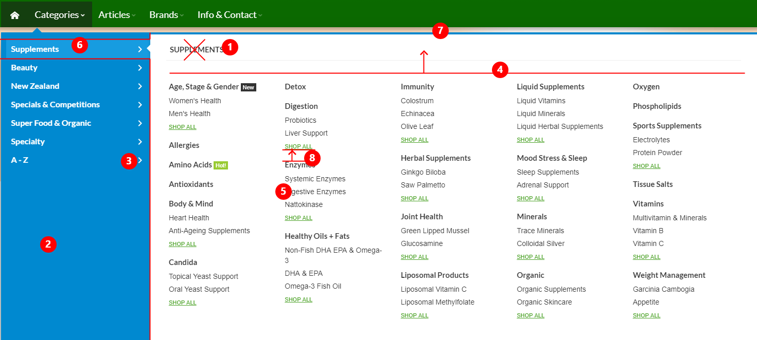
Categories menu
Issues: The menu has issues with usability and general perception of information (pic. 4)
Solution:
- The title can be removed, it takes up too much space.
- The font should be light grey in order to be less noticeable.
- Add arrows to make it clear that the menu is a dropdown.
- The menu can be moved higher.
- The subcategories should be grey and moved to the right, it will divide them from the categories.
- Make the selected category more noticeable.
- The dropdown should be more compact by its height, so as to fit into small screens.
- Make the space bigger.
Pic. 4
Articles menu
Issues: Titles strongly merge with subtitles (pic. 5)
Solution:
- Highlight the titles to make them more noticeable. (pic. 5)
- Make this dropdown block with articles more interesting. Example (pic. 6)
Pic. 5
Pic. 6
Advantages block
Issues: It looks empty (pic. 7)
Solution: Make it more interesting.
Pic. 7
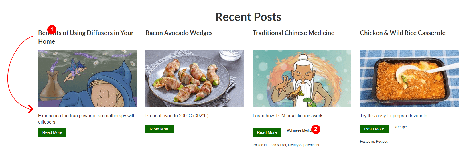
Recent Posts block
Issues: The information looks scattered (pic. 8)
Solution:
- The title should be placed under the image.
- Tags can be made better.
Pic. 8
Catalog
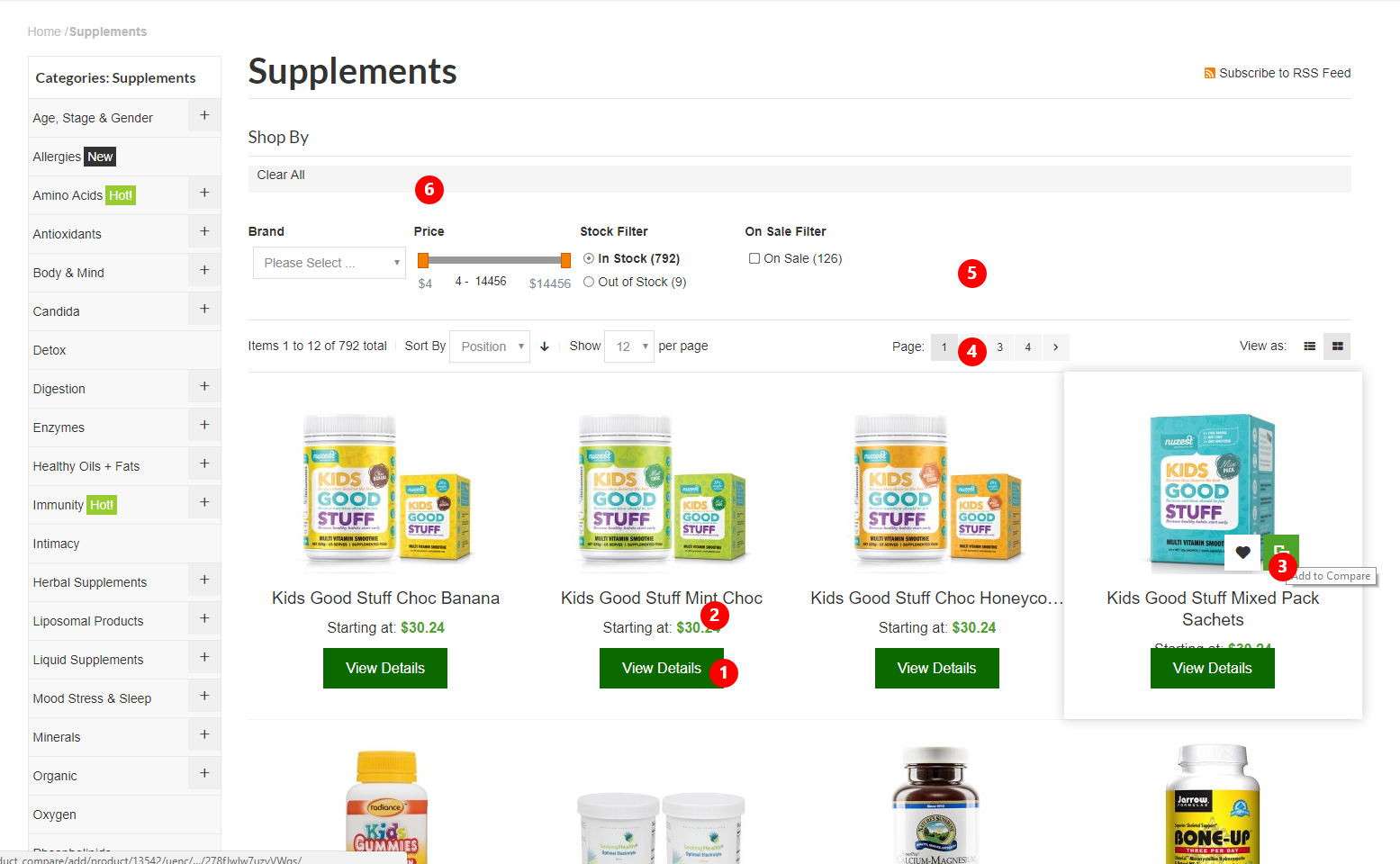
Issues: There are a few remarks on the catalog interface. Some blocks are hardly visible (pic. 9)
Solution:
- Add an ”Add to cart” button next to the ”View details” button (pic. 9)
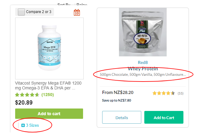
- The rating and the number of reviews can always be displayed, not only upon hovering (pic. 9). You can still display at once what sizes are available or their number. Example (pic. 10)
- The “Compare“ icon is not explicit (pic. 9). It is possible to show how many items were added for comparison (pic. 11)
- The pagination and the sorting panel should also be duplicated below under the catalog (pic. 9)
- Add sorting by rating (pic. 9)
- The “Clear all” button should be more noticeable (pic. 9)
Pic. 9
Pic. 10
Pic. 11
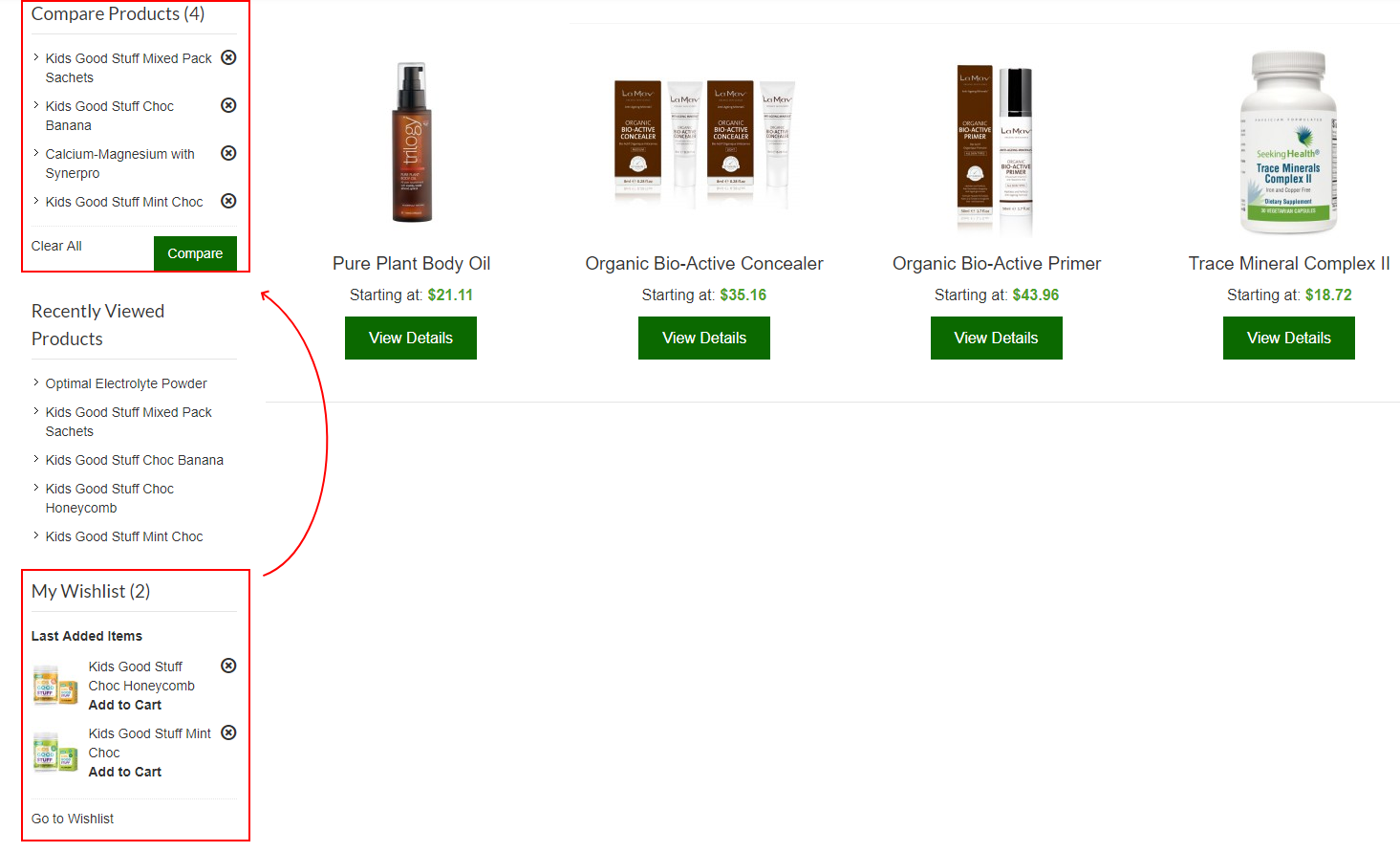
“Compare Products” and “My Wishlist” blocks
Issues: These blocks are useful but very difficult to notice (pic. 12)
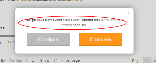
Solution: I think these blocks should go one after another, and only after them should the “recently viewed goods” block appear (pic. 12). It can be in the popup when you first add the item to the wish list or compare the picture to show with animations what will happen after you add a product to your wishlist or comparison (pic. 13)
Pic. 12
Pic. 13
Product page
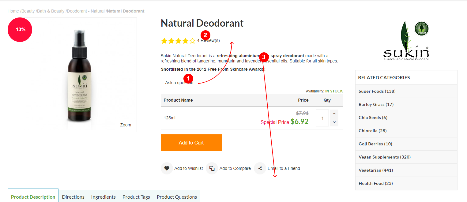
Issues: The information looks dispersed (pic.14)
Solution:
- The “Ask a question” button can be placed near “Reviews” to make it more compact.
- Underline the “Reviews” and “Ask a question” buttons to make it clear that these are the links.
- Place the product description under the “add to cart” button, so as not to scroll the page when there is a lot of text.
Pic. 14
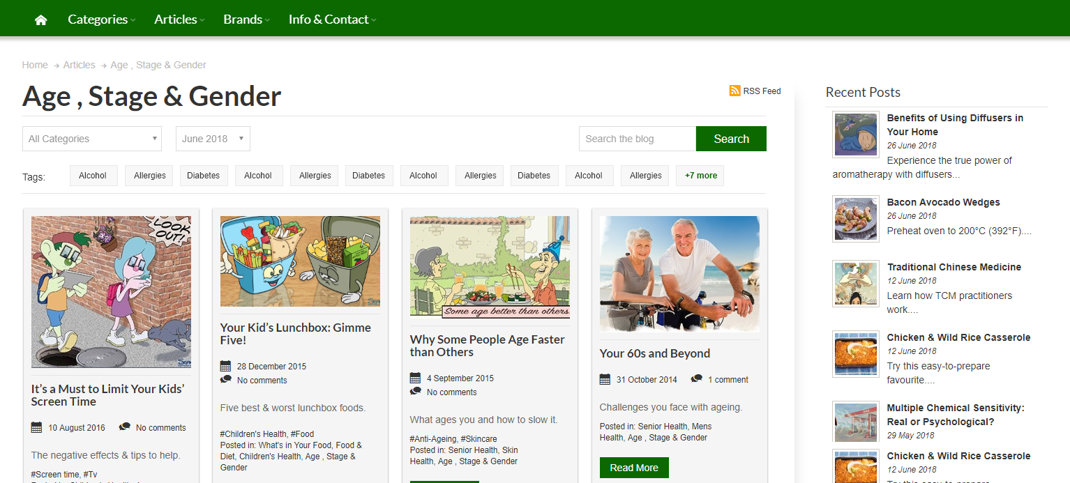
Articles
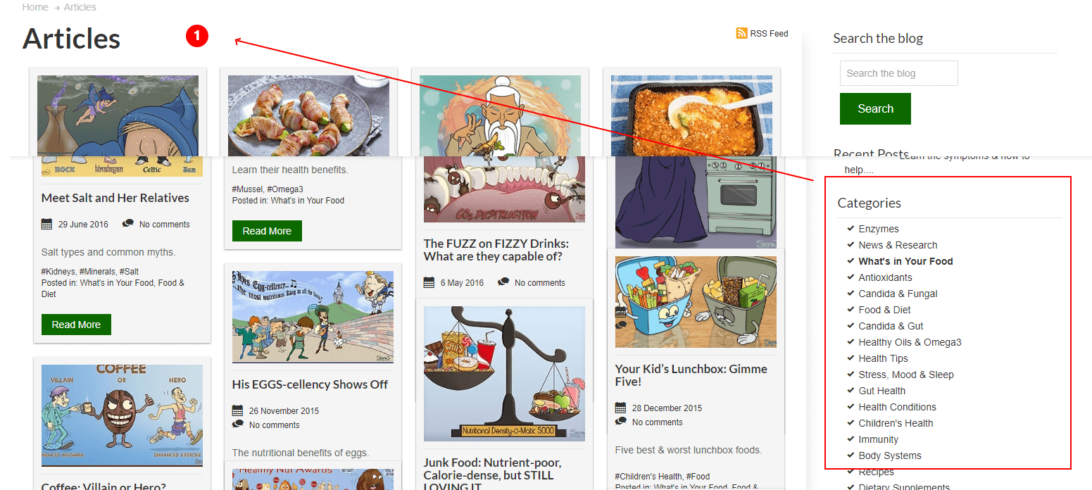
Issues: The filters and tags are invisible (pic. 15)
Solution:
- Filters can be placed above the articles, as it is more convenient to sort by date, name, etc. (pic. 15) Example (pic. 16)
Pic. 15
This was an example of how the usability audit of a site is happening. We found some errors and suggested solutions that will improve the interaction between a user and your product. Thank you for reading, hope the article was useful.


