Introduction
Any modern website should be well adapted for all sorts of devices, such as PCs, tablets or mobile phones. Following this approach, we have to choose one of the following methods when developing our website – either to apply a responsive or a mobile theme. To understand, what the differences between them are, let’s consider each theme in more details below.
Responsive themes
A responsive theme is sort of a single unified theme which is applied for all devices. However, the website appearance will look different depending on the type of device which is being used to access your site. Such an effect is achieved by means of a flexible markup structure which specifies the size of blocks and images in percent, while the position of page elements, text size, text color, background and other elements are adjusted automatically for the device which is accessing the web-page. All these parameters are controlled by media queries. A media query is a part of code that contains rules for different output devices. If the conditions, specified in the media query, are observed, the media query activates the code. Here below you may see an example of such a media query.
In this example, for all devices with the screen resolution of 768px or lower the body text color will be red. In the same way you may create multiple media queries. As a result we get a responsive theme which is able to display your website content perfectly well on any device. One of the peculirities of such a responsive theme is that it can adjust the page size automatically once you re-size your browser window. Take a look at the good example of a responsive theme.

Mobile themes
A mobile theme is just a general name meaning that a website is using different themes when being viewed on different devices. Let’s see how it works: when a user accesses a website the server also receives the information about his device characteristics and loads the corresponding theme which suits the parameters of that particular device in the best way: desktop version will include maximum number of elements, tablet version will contain blocks that can be easily manipulated via the touch screen, phone version will display light and small images for faster page load, printer version will contain only A4-size text data etc. However, the end user does not see how this selection of the appropriate theme is being performed by the server.
So, to sum up: the server loads the information about the device, then verifies this info with the media query rules and then selects the appropriate theme to be loaded on that device. Let’s see where it is possible to specify media query rules for Magento 2.
Log into your admin panel and go to Content/Design/Configuration and select your website where you can specify theme rules:
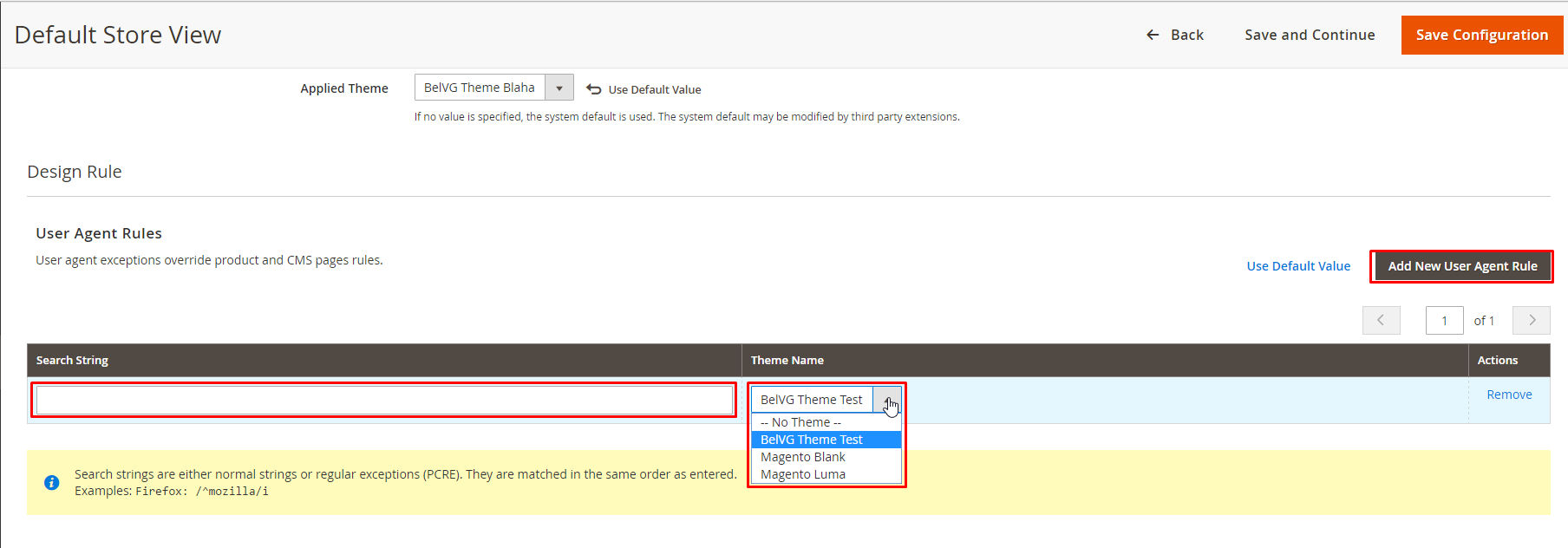
Next click “Add New User Agent Rule” – submit a new rule and in the drop-down menu select the theme which should be used if the rule is observed:
Conclusion
As you see, the main difference between a responsive and a mobile theme is that a responsive theme is single and unified for all devices, while a mobile theme has several separate versions for different types of devices (at least 2 of them – one for laptop and desktop machines and one for tablets and smart-phones). As a rule, both responsive and mobile themes use the same media query rules and the same markup structure that define the size of page elements in percent.
I would also like to mention certain advantages and disadvantages that one may encounter when using either a responsive or a mobile theme. The main advantage of a responsive theme is that we need to develop only one theme for all devices, which saves us pretty much time. The drowback is that all page elements that may not be visible on some devices are still present on the page. The user does not see them yet all of them are still loaded. Also, all big images that are specifically optimized for big screens are also loaded for mobile devices and tables. Of course, this reduces the page load speed and site performance.
Speaking about mobile themes, their main advantage is that they have separate well-optimized versions of the same website for different types of devices. This allows us to output only necessary page elements and images, thus, optimize the website performance and load time. The main disadvantage of such themes is that they require quite a lot of time for their development.
The best solution, to my mind, is to create 2 responsive themes: one for desktop machines and laptops and the second one for tablets and smart-phones. The desktop theme should also be well adapted for all screen sizes (in case a user minimizes the browser window).


