The modern e-commerce market is teeming with web stores that differ nothing from each other. The only point that helps distinguish a web shop is well-designed features implemented on the website. Today we’ve selected five webshops running on Magento and are going to compare their product pages that are considered as a motivator while purchasing products.
- Rebeccaminkoff.com
Rebecca Minkoff is a world-known brand that creates luxury handbags, accessories, footwear and apparel. Providing customers worldwide with popular items, web store owners focus on the web shop designed to meet client needs. Let’s consider its product page and define whether managed or not.
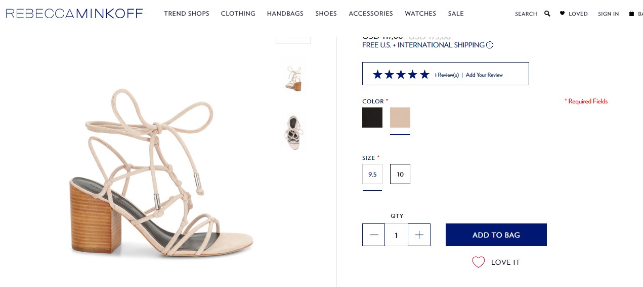
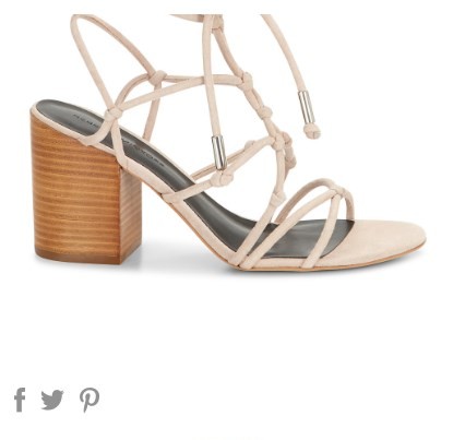
The first significant point is a product image which should be taken on the solid color background while being high resolution. The presented website fits the requirements described. The high-resolution picture is on the white background that helps have a closer look at the item on all sides. While managing a web store, you should focus on the important aspect. Since customers do not have an opportunity to see an item live, product images should be rich in quality. Besides, there is a main image large in size surrounded by thumbnails containing the image of the same item. When clicking on the thumbnails, it takes place of the main image and gets bigger in size. In addition, while hovering over, it is zooming in, so even minor details can be observed.
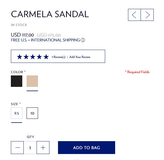
On the right hand, there’s a block of product information. The first line includes the product name, price as well as the discount applied. You can see the type of shipping and its availability depending on customer location. The next point you should pay attention to is customers feedback that has already ordered an item. It is the greatest way to find out some details concerning size or color if it doesn’t fit the data described. Moreover, the point of great importance is product size that is available to purchase. Having chosen color and needed size with a number of a product, you click the button “add to bag”, as a result, your products are added and you’re able to process checkout process.
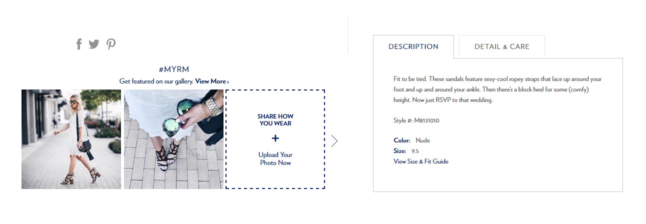
Apart from the above mentioned, there’s a block including item description with some details such as occasions when and where an item can be worn. In order to confirm the idea, on the left hand, there’s a gallery with photos shared by customers. In fact, an item purchased by unknown people worldwide can be observed by you. Moreover, you have a possibility to share your photo with the item you have already bought.
With this in mind, we’ve jumped to the conclusion that the web store is quite up-to-date and meets customer needs. Focusing on modern requirements, the buttons on the website have been designed as large and easy to navigate. Besides, it doesn’t matter which device you use for browsing, laptop or mobile phone, as it is well designed for both devices. The only thing that gets us amazed is colors. Probably, it is a matter of taste.
- Monin.com/us
Monin is the world famous syrup brand a lot of people around the globe are passionate about. Focusing on customers, Monin’s web store has been developed according to recent trends, that’s why the Magento platform has been chosen. Moreover, BelVG company was entrusted Magento development.
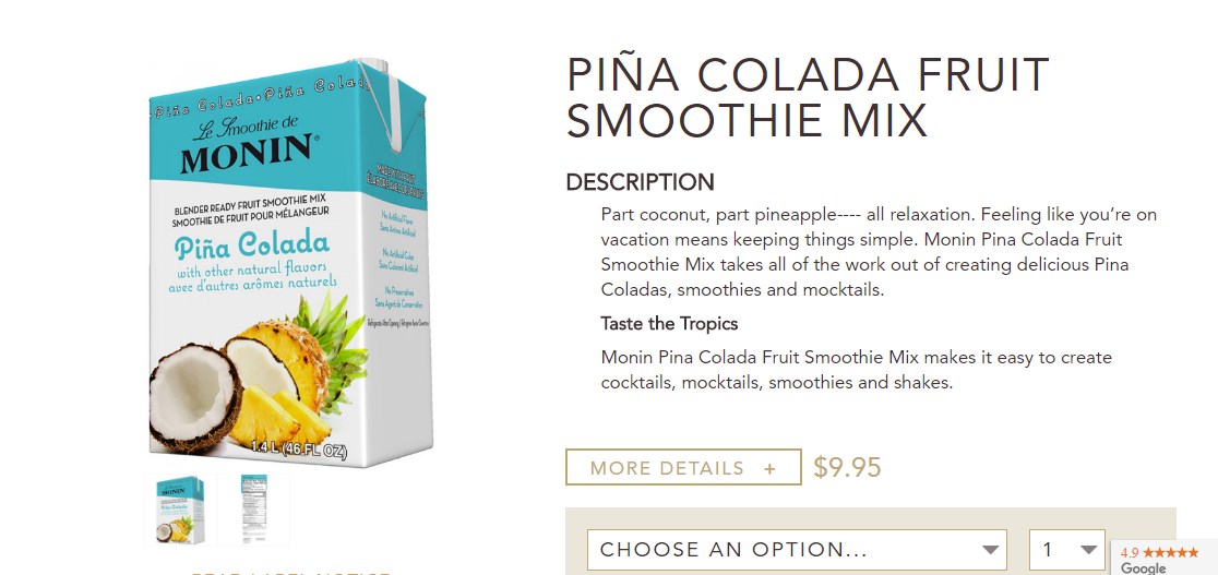
As for the product page, it consists of a product image and its description. At the left product, the image is placed containing thumbnails. While clicking on the thumbnails, they take palace of the main image. Besides, you’re allowed to see all the sides of the image when hovering over. Even product package, as well as details written on it, can be observed. Taking into account the fact that the company specializes in products that do not require detailed images, these elements are enough to fall under the impression.
At the right, there’s a description block containing information on product and aims of its usage. If you’d like to see more details, you should click on the button called “more details”, then you’re provided with comprehensive description. The cost of a product is placed below the description and emphasized by another color. Before adding to cart, you should choose the number of a product you want to purchase as well as the size. Here two variants are represented, one of which implies saving, if you order 6 packages at once.
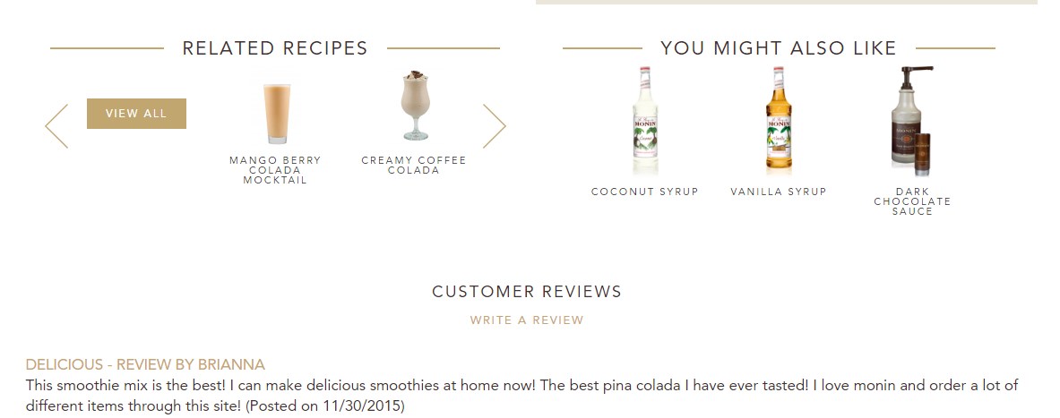
In addition, a shopper is suggested “related recipes” block which is considered to be rather useful. With the help of the block, you can find additional data how to mix ingredients for cocktails. Moreover, “you might also like” block is proposed to you in case that you want to purchase one more item. If you’re not sure whether to buy or not, focus on feedback left by customers who have already ordered it.
On the whole, the web store designed on Magento platform fits customer needs and makes clients satisfied with their shopping experience.
- Getolympus.com
Olympus is supposed to be a well-known brand which specializes in cameras, voice recorders, medical endoscopes and other medical devices. The company has gained a good reputation supplying items worldwide. In order to fit modern trends, the web store has been developed on Magento.
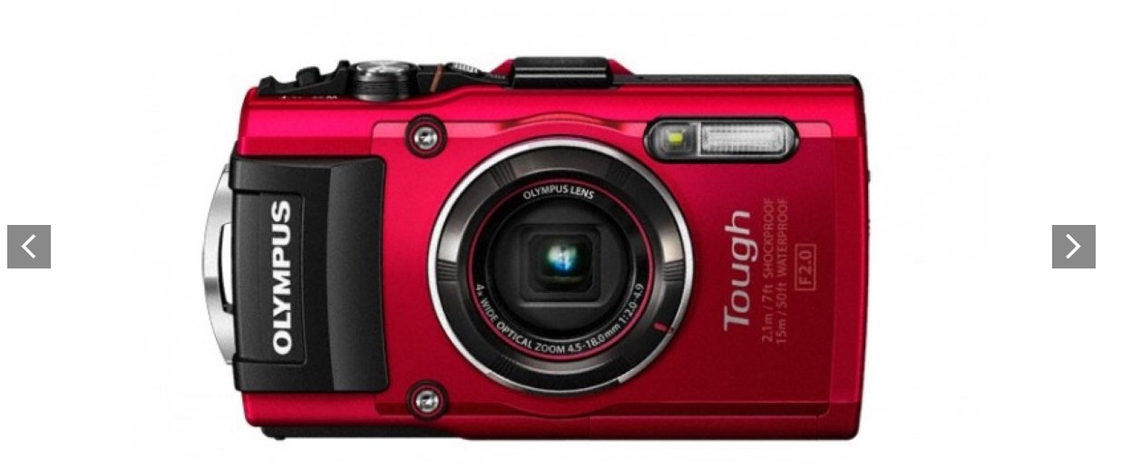
The first thing which is worth attention is the slider containing a number of product images. With the help of the gimmick, a client has an opportunity to see a product on all sides. Just clicking on the image, a photo is zooming in, so every minor detail can be seen.
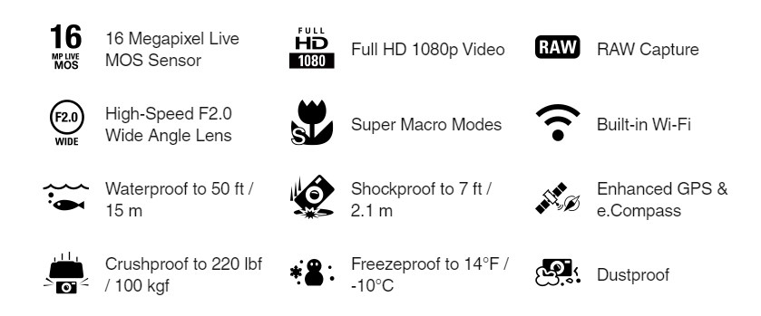
In order to see the next block of the product page, you should scroll down it. Here you can observe the main features a product possesses. It’s represented not by written text, but various icons that help distinguish between features. It seems rather convenient and easy to comprehend.
When all main features have been mentioned, the block with extra features is presented. It means the key points which deserve attention are introduced.
The company has posted the link on the web store clicking which you’re provided with press release made by a third party source.
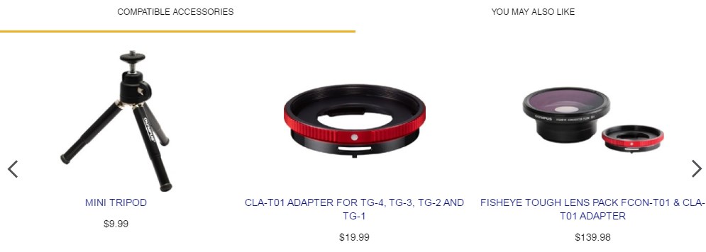
The section implies compatible accessories you might want to purchase. Besides, some items relating to the product you’re observing are proposed as well.
One more distinctive point of the web store is product overview video where it is explained pros and cons of the product as well as comparison with another one.
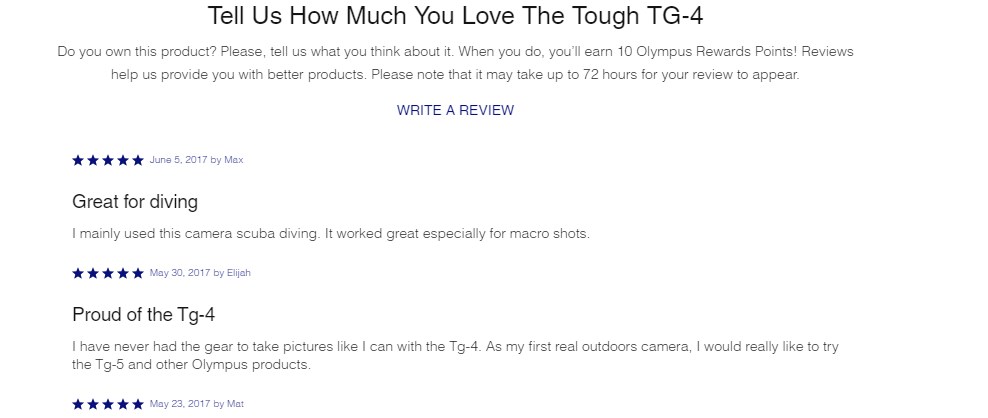
At the bottom of the web store, you can find a section dedicated to clients’ feedback. People who have already ordered an item can leave their opinion and define if they are satisfied with service or not.
All in all, the web store has been designed focusing on customer needs. Having chosen Magento and developed the needed sections for such kind of product, the company meets modern trends and get customers satisfied.
- Bulgari.com/en-ch/
Bulgari is a jewelry brand famous for its variety of products as well as quality. Many people all over the world purchase Bulgari’s rings and necklaces in order to wear luxurious valuables. To fit recent trends, the web store has been developed on Magento.
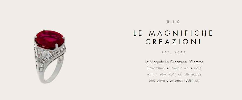
The product page contains the image of a product. The photo taken is single, so there are no photos for better observation. When hovering over, the image is zooming in to look through. Since the only image is provided, you can observe only the one side of an item. At the left, there’s a description block with data on a product.
One more expressive description written in a literary style is presented below. It is used to convey the idea the author has had while designing an item.
One more block used to get shopping experience pleasant and convenient is the option helping find the nearest store. Having chosen your country, you should click the button “search” and the locator defines the nearest stores located in your region. It’s quite simple and beloved option by many customers.
As for the web store, the site is quite simple and not rich in details and options. Probably the matter is Bulgari’s web store is not a store at all. It’s a website where you can get familiar with the variety of product. But in case if you’d like to buy them, you should go to the store where they’re represented.
- Nespresso.com/us/
Nespresso is the top-class brand that brings luxury coffee and espresso machine into a customer kitchen. Having customers around the globe, the company supply products via web store running on Magento.
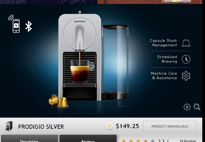
The product page of the web store differs from the web shops mentioned above. First off, the image of the product is placed with the short description at the right. Below the price is defined as well as the icon relating to product availability. So a customer is provided with the most significant data.
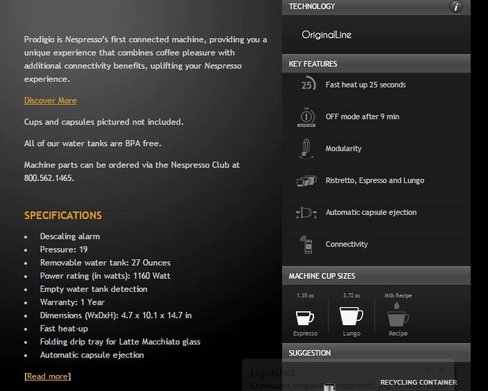
Then you can see a block consisting of two tabs. The first one is dedicated to the comprehensive description of the product and its specifications. A user has an opportunity to download a guide helping handle the product. The second one is reviewing, where customers who have already bought the product, leave feedback. Focusing on feedback, you can easily define whether the product is worth your attention or not. The left section provides more useful details the product possesses. All the descriptions convey the impression.
At the bottom of the page, there’s a block called “you may also enjoy” where a client can find related products and buy them as well.
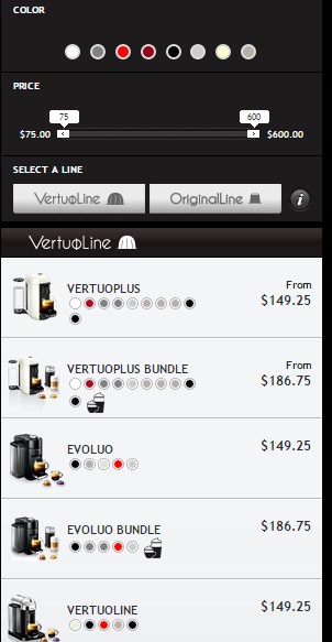
One of the most significant features of the web store is a filter. In case the product page you’ve opened doesn’t meet your expectations, you can use the filter to select another one. So all you should carry out is choose a color, define the price and select a line. Having implemented required parameters, the list of appropriate products is displayed. Besides, the product image and its price are presented in the filter section as well.
Generally, the web store is rather up-to-date fitted with modern features that help ensure an excellent shopping experience.

