
Unique illustrations
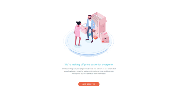
First off, using illustrations makes your project look more personal (which is pretty important in the era of flat layouts). Secondly, this approach can perfectly match any custom typography, thus making your layout even more unique and personalized. Here you can also add the tendency of using images that display samples of real design and content instead of placing juts some common widely used stock-images.
Monochromatism
Using minimalistic color palettes. Despite the fact that the current screens are becoming brighter and support more and more colors and shades, the general tendency for monochromic colors and design is still pretty strong. One of the major attributes of the modern web-design are bright single-color images.
Custom grid
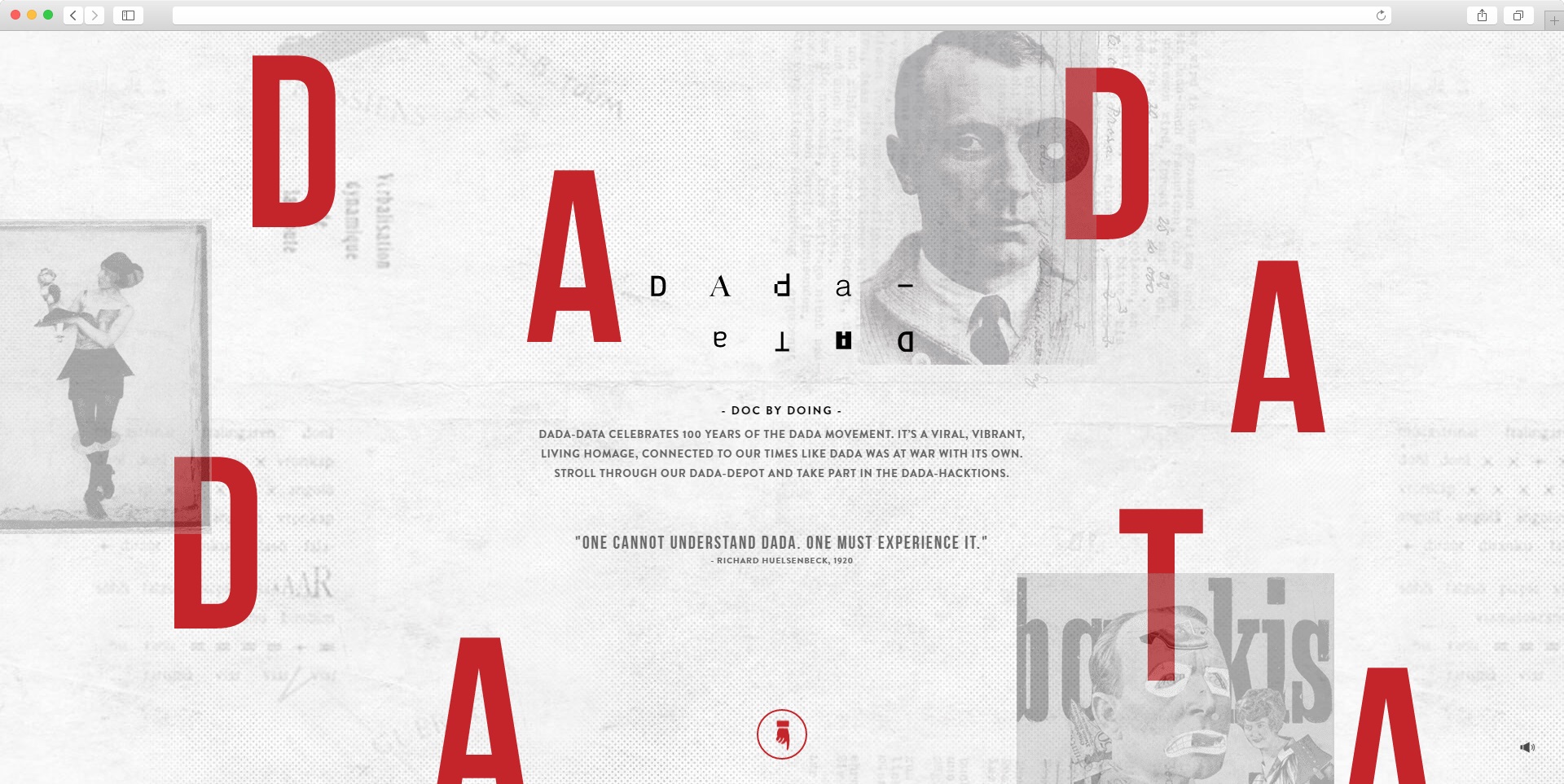
A gird is considered to be some sort of a basis which helps you to properly arrange your web-page space. But it can also become an obstacle for those web-designers who try to think out of the box. However, there will always be adventurous hearts which will find new original solutions that do not fit into strict borders of design dogmas. Such approaches can be frequently met in image and artistic works. But in 2017 even strict corporate projects seems to have started following this trend.
Putting web-elements on unusual places lets you arrange your space more efficiently: you can use full page space, add more layers to layout and increase page depth effect. This lets you create an impressive design without even using any full-size video or animation effects. Taking into account hundreds of thousands of typical layouts in the Internet, using custom and unique solutions will make your website stand out and attract more visitors. So, this should be definitely taken into one’s armory!
More bot-chats
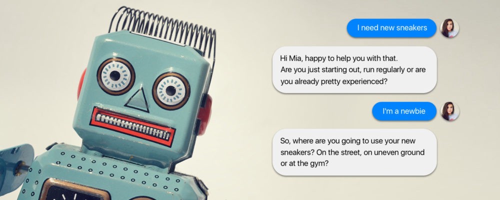
According to experts, the year 2016 can be easily nominated as the year of bots. But we expect the tendency to increase in 2017 as well. However, to start using bots one first has to implement a user-friendly interface with simple and plain language. Content-managers will also get the possibility to provide design-solutions for bots as well. We also expect quite a lot of resources to be invested into the user-generated content, such as forums, communities and similar sections.
Popularity of SVG-files
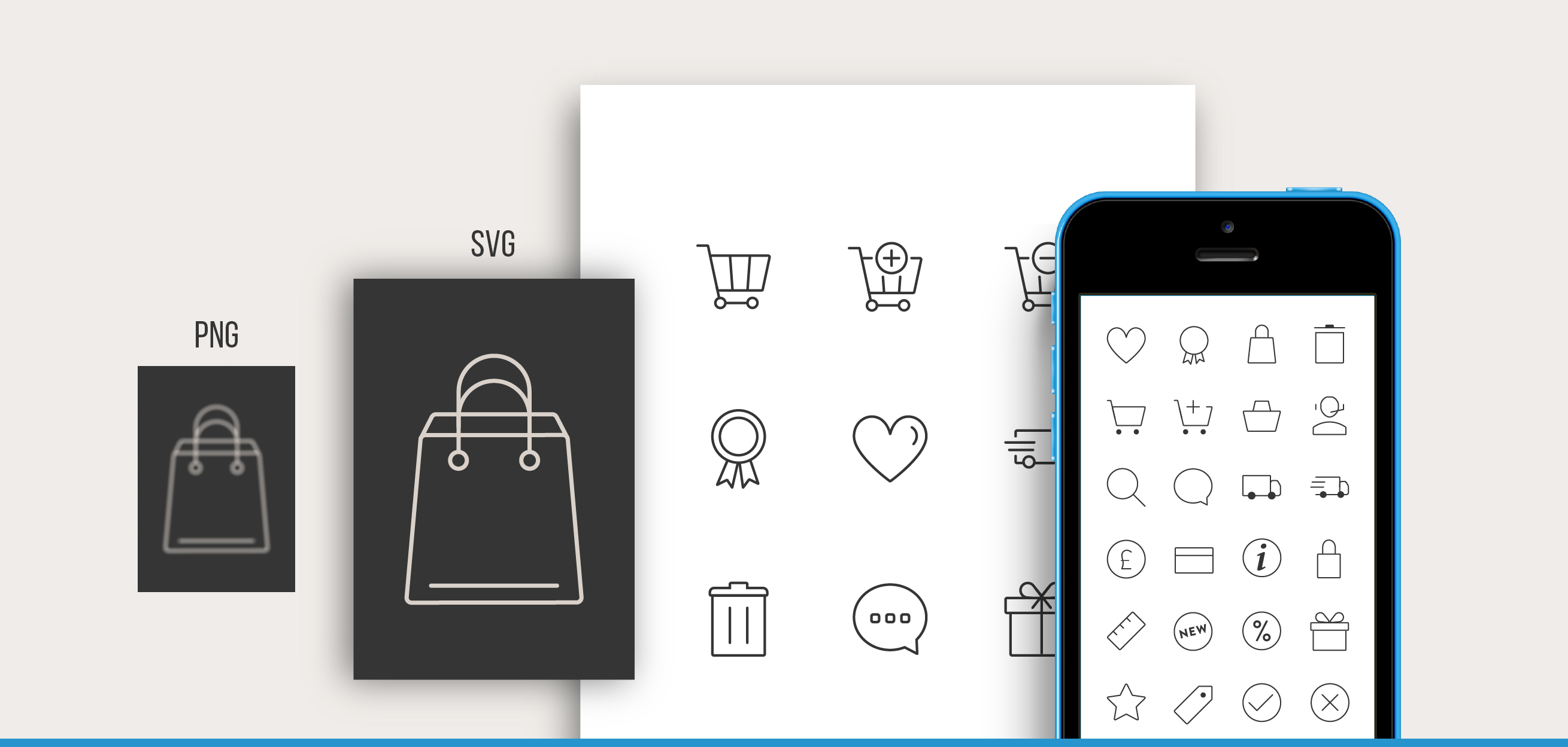
This scalable vector graphics provides more advantages for web-designers and developers than conventional JPG, PNG and GIF formats. SVG has quite a lot of positive sides: high file load time, files are interactive and can be easily adapted or modified.
New possibilities for graphic design
Over the recent years web-designers have been concentrated mostly on CSS-design techniques. But already in March 2017 Chrome and Firefox are going to start supporting CSS-grid which will let you make more expressive layouts. So definitely, here we can speak that certain graphic design evolution is going to take place.
Smart navigation
Quite a lot of users often get irritated with the so-called hamburger menu. However, this menu is only an unsuccessful attempt to build up a better navigation. Yet more and more shops today are using smart algorithms which track user’s behavior and provide navigation hints on the basis of your personal experience. To be more precise, smart navigation shows users different parts of website content on the right time and place, so they do not get distracted from the main content.
I have described top 10 design tendencies that are going to be widely used in web-design in 2017. But in fact, most of the effects described here were already used in the past years such as cards, bright backgrounds, parallax effect, large typography and others. But we also expect some original fonts and navigation solutions to appear this year. Except for the point with augmented reality, we can say that the tendency to simplify the general view of online projects still remains and designers are just looking for more effective and interesting methods for implementation.



Designing plays the most important role in the presentation of any kind of website. It does not matter how strong server a website as if the design is not proper then its all waste of time. I have been through all these tips and I feel these tips are really helpful and looking forward to reading such articles in the future!