Let’s discuss how the idea of web-based applications was born and look through its main advantages and disadvantages. We have also prepared a detailed audit of three popular open source PWA solutions – Vue Storefront, ScandiPWA and the Venia storefront built with the help of Magento PWA Studio.
Table of сontents:
What is PWA?
Advantages & Disadvantages of Progressive Web Apps
Demo Versions by the Best Magento PWA Providers: Comparison
What is PWA?
Progressive web apps (PWA) are developed with the help of the same technologies as websites but for the end user they feel and look like an actual app. Easy to share and with no installation required, PWAs also allow creating a website’s icon on the screen of a user’s device without App Store or Google Play. Another known feature is that PWA allows push notifications and some service functions can be used offline.
In a nutshell, PWA is claimed to combine the best features of the regular websites and native mobile apps. It sounds good but at the same time, there are some disadvantages. Let’s get into it.
The brief story of Progressive Web Apps
Back in 2015, Google Chrome engineers brought the term “Progressive web apps” to existence but even before that, the whole idea around the apps based on the web technologies was not new. In 2007, Steve Jobs presented the community Apple’s vision of web-based applications for iPhone, working with the Safari browser. Building apps without a software development kit sounded like an attractive solution for some, while the others were skeptical.
Soon enough it became clear that back in 2007 the web technologies were not ready to cover the functions of native apps. The lack of security resulted in the iPhone getting jailbroken in less than a month after its release [1]. It came together with the poorer performance compared to native apps and difficulties related to the limited access to the core architecture. So by the end of 2007, Apple announced that they were moving towards the native apps and started working on their software development kit and App Store. For Apple, this decision turned out too profitable to give it up and come back to web apps [2].
Native apps flourished, while the idea of web applications was almost forgotten for years. This technology had to wait for its moment until it was reborn with the help of Google Chrome developers in 2015. The article published on Medium by Alex Russel – Google Chrome developer – was meant to help the audience rethink their attitude towards the web-based applications and get them ready for changes. Since then, Google started to actively promote PWAs as a more effective alternative to native apps.

Build a PWA for your Magento store!
Leave the details and our project coordinator will reach out to you soon
Get startedBy 2018, Google developers already had an impressive portfolio of case studies with stats about the PWA usage by such brands as Starbucks, The Washington Post, Jumia and AliExpress. No wonder, after such a promotion, more companies got interested in progressive web apps.
So what do we have now?
The PWA global popularity is growing and more platforms, including Magento, Shopify and Shopware gave their users an opportunity to build a web app. The open source PWA solutions are being developed. In 2019, Magento announced the PWA Studio availability and kept working on it adding the Braintree integration to assess payments. By December 2020, the Magento team published the report about the early adopters of the PWA Studio.
Other development companies offer their PWA solutions for ecommerce as well, for example, Vue Storefront, Deity Falcon, ScandiPWA, Litefy, Superchargify and AmpifyMe. Here we will compare the storefronts of the most popular Magento PWAs, including the Venia PWA Storefront by Magento itself.
What do the stats & surveys say about PWA?
During the pandemic, online shopping and specifically mobile shopping experienced an unprecedented boom, sales went up as well as competition. Growing market is a perfect place for a new technology to set down roots.
According to the Statista’s survey among the ecommerce decision-makers worldwide, 24% of them were planning to invest in the PWA technology for their company by the end of 2020 while 11% claimed to already have a PWA.
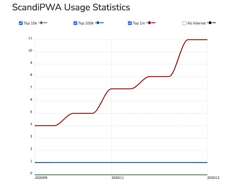
Builtwith statistics say that the number of top 1 million sites using various PWA solutions is increasingly growing.
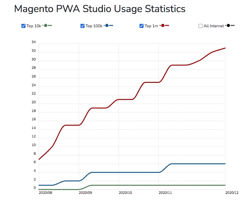
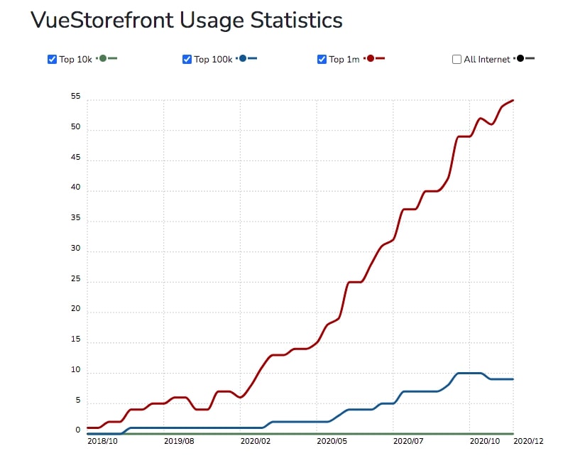
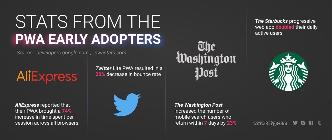
Most of the PWAs that we can see in the Google developers’ portfolio are the well-known brands. The early adopters include Forbes, Aliexpress, Twitter, Tinder, Washington post, Spotify, BMW, Uber and others. As you can see, the industries where PWA got in, are different, from social networks to car manufacturers. Below, you can find some interesting stats provided by these companies.
Advantages & Disadvantages of Progressive Web Apps
When we speak about the advantages or disadvantages of any technology, it is always easier to compare it to other existing solutions. In our case, we will discuss where PWA is winning and losing to native apps.
PWA vs native apps
Similar features (which you don’t get with a regular responsive website)
- Push notifications. This feature allows you to promote the hottest deals, newest arrivals or content updates without using extra resources. This communication channel that previously belonged to the native apps only is not yet overused by the web marketers. The early adopters can still gain direct, not background attention.
- Adding an icon to the homescreen. When a user opens a PWA, they receive a notification suggesting to add it to the homescreen for easier future access. The process is smooth and requires no authorization or installation.
- Offline access. One of the most discussed PWA features is the ability to use some functions offline. With the help of cache, once the pages are fully loaded, a user can scroll and open them even with unstable connection.
PWA advantages
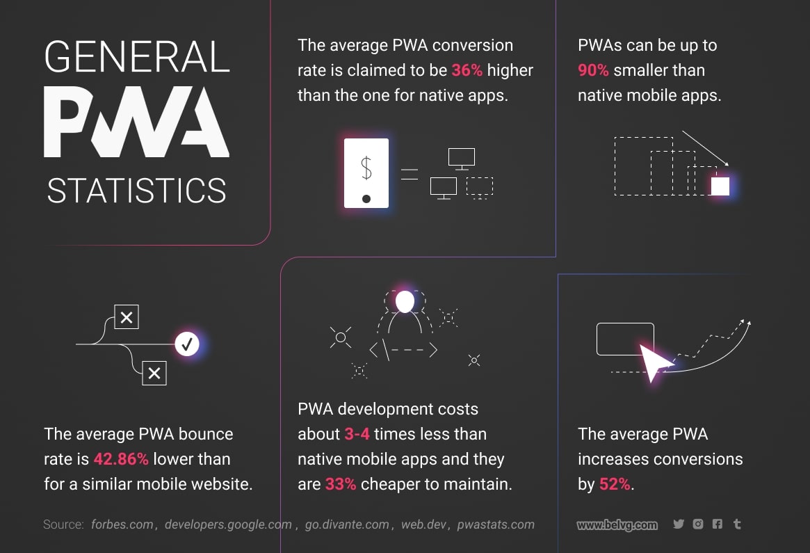
- Lower development and maintenance costs. On average, a regular app costs between $20,000 to $80,000 while a progressive web app costs between $6,000 and $20,000 [2]. There is a money/time saving factor – your development team won’t have to build two separate systems, webstore and an app, which means that building a PWA is going to take fewer development hours. The maintenance is also cheaper due to several reasons, one of them is that with PWA all the website users run the same version of the website’s code, unlike its fragmentation when using the native apps. Breakdowns are less frequent.
However, this advantage highly depends on the number of custom features and extensions used in a certain website. As we mentioned before, PWA is a relatively new technology and currently it cannot provide any kind of ready-made extensions or integrations. Turning a complex website overloaded with different features into a PWA may be costly.
- Advanced SEO. As we all know, most of the search engines now follow the mobile-first approach set by Google. If you test the website with the Google PageSpeed Insights tool, you will see that the requirements for good score on mobile are now pretty strict. PWA is the solution highly promoted by Google developers, so most of the progressive web apps load almost instantly on mobile devices and fit in well with these requirements.
Marketing for native apps is quite expensive, while PWAs are indexed by Google so they can draw organic traffic as a regular website. A general lack of opportunities to promote native apps is frustrating but there are numerous ways to draw potential customers to a PWA.
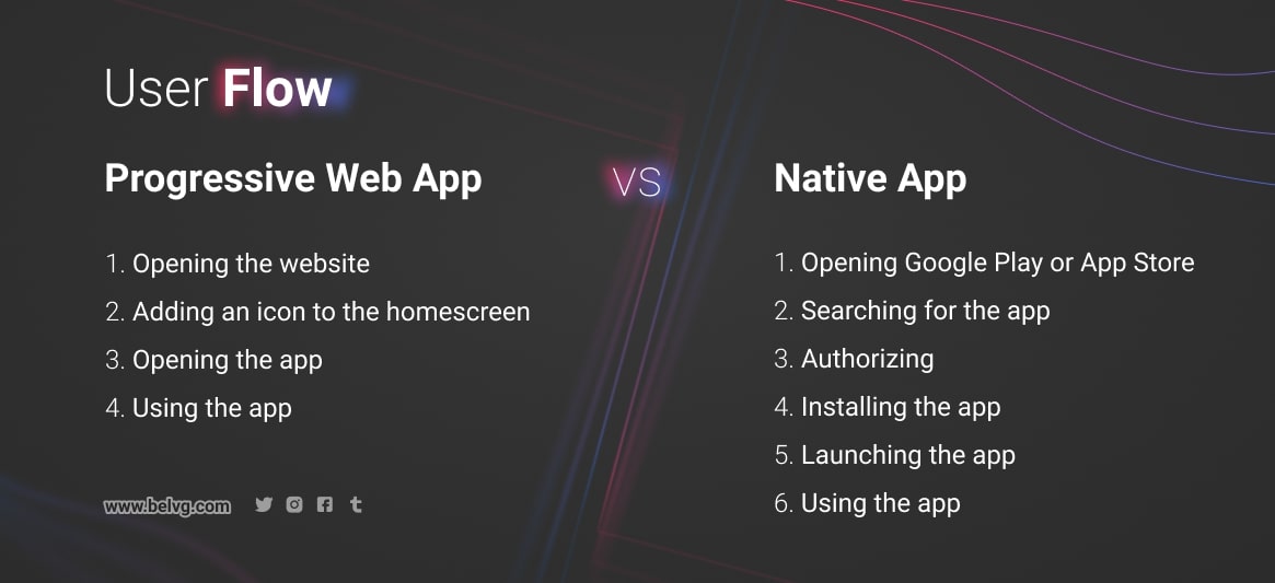
- Faster user flow. When it comes to native apps, abandonment during the installation is a real issue. At the same time, there are many people that do not install apps at all [3]. While native apps take extra effort and require more time for installation and launching, PWAs provide almost instant engagement.
- Different device compatibility. The progressive principles used for creating PWAs enable it to work on different browsers and screen sizes. Even though not all devices currently support the full range of PWA features, in some way they can still be used on any device.
- No dependency on app stores. Progressive web applications work outside of the app store ecosystem which means that you won’t have to be afraid that Apple censors or removes the app for any reason.
- Hyperlinks. Unlike with native apps, using a PWA, you can provide direct links to the necessary section of your website. The customers can follow a hyperlink and access the required information without searching for it. You can also use direct links to a product or information in your marketing campaigns.
PWA disadvantages
- The brand cannot be discovered via app stores. Having a PWA, you won’t be able to reach new customers via this sales channel. However, the stats show that it is not a huge problem as the overall popularity of shopping apps is relatively low compared to other types of apps. The apps for shopping are just the 12th favorite category (out of 20 provided) on the App store according to Statista. It is 2.42% of active installed apps.
- Poor UX. The access to the core PWA architecture is quite limited. As a webstore owner, you will not have an opportunity to implement any feature that you want. For a user, a PWA provides fewer interaction elements than a native app.
- No proper connection to other installed or default apps. The PWA technology is yet unable to let a user use camera or other apps for more advanced search or interaction.
- Limits for iOS devices. Ironically, the most significant issues with the use of web-based apps are related to the products of the company where the idea of such apps was born – Apple. iOS supports PWA from the 11.3 version onwards, no support for earlier versions. Also, re-engagement is not easy for Apple users as the software still limits the PWA capabilities.
Demo Versions by the Best Magento PWA Providers: Comparison
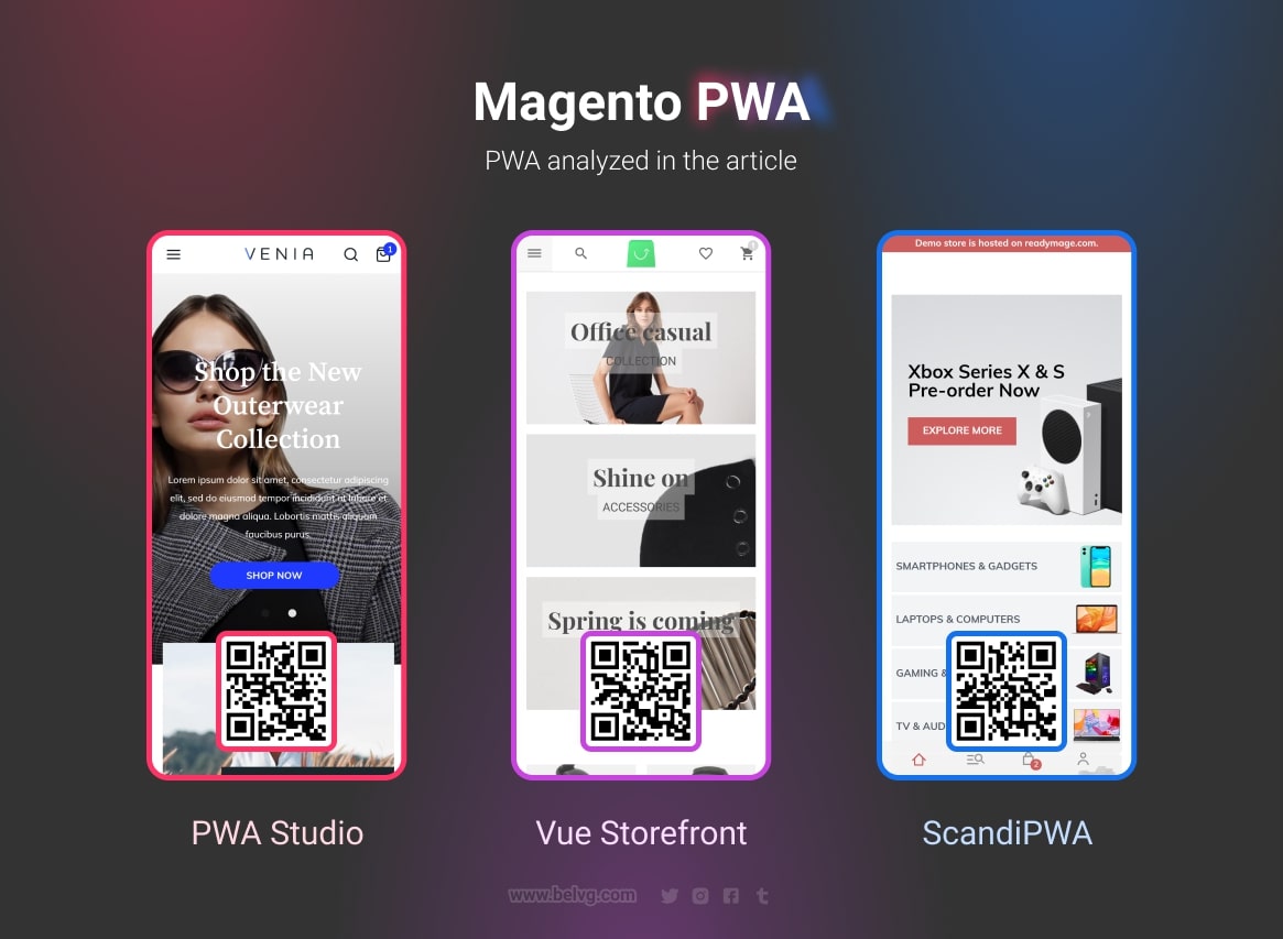
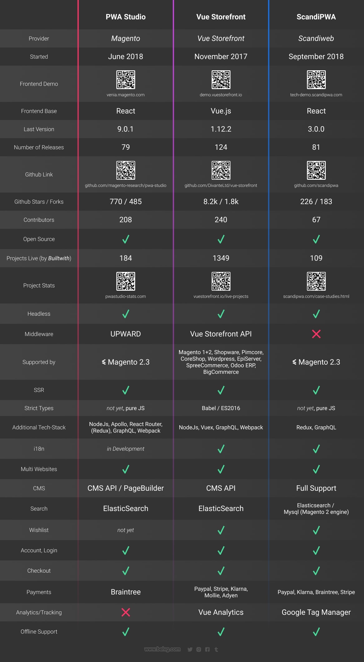
Here we are going to discuss three growing open source PWA solutions. We will look through their advantages and disadvantages, highlighting the functionality that differs them from one another in a positive or negative way. First, you can take a look at some basic info about Vue Storefront, ScandiPWA and PWA by Magento.
Vue Storefront PWA
Demo: demo.vuestorefront.io
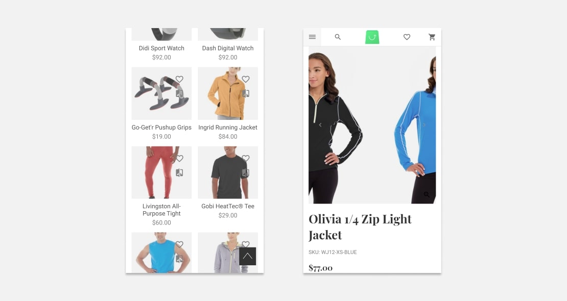
All in all, this demo does not fully take advantage of the PWA functionality keeping the functionality similar to a regular website.
- When scrolling down the catalog, the menu is hidden. And besides the menu, the website does not provide a user with other interactive elements. It is common for a website working in a browser, but in this PWA, there is no browser’s status bar and a user is not able to switch tabs. It causes a lack of control. There is enough interface space for extra elements.
- The implementation of the product comparison menu is poor. A user always has to scroll to compare more than 2 products.
- When you actually access the compared products, getting back to the initial menu is difficult because the functionality is implemented on a single tab. It does not cache and requires coming back to the menu for additional operations.
- Swiping works well but we would not pay much attention to this function as it is the necessary minimum.
- It is not possible to return to the previous page using just the provided interface. The Apple users would have to go back through the menu and further to the categories. In mobile apps, it works via the division into sections, each of which is responsible for a category. One of the good examples of this function is music streaming services like Spotify where the user progress is stored on the tabs. From the main page, a user can open a page with songs of a certain artist and then use another tab for search. In the meantime, a user does not lose the progress on the main tab but just switches between them. The navigation is the key there.
- There is no add to cart button at the category page (at the product page only).
Shopping cart
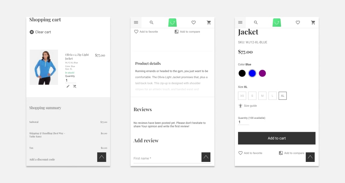
All the basic functions of the shopping cart work well. However, the product quantity selection and the product configuration are different from those on the other pages. It is difficult to click on them and there are no useful buttons.
Product page
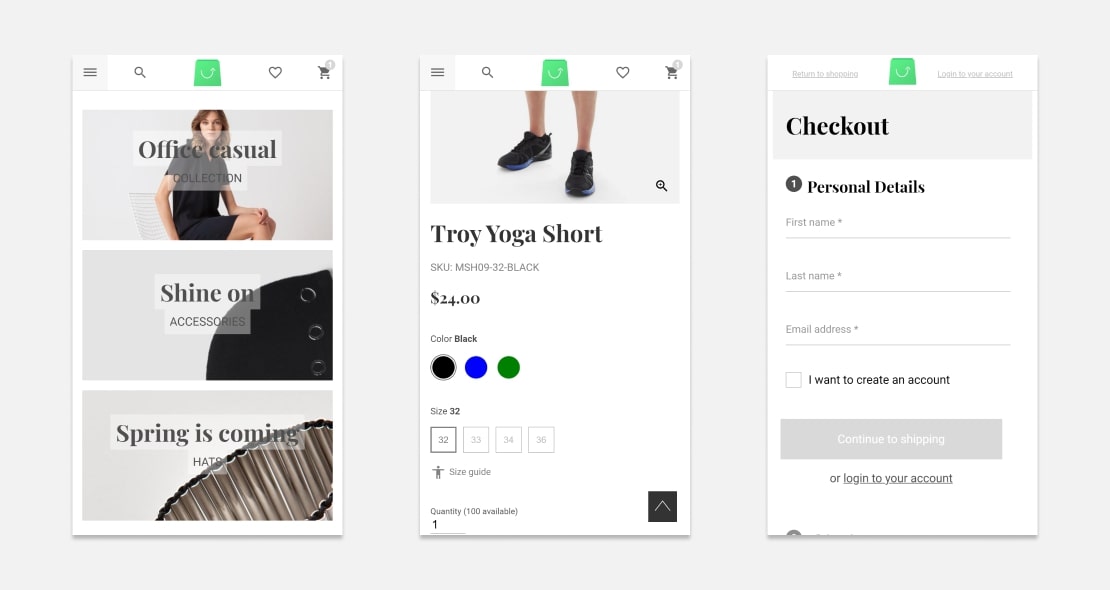
- It would be better to add a spoiler for the product information. It is not the best strategy to wait for a user to figure out to click on the element – all the interactive elements should be highlighted, for example, with an icon.
- The text content is quite small as well as the interface. The page stands out from the others.
Switching to the PWA paradigm, the design of this demo keeps using the same web patterns. The key PWA advantages are storing the data, working with an unstable internet connection, using the key interface elements as in a native app installed from Google Play or App Store. We don’t have it in this demo as it is almost a copy of the website’s functionality. It would not be a minus if the goal were not different.
The conclusion is that just creating a manifest and using service workers would not create a PWA from a website. Some good PWA examples are the sites of social networks like Twitter or restaurants delivering food. In many ways, they allow bridging the gap between “using a site” and “using an app”. In design, such sites are guided by mobile interface and functionality.
Venia Magento PWA Storefront
Demo: venia.magento.com
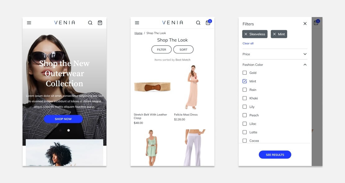
This demo is similar to the previous one in the way that it has not gone far from the desktop version. However, at the same time, it has convenient interface elements such as buttons.
- There is no comparison function.
- There is no Top button anywhere. It’s impossible to immediately move to the top of the page.
- The sorting function is well-built and user-friendly even on the smaller screens.
Product page
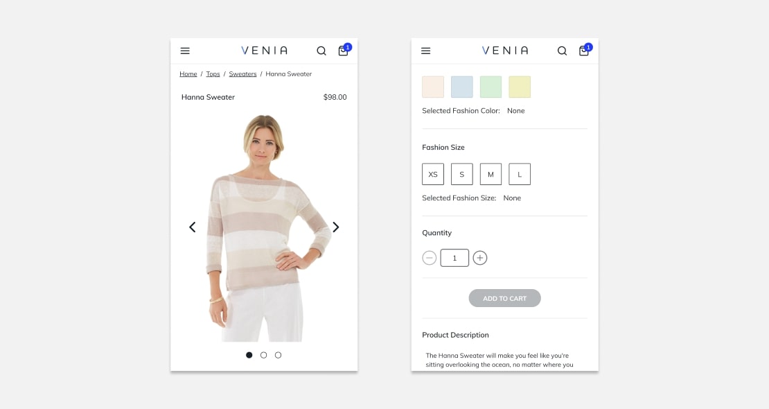
- The breadcrumbs allow returning to the previous page. The functionality is equal to the functionality of a regular website without using the functionality of a mobile app.
- At the bottom of any product category page, the links to Account, About Us, Help are unclickable.
- At the Home->Accessories->Jewerly section, the product price is 0,00. It is possible to choose the number of items there but adding to cart does not work. There is no valid error message about it.
Shopping cart & transactions
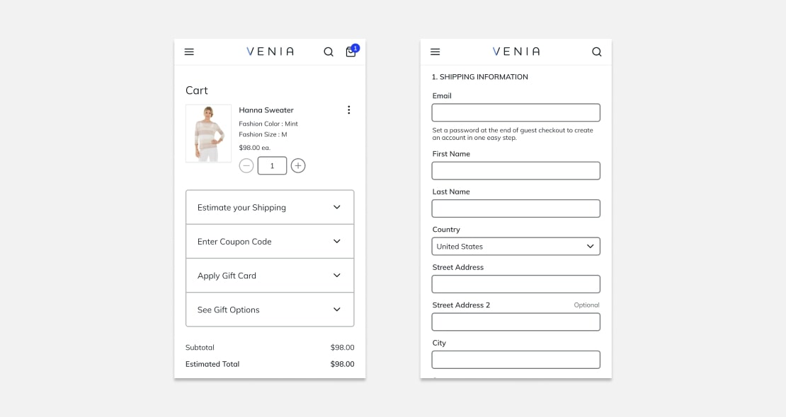
- A user cannot return to the previous page from the shopping card, using just the provided interface.
- The text content blocks are framed into a spoiler.
This demo has a user-friendlier interface compared to the previous one. However, the PWA’s potential has also not been realized here. It uses the same patterns as a regular website and the functionality is implemented on the main screen without division into the tabs. There is also no functionality separation: catalog, search, user account, shopping cart etc.
ScandiPWA
Demo: tech-demo.scandipwa.com (scandipwa.com/demo)
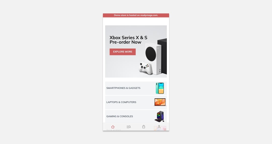
The main difference and advantage of this demo is alternative navigation. It is closer to mobile design.
The functionality is separated into 4 sections: main (and a catalog), search (and a current session), shopping cart and a user account. There is a minimum for a parallel interaction with different sections.
Disadvantages:
- In some cases, the interface elements (buttons, text content blocks) are too small;
- The logic of functionality separation is quite narrow and not intuitive.
Main section & its functionality
- The function of the main section seems to be the navigation but it is also the function of the search section. It means that there is no other function for this section but for “linking”. The functionality of navigation and interaction with the catalog would be better not to redirect to other sections. It interferes with their intuitive logic mixing it all.
Search section & its functionality
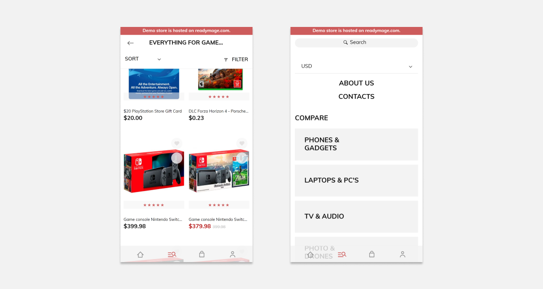
Besides its main function, the search section deals with displaying the comparison of the selected items, acts as a catalog and displays an item. The last function would fit better in the main section as otherwise there is a mix of functionalities with different functions.
Three modes of the search section:
- Regular mode. It is displayed when clicking on the section icon as long as there were no categories selected in the main section. In other cases, it is displayed when clicking on the section icon twice to return to the original mode. The functionality of a regular mode is searching and displaying the search results and product pages.
- The comparison mode. It is a mode for displaying the selected products. To call this mode, a user needs to open the search section in a regular mode and then go to the “compare” subsection.
- The catalog displaying mode. It displays the subsection selected in the main section with further interaction. We think it is the controversial functionality as the search section’s main function is the search and the extra function is product comparison. In this case, there is also another one – the catalog function. It means that the main section does not provide any other function but for linking to the other sections without changing its own mode in any way.
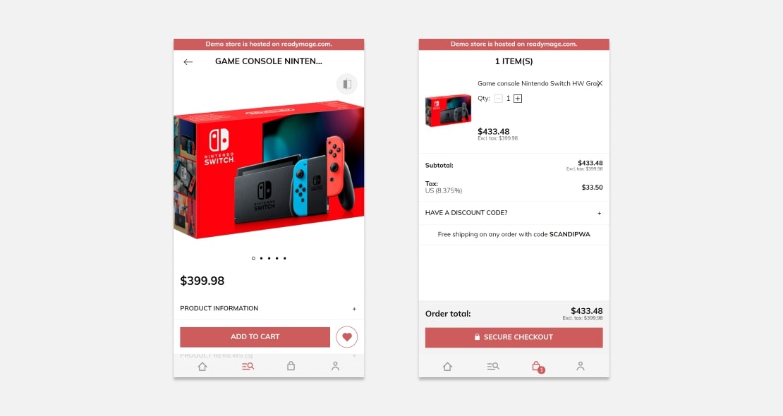
The examples of pages displaying a product in the search and shopping cart sections. (The notion “page” is incorrect for a mobile app. So it should be called section or screen).
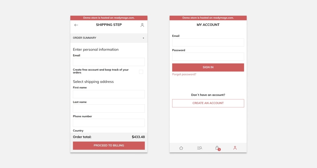
Transactions & user account screens in the incognito mode
Such design type when the functionality is implemented not by the pages but by the sections makes the functionality broader. It happens not because of the number of tabs in a browser but because of combining the functionality of tabs into sections with faster operations and switching between them. This demo implements the PWA ideas better than other solutions.
But there is a but. If the interaction with multiple tabs in a mobile browser was convenient, there would be a growing trend on rethinking this way of interaction.
Conclusion
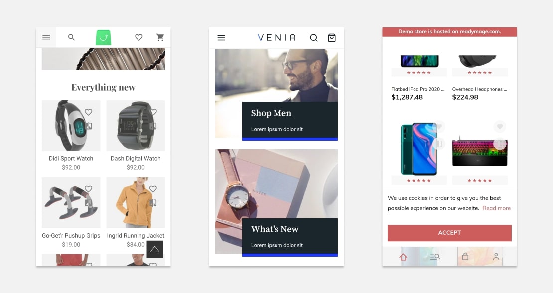
The Vue Storefront PWA and Venia Magento PWA storefront are still websites even though they are displayed outside of the browser. They stick to the “page” logic assuming that a user will open the necessary number of tabs and keep working. However, outside of the browser ecosystem, there is no such functionality. ScandiPWA solves this issue relying on a strict functionality separation and its organization into sections.
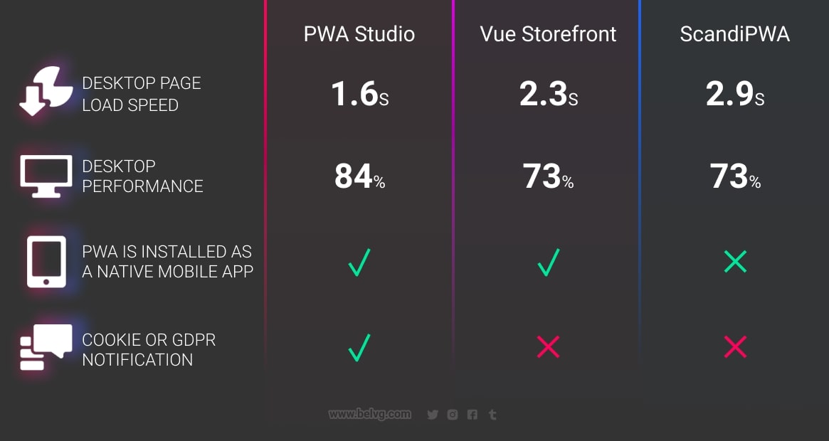
However, the PWA paradigm is not only about implementation out of a browser. It involves using an extra storage, notification functionality and working with the saved data in case of connection issues. Perhaps, in subsequent specifications, the browser ecosystem will obtain a permission to accept calls and send messages, work with a camera and other already installed apps having access to them. The PWA story will not end on displaying a website outside of a browser.


