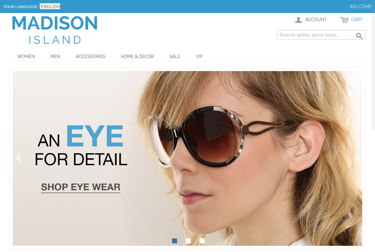
The recent Mаgentо 1.9 release included a new theme, which, unlike the old one, ideally suits both desktop and mobile devices. The theme also includes such popular modules as Interactive Slider and Ajax Cart – they have also been optimized for mobile devices, which makes your store available for a large number of users under any device.


Here is a sample of the code, which turns page header into grey color on mobile devices (which screen width is 400px max):
|
1 2 3 4 5 |
@media only screen and (max-width : 400px) { .page-header { background: gray; } } |
This way you can optimize your design for any device. Here are examples of how this can be used for Iphone and Ipad:
|
1 2 3 4 5 6 7 8 9 10 11 12 13 |
/* iPhone */ @media only screen and (min-device-width : 320px) and (max-device-width : 480px) { .page-header { background: red; } } /* iPad */ @media only screen and (min-device-width : 768px) and (max-device-width : 1024px) { .page-header { background: blue; } } |

Partner With Us
Looking for a partner to grow your business? We are the right company to bring your webstore to success.
Talk to Andrey


