
Today I’m going to explain how to animate your website by CSS3 hover-effects, that are activated upon mouse hover. We will consider a case based on Theme configurator (themeconfigurator) default module in Prestashop 1.6 theme. And this article is dedicated to such CSS-properties as transform and transition, that you can easily apply in your webstore.

Smooth moving and scaling of blocks, tilts and rotations: it is very simple to implement all of these transforms in default CSS by the transform property.
To get more details about CSS3 transform property you can in specification on W3С official site.
And get more information about CSS3 transform browsers and syntax support you can on the Can I Use page.

CSS transform allows us transform different elements in 2D and 3D dimensions.
So in our case we will use 2D transformation: translate and scale.
Transform function: translate
This transform moves the element in both the X and Y directions.
Syntax:
transform: translate(x, y);
As you can see, these two values are just listed separated by a comma, besides these two could have different units of measurements: px, %, em.
At first let’s have a look at coordinate system in which this object is placed. The key feature is that Y-axis is directed downward, because a web page starts from upper-left corner and goes down.
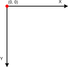
For X-axis: positive value moves it to the right, negative — to the left.
For Y-axis: positive value moves it downwards, negative — upwards.
As you can see negative values moves element in the opposite direction.
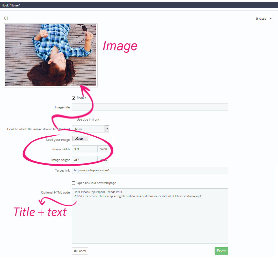
Here we modify an image size and add some title and text on our banner. Now it’s turn to add some movements:
Example #1
|
1 2 3 4 |
#htmlcontent_home .item-link:hover h2 { -webkit-transform: translate(0,-40px); transform: translate(0,-40px); } |
The first movement we are going to perform is vertical. We will move objects up, and in our case it’s a text.

PrestaShop Support & Maintenance
Take your online store to the next level with BelVG PrestaShop Support & Maintenance
Visit the pageThis function will move the object upwards by 40px in Y direction. Please make a note that there were used negative values of transformation to move the object upwards.
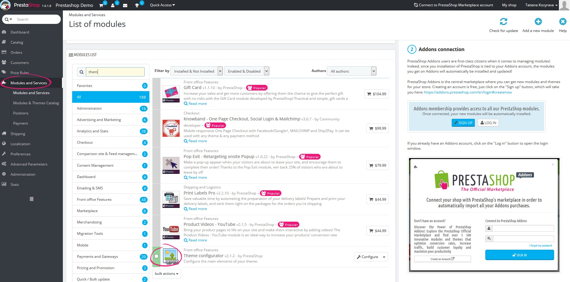
Please navigate in Admin Panel to Modules and Services -> themeconfigurator in admin panel to open the Theme configurator module.

Transform function: scale
This function specifies element’s vertical and horizontal scaling.
Syntax:
transform: scale(x, y);
The value that exceeds “1” – increases element scale, less than “1”- decreases element scale.
And here are coordinates are specified in parentheses:
- Number: X-axis scaling
- Number: Y-axis scaling
Please note that these parameters are not amount of pixels, each number is a full width or height of an object:
- 1 – no size modification;
- 1.5 – size will be increased by 1,5 times on width or height;
- 2 – size will be increased by 2 times on width or height;
- 3- size will be increased by 3 times on width or height;
And so on…
Example #2
Let’s add image scaling.
|
1 2 3 4 5 6 7 8 9 |
#htmlcontent_home ul .htmlcontent-item-2 img { -webkit-transform: scale(1.15); transform: scale(1.15); } #htmlcontent_home ul .htmlcontent-item-2:hover img { -webkit-transform: scale(1); transform: scale(1); } |

CSS transition allows you control the animation speed in order of CSS properties are modified.
Instead of the instant appliance of this property, you can add some dynamic, i.e. all the transforms will take some time.
You can find the CSS transitions property specification on the official W3С website.
And get more information about CSS3 transform browsers and syntax support you can on the Can I Use page.

Example #3
Let’s modify element color and apply some darkening upon the hover. And this color changing should be performed during the certain time interval.
Syntax:
|
1 2 3 4 5 6 7 8 9 10 11 12 13 14 |
.example { transition: [transition-property] [transition-duration] [transition-timing-function] [transition-delay]; } #htmlcontent_home ul .htmlcontent-item-3 img { -webkit-transition: opacity 0.5s, -webkit-transform 0.5s; transition: opacity 0.5s, transform 0.5s; } #htmlcontent_home ul .htmlcontent-item-3:hover img { opacity: 0.4; } |

Example #4 and #5
Let’s apply background brightening upon the hover, smooth appearance of a text and image scaling by all the properties listed above.

All the styles of effects are stored in the themes/default-bootstrap/css/global.css file.
Every block has its own class: .htmlcontent-item-1, htmlcontent-item-2, etc.
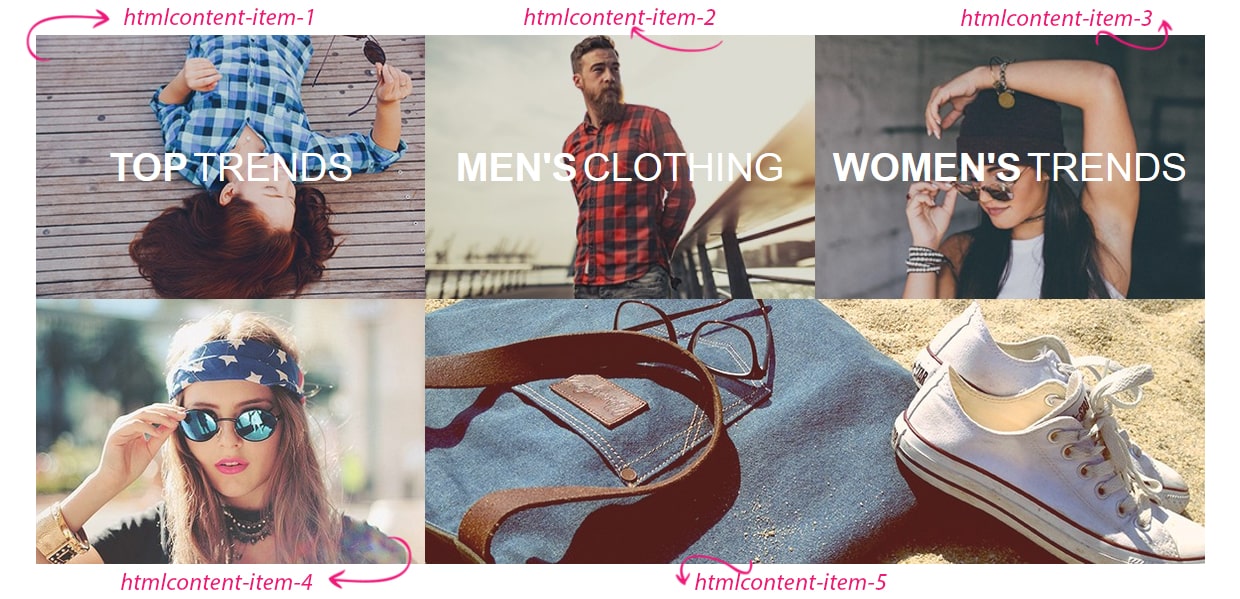
You can download zip-file with already modified files of the default scheme.
Here you can check the demo.
In this article we covered just few examples of CSS3 hover-effects. To explore others properties more in details you can on the official site: https://www.w3.org/
Feel free to make your website more interesting for visitors and use various hover-effects. I really hope that this article was helpful for you and now you can start to test out new features of CSS3.

PrestaShop Development
Take your online store to the next level with BelVG PrestaShop Development
Visit the page


