


The header is the first thing a visitor sees on your website. It usually includes a logo, navigation, search, shopping cart, list of services and shops, live chat, etc. All these elements are meant to capture attention and improve the user experience.
There are also special notifications, discounts, delivery info, and so on. As a store owner, you can also analyze your traffic, detect the most popular pages and queries among your visitors, and place the corresponding elements at the forefront of your online shop.
In this article, I will show you the most common header elements and explain their meaning, effects, and positions.
Table of contents:
Pricing
Background
Logo
Search
Navigation menu
Special offers
Pricing
A great example of a pricing element is a “Get Pro Pricing” block at the build.com website.

Free delivery on orders of $399 holds a significant place at the Sears.com website.

Background
At the crutchfield.com webstore, the header background is a satisfied client’s photo gallery; this move is great for immediately establishing a relationship of trust with the visitor.

Magento 2 Migration
Take your online store to the next level with BelVG Magento 2 Migration
Visit the pageLogo
The logo is conventionally positioned in the upper-right corner or in the middle of the header. Make sure your logo stands out and place a slogan below – this way, a logo and a slogan will work together for your brand promotion. It has also become a common practice to make the logo clickable, leading to the homepage.

Search
About 30% of online users use the webstore search bar to find a specific product. If you are certain the visitors know what to search for at your webstore, make a search bar a prominent element of the header.

On the other hand, if the analytics show your customers prefer to search for items in the catalog, design a smaller search bar. Also, don’t place it near other input fields, like login/password. Moreover, a big Search button is, in any case, better than a small search icon.
If your store includes autocomplete or search suggestions, make sure they display relevant products and categories. Features like these can reduce the number of clicks required to find an item, making product discovery more efficient.
Navigation menu
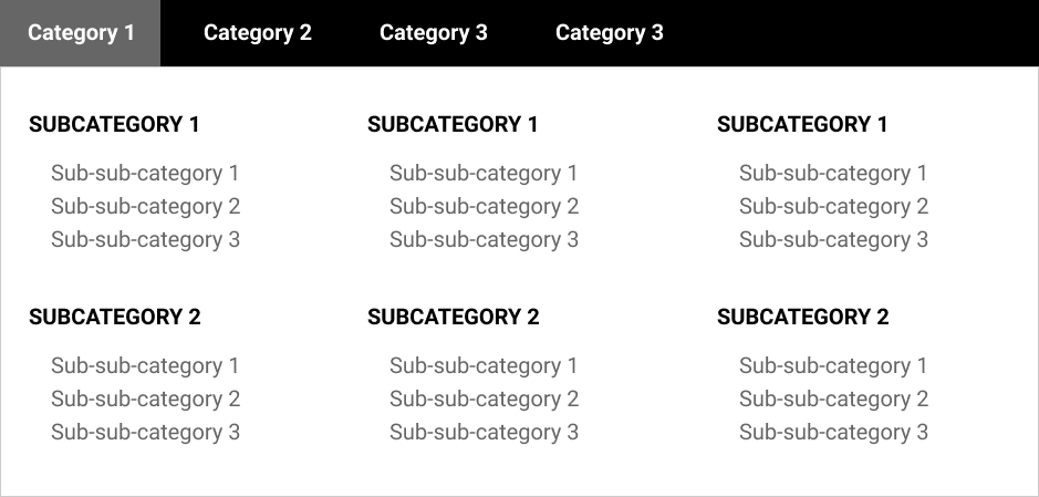
The menu structure should be clear and have a strict hierarchy. Divide your merchandise into categories and subcategories to make the search process more intuitive for your customers. Also, create a drop-down menu based on categories and subcategories.
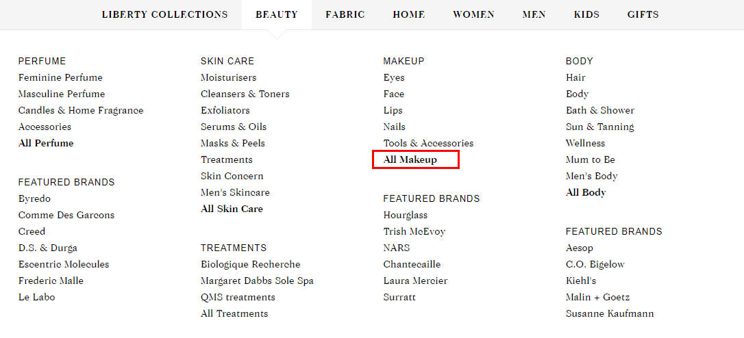
It is also crucial to give your customer the chance to select all categories. In the example below, you can see among the subcategories a noticeable All Makeup link.
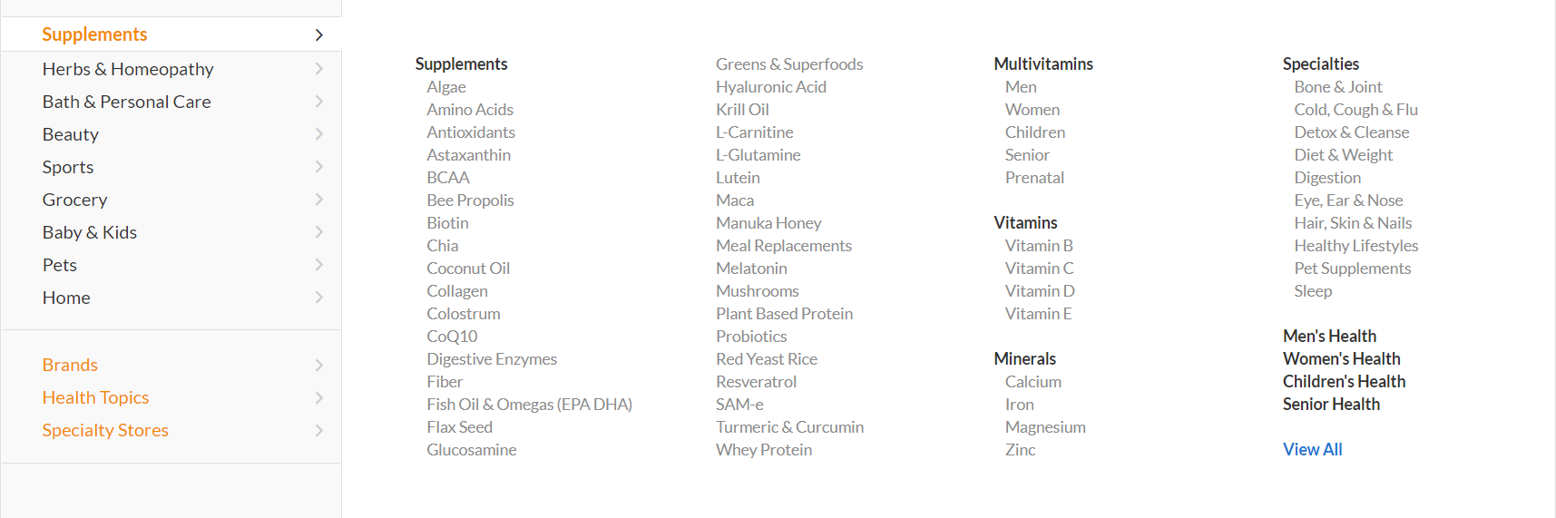
The drop-down menu should be easy to comprehend so that the user can find the needed section at first glance. Yet in case you have a large number of subcategories and categories, you must stick to a megamenu (see the example below). This way, the visitor won’t need to scroll to see all the sections.
Special offers
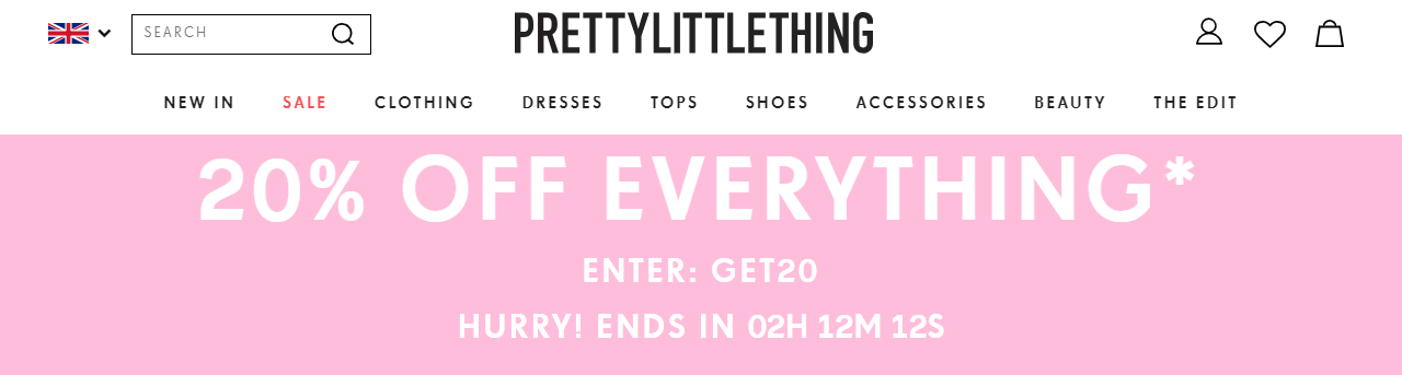
You have 10 seconds of a visitor’s attention, so try to make the most of it. In particular, place the information about the latest or seasonal discounts and special offers to spark customers’ interest. Below is an example of this practice.

Another example – this website allocated a large space from the header to announce a 20% discount on every item in the store.
Wrapping it up
As you can see, there are a large number of header design combinations out there. The main point is to analyze and interpret visitors’ behavior accurately and get inspired by the best examples.
Since a large share of ecommerce traffic now comes from mobile devices, your header should remain clear and easy to use on smaller screens. Important elements such as navigation, search, and the shopping cart should stay accessible without overcrowding the layout.

Ecommerce Development
Take your online store to the next level with BelVG Ecommerce Development
Visit the page