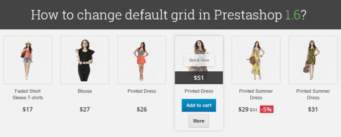
By default Prestashop 1.6 uses grid of 3 products at the category page and 4 products at the homepage. Here is the solution on to change grid on these pages.
Prestashop 1.6 use Bootstrap, so we can change class of the columns.
Open product-list.tpl and find this code:
|
1 2 3 4 5 6 7 8 9 10 |
<li class="ajax_block_product{if $page_name == 'index' || $page_name == 'product'} col-xs-12 col-sm-4 col-md-3{else} col-xs-12 col-sm-6 col-md-4{/if}{if $smarty.foreach.products.iteration%$nbItemsPerLine == 0} last-in-line{elseif $smarty.foreach.products.iteration%$nbItemsPerLine == 1} first-in-line{/if}{if $smarty.foreach.products.iteration > ($smarty.foreach.products.total - $totModulo)} last-line{/if}{if $smarty.foreach.products.iteration%$nbItemsPerLineTablet == 0} last-item-of-tablet-line{elseif $smarty.foreach.products.iteration%$nbItemsPerLineTablet == 1} first-item-of-tablet-line{/if}{if $smarty.foreach.products.iteration%$nbItemsPerLineMobile == 0} last-item-of-mobile-line{elseif $smarty.foreach.products.iteration%$nbItemsPerLineMobile == 1} first-item-of-mobile-line{/if}{if $smarty.foreach.products.iteration > ($smarty.foreach.products.total - $totModuloMobile)} last-mobile- line{/if}"> |
We need these – columns classes:
|
1 2 |
{if $page_name == 'index' || $page_name == 'product'} col-xs-12 col-sm-4 col-md-3{else} col-xs-12 col-sm-6 col-md-4{/if} |
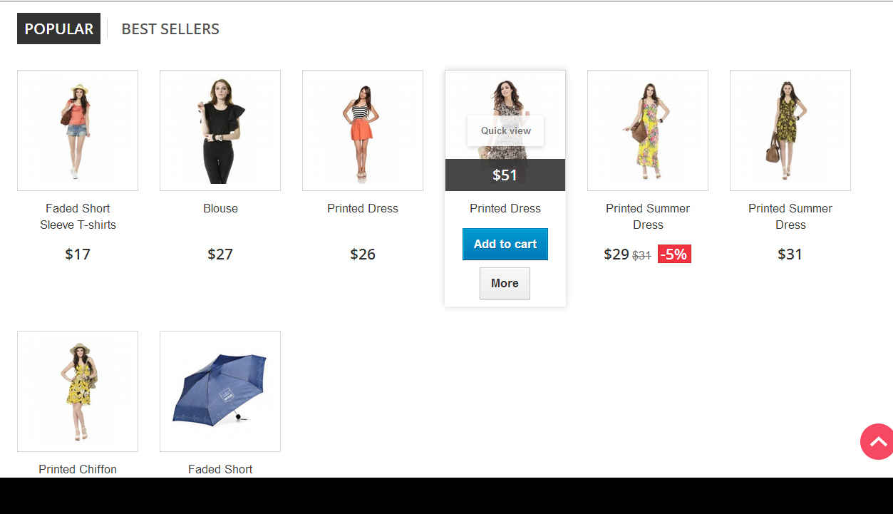
For homepage change class col-md-3 to col-md-2, and you’ll get 6 columns grid.
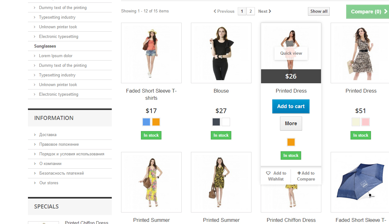
For category page change class col-md-4 to class col-md-3, and you’ll get 4 columns grid.
You can change column class to any you need.
Don’t forget to change number of products per line:
|
1 2 3 4 5 6 7 8 9 10 |
{*define numbers of product per line in other page for desktop*} {if $page_name !='index' && $page_name !='product'} {assign var='nbItemsPerLine' value=4} {assign var='nbItemsPerLineTablet' value=2} {assign var='nbItemsPerLineMobile' value=3} {else} {assign var='nbItemsPerLine' value=6} {assign var='nbItemsPerLineTablet' value=3} {assign var='nbItemsPerLineMobile' value=2} {/if} |
For correct list view find js/global.js and change the class for list view:
|
1 2 3 4 5 6 7 8 9 10 11 |
function display(view) { if (view == 'list') { $('.product_list > li').removeClass('col-xs-12 col-sm-6 col-md-3') .addClass('col-xs-12 col-sm-6 col-md-12'); } else { $('.product_list > li').removeClass('col-xs-12 col-md-12').addClass('col-xs-12 col-sm-6 col-md-3'); }} |
Prestashop 1.7
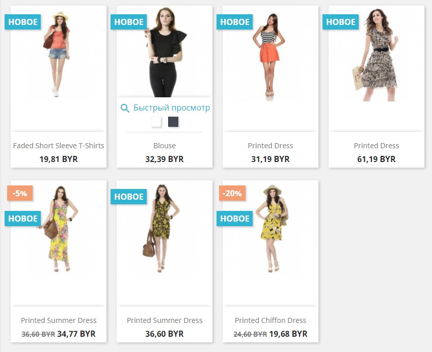
In Prestashop 1.7 as well as in its previous version 1.6 there are 3 product columns for category page and 4 columns for homepage. But there are some differences in implementation. In Prestashop 1.6 bootstrap classes are used (which is described above in details), while in Prestashop 1.7 everything is done with CSS styles. Moreover, in Prestashop 1.7 “display: flex” is applied to create a grid for product list block, and the block width is specified for the product list. Since the width of container block (or product list block), as well as the width of product block, has specified value, the number of products in a row depends on the container block (3 for category page and 4 for homepage). Default width of product list block is 257 pixels (and this is for category page as well as homepage). In order to change the number of products in a row, we should alter the product block width.
As an example, let’s try to carry out it on the category page (for homepage and other pages where there’s a product list, it will be the same). We’re going to create not 3, but 4 products in a row.
In the style file (make sure the file is attached after the file “/themes/classic/assets/css/theme.css”) we should specify the width of product block (according to the container width it will be 188 pixels).
|
1 |
"#products .thumbnail-container {width: 188px;}" |
But it’s not enough for us. Since we’ve changed the block width, we’ll have to change the style of the elements placed within the block.
|
1 2 3 |
"#products .highlighted-informations {width: 188px;}" "#products img{width: 100%; margin: 0;}" "#products .product-description {width: 188px;}" |
Primarily, the product list looked that way:
After settings are implemented, it will look like this:
Improve your customers’ experience with this Product Hover module for PrestaShop.




Hi Rafael
Try to set width in css styles.
Hola Lena, en la página de categorías ha funcionado bien, algunos ajustes de botones pero sin mucha importancia; el problema es como lo consigo en la pagina de inicio, que aparezcan cuatro productos mas la columna izquierda, muchas gracias
webhoster, not sure I clearly understand your question, but you can simply change the gap in styles
Hi very nice instruction — however i have a question how to make the gap between the product container or maybe non at all so that it get closer together (divided only by line) and i can display more products
Dear Ali,
the issue is pretty complicated. Unfortunately, it’s not possible to provide a qualitative answer without getting into details.
Please contact our support department in case you need an individual consideration of the matter: [email protected]
We’ll be happy to assist.
Hi Lena;
Thanks for your advanced advices, help much.
I have some unsolved problem about product display on home page.
As you can see, featurated products are displaying 2 products per arrow/line which I do not want to display in that way. I want them to be displayed 3 products per arrow as the same display in category page. If you click on one of the categories on the left column you can see that products display by 3 per arrow but not on home page. Whatever I tried to solve this I failed, never worked.
Please help me to solve this problem before I hurt myself.
Thanks,
hi
in prestashop 1.7 when I make it to be 6 products per row, each product box looks too high (as compared with the width). Also when I insert the add to cart and quantity fields on each product, the add to cart button is too big. How can I add those 2 objects (add to cart and quantity) on each product when there are 6 products per row and how to make decrease the height of each product so it will look more in proportion?
thanks in advance
Thank you, Ben!
Subscribe to our blog to stay tuned :)
i say it in french
C’est exactement ce que je cherchais
et ca marche parfaitement
Merci bcp
Hi Enda, you need to modify product-list.tpl file. Here is an example of modified grid in our template: https://module-presta.com/craft-prestashop-1-6-responsive-template.html
Thanks lena.
Where is link for modify the product ?
Do you have sample website from ur project.?
how to display 6 products in prestashop 1.7 version
thanks
Hi Enda,
In 1.7 version you are free to use any instruments to achieve 2 columns, you may use bootstrap col-xs-6 class, or use flexbox, or create your own grid.
Hello,
i want make 2 columns in presta 1,7 mobile version. but i dont know coz i check 1,7 not same like version 1,6.
thanks
The tutorial works fine, but if you are trying and you did’t see changes, you need to delete all objects( except index.php) from “cache/smarty/cache” and “cache/smarty/compile”
Hi, thanks for the help. But it´s not worked here.
I did change de product_list.tpl (“col-md-2”) for homepage, and did change the global.js. When i whatch the files on ftp, they are exacly how you said to do up here. But when a see the homepage, the product list is still like this: “col-md-3”. So, it’s still showing 4 products per line. Is any more change to do?
Thanks Caue
How for mobile version, home future 2 colom??? please help me
How can i show more of 8 products there (in homepage)?..
Good afternoon, Lena and thank you so much for all your advises :)
i do all you said and all is working .. (i mean… 6 products at the homepage and 4 products at the category)
But… exist a little problem .. (at the homepage)
Now
I can see 6 products .. in the “first line” (and that’s good)
but..
I see “2 products only” in “the second line” (I cannot see 6 products like the first line)
Thank you for reading these lines and waiting your answer
Have a good day
:)
none of this works. changing the grid view messes up the list view and visa versa.
JJ, just make sure that you have changed col-md-3 to col-md-4 if you want 3 columns grid. Here is a description of how bootstrap grid works: http://getbootstrap.com/css/#grid
Marianne, thanks! Glad that my articles were helpful!
Dear guys,
I want to have 3 instead of 4 products on the productpage.
Can someone please sow me how to do ? (i can find the product-list.tpl and js/global.js and changed every md-4 into 3 but nothing changes :(
Hi Lena,
It is the second time I read one of your articles to fix some slight container’s issues on my shop.
Just like the last time I read your advice, I found a solution I had been looking for days and nights !
I do not often comment on articles, but this time I had to.
Thank you for all the time you spend on writing these helpful article, you’re my prestashop hero ! haha
Have a nice day !
@mohammad, do you use smarty caching on your website?
hi there
i do all you said but unfortunately it is not working anyway
my website is: http://www.20look.com
my problem is that by changing col-md-3 to col-md-2 for home page but in inpec of chrome it is still stay col-md-3 again!!!!
i dont khnow where is the code that it follow of it
It worked for me.. Thanks a lot and God will bless you for this tutorial!
Thanks
thank you. I have gained two hours to live
Marco,
Prestashop theme uses bootstrap grid, so it’s only availbale 12, 6 , 4, 3, 2, 1 products per line.
Paul,
Try to disable cache in the backend.
Hi Lena,
It worked for me perfectly. Can you tell me please how I can do if I want to show 9 or 10 or 11 products per line?
Thanks in advance
I tried that and it still only shows 3 products across the product grid page. Any ideas?
{assign var=’nbItemsPerLine’ value=4} in this line you should change to value=6. Because you wrote col-md-2 class
Hi
I made the changes to the product-list.tpl but not to the global.js as I want the list view to stay as it is. All I wanted to change was the Grid View of the products to 4 cross instead of 3.
Any ideas on where I’m going wrong? I’m using ver 1.6.1.4
Thanks
———–
{if isset($products) && $products}
{*define number of products per line in other page for desktop*}
{if $page_name !=’index’ && $page_name !=’product’}
{assign var=’nbItemsPerLine’ value=4}
{assign var=’nbItemsPerLineTablet’ value=2}
{assign var=’nbItemsPerLineMobile’ value=3}
{else}
{assign var=’nbItemsPerLine’ value=6}
{assign var=’nbItemsPerLineTablet’ value=3}
{assign var=’nbItemsPerLineMobile’ value=2}
——
<li class="ajax_block_product{if $page_name == 'index' || $page_name == 'product'} col-xs-12 col-sm-4 col-md-2{else} col-xs-12 col-sm-6 col-md-2{/if}
————–
Elmar,
In 1.6.1.4 version this code is in the same place as previously, it’s a class of
tag.
Hello,
I work with Prestashop 1.6.1.4 but i can’t find the following lines..
CAN’T FIND IN PRODUCT-LIST.TPL:
{if $page_name == ‘index’ || $page_name == ‘product’} col-xs-12 col-sm-4 col-md-2{else}
col-xs-12 col-sm-6 col-md-3{/if}
Is there something change in the newest versie?
I FIND ONLY THIS LINES:
{if $page_name !=’index’ && $page_name !=’product’}
{assign var=’nbItemsPerLine’ value=7}
{assign var=’nbItemsPerLineTablet’ value=2}
{assign var=’nbItemsPerLineMobile’ value=3}
{else}
{assign var=’nbItemsPerLine’ value=8}
{assign var=’nbItemsPerLineTablet’ value=3}
{assign var=’nbItemsPerLineMobile’ value=2}
But i see the same, it doesn´t change i still seeing 4 item per row
Any help please?
Tnx
Everything works allright but the modification for the list view, that need further explanation. Here is.
You have to find the function display (view) and do the following:
function display(view)
{
if (view == ‘list’)
{
$(‘.product_list > li’).removeClass(‘col-xs-12 col-sm-6 col-md-3’)
.addClass(‘col-xs-12 col-sm-6 col-md-12’);
modify ONLY the previous line, changing md-4 for md-3. Let the rest of the function untouched
…
(rest of the code untill the else, untouched)
…
}
else
{
$(‘.product_list > li’).removeClass(‘col-xs-12 col-md-12’).addClass(‘col-xs-12 col-sm-6 col-md-3’);
…
do the same, change 4 for 3 in the previous line. Let the rest of the code untouched
…
}
}
Perhaps this litle explanation will help somebody, I hope so.
worked like a charm! Thanks Lena
Hi.
I did everything like you show but nothing happens. I still having 4 colums on hompage and 3 columns on categories page.
I d’ont know wath is wrong. I re-create de thumbnails too in admin panel, and nothing changes.
my presta version is 1.6.0.11
thanks
Borja, you had to change the class of bootsrap grid:
For correct list view find js/global.js and change the class for list view:
I have a problem.
i did all you say but i don´t see any change
how its possible?
I change the document /themes/default-bootstrap/product-list.tpl
{if $page_name !=’index’ && $page_name !=’product’}
{assign var=’nbItemsPerLine’ value=7}
{assign var=’nbItemsPerLineTablet’ value=2}
{assign var=’nbItemsPerLineMobile’ value=3}
{else}
{assign var=’nbItemsPerLine’ value=8}
{assign var=’nbItemsPerLineTablet’ value=3}
{assign var=’nbItemsPerLineMobile’ value=2}
But i see the same, it doesn´t change i still seeing 4 item per row
Any help please?
for correct GRID-LIST
you must change values in /js/global.js too:
function display(view)
{
…
$(‘.product_list > li’).removeClass(‘col-xs-12 col-sm-6 col-md-3’).addClass(‘col-xs-12’);
…
$(‘.product_list > li’).removeClass(‘col-xs-12’).addClass(‘col-xs-12 col-sm-6 col-md-3’);
…
how to open the root in presta shop
I tried this. It worked exactly as promised. Until I selected the list mode. Then that area of the screen got very “confused”. I had to put it back. Have you experienced this? Is there a fix?
Hi using this method works excellent in grid view. However when I switch to list view, everything is messed up…. what do I need to edit to adjust this? Thanks!
Hello
I successfully changed grid in my shop under prestashop 1.6 but when i am clicking on list view in category section i can’t see list view and every thing is meshed up and after that i again click on grid view then it shows the original grid so to bring back modify grid i need to refresh the page so kindly resolve my issue please.
Thank you
Thanks Lena, My shop went live this weekend so not much time for learning/reading at the moment but I do plan to get more into the development side of things when we have settled into a routine, this will be one of the documents I will include :-) thank you for taking the time to explain.
Joe
Hi, Joe,
col-xs-12 col-sm-4 col-md-3 are a Bootstrap grid classes that define number of columns on devices. col-md-3 means 4 columns on desktop, col-sm-4 means 3 columns on tablet and col-xs-12 means 1 column on mobile. Here you can find the whole documentation http://getbootstrap.com/css/#grid
Ha… brilliant, this was just what I needed – I had overflow problems on the home page and wanted it to match the categories page – 4 items per line. I struggled with this for two evenings – changed two characters and it worked.
Out of interest Lena, what are these classes:
col-xs-12 col-sm-4 col-md-3
????
Hi, I’ve already notice what was missing in the case of views: jQuery
In my case: {if $page_name == ‘index’ || $page_name == ‘product’} col-xs-12 col-sm-4 col-md-2{else} col-xs-12 col-sm-6 col-md-3{/if}
In the default-bootstrap/js/global.js —> display(view)
In the if statement:
-List: Change the clases which you’ve alter… $(‘.product_list > li’).removeClass(‘col-xs-12 col-sm-6 col-md-4’).addClass(‘col-xs-12’); ….. so col-xs-12 col-sm-6 col-md-4 —> col-xs-12 col-sm-6 col-md-3
-Grid (else): The same… $(‘.product_list > li’).removeClass(‘col-xs-12’).addClass(‘col-xs-12 col-sm-6 col-md-4’); ….. so col-xs-12 col-sm-6 col-md-4 —> col-xs-12 col-sm-6 col-md-3
Sorry for my previous post I just want to change the code parte:
{if $page_name !=’index’ && $page_name !=’product’}
{assign var=’nbItemsPerLine’ value=6}
{assign var=’nbItemsPerLineTablet’ value=3}
{assign var=’nbItemsPerLineMobile’ value=3}
{else}
{assign var=’nbItemsPerLine’ value=6}
{assign var=’nbItemsPerLineTablet’ value=3}
{assign var=’nbItemsPerLineMobile’ value=2}
{/if}
{if $page_name == ‘index’ || $page_name == ‘product’} col-xs-12 col-sm-4 col-md-2{else} col-xs-12 col-sm-4 col-md-2{/if}
Hi, I’m getting a pretty ugly situation I’ve modified the code as this post but I’ve notice a problem in the views on category:
-Grid view: I’ve clean cache but I don’t know why when change of view the changes don’t show properly (show the default not the modified)
-List view: The products don’t list properly, all are in one line *here something I saw: col-sm-4 col-md-2 on ‘li’ when it should not be there*
{if $page_name !=’index’ && $page_name !=’product’}
{assign var=’nbItemsPerLine’ value=3}
{assign var=’nbItemsPerLineTablet’ value=2}
{assign var=’nbItemsPerLineMobile’ value=3}
{else}
{assign var=’nbItemsPerLine’ value=4}
{assign var=’nbItemsPerLineTablet’ value=3}
{assign var=’nbItemsPerLineMobile’ value=2}
{/if}
{if $page_name == ‘index’ || $page_name == ‘product’} col-xs-12 col-sm-4 col-md-3{else} col-xs-12 col-sm-6 col-md-4{/if}
Hi, I made the change but in my case I notice that there’s still a little problem in the views of category, I tried cleaning the cache but there’s still not showing properly in the grid view (first time showing default configuration, refreshing showing the modified one) and the list view (it looks pretty ugly all in one row). I’m not sure if it’s something I did or something else need to do
{if $page_name !=’index’ && $page_name !=’product’}
{assign var=’nbItemsPerLine’ value=3}
{assign var=’nbItemsPerLineTablet’ value=2}
{assign var=’nbItemsPerLineMobile’ value=3}
{else}
{assign var=’nbItemsPerLine’ value=4}
{assign var=’nbItemsPerLineTablet’ value=3}
{assign var=’nbItemsPerLineMobile’ value=2}
{/if}
{if $page_name == ‘index’ || $page_name == ‘product’} col-xs-12 col-sm-4 col-md-3{else} col-xs-12 col-sm-6 col-md-4{/if}
Welcome.
I am writing regarding changes in the view of the category 4 in the column.
I would add that I was able to do file modification
themes / default-bootstrap / product-list.tpl and themes / default-bootstrap / css / global.css.
1) product-list.tpl line 25
{if isset ($ products) && $ products}
{* define numbers of product per line in other page for desktop *}
{if $ page_name! = ‘index’ && $ page_name! = ‘product’}
{assign var = ‘nbItemsPerLine’ value = 4}
{assign var = ‘nbItemsPerLineTablet’ value = 2}
{assign var = ‘nbItemsPerLineMobile’ value = 3}
{else}
{assign var = ‘nbItemsPerLine’ value = 4}
{assign var = ‘nbItemsPerLineTablet’ value = 3}
{assign var = ‘nbItemsPerLineMobile’ value = 2}
{/ if}
2) global.css line 869
.col-md-4 {
width: 25%; }
The problem is that the view list is reformatted view of the grid.
Is it possible to somehow assign an external style list view.
I’ve included a link to the product. Please see widk category as a list.
As this format?
Please help.?
Edwin,
You forgot to change the number of products per line, that caused white space for 2 products.
Hi, it’s not working properly.. On the new products there 4 products per line and it desapeared after i did this coding (i created a new product and than new products showed up, but 4 per line leaving white space for 2 more products).
Excellent job! Thank you…!
Great but how to make for list result ?
Thank you