Today we’re going to consider one of the most sought-after questions we’re always asked. Despite prospective website owners have a business they successfully run and know all the gimmicks that need to be implemented, there’s an issue left. Owners appreciate the necessity of upgrading their website to get the business flourishing, but can’t comprehend which elements require alteration. That’s why you’re proposed to consider the web shops that belong to the most popular brands and the key elements upon which the sites are based. Today’s topic for discussion is a menu header and search that are considered to be the essential elements of any sites.
Coca-Cola
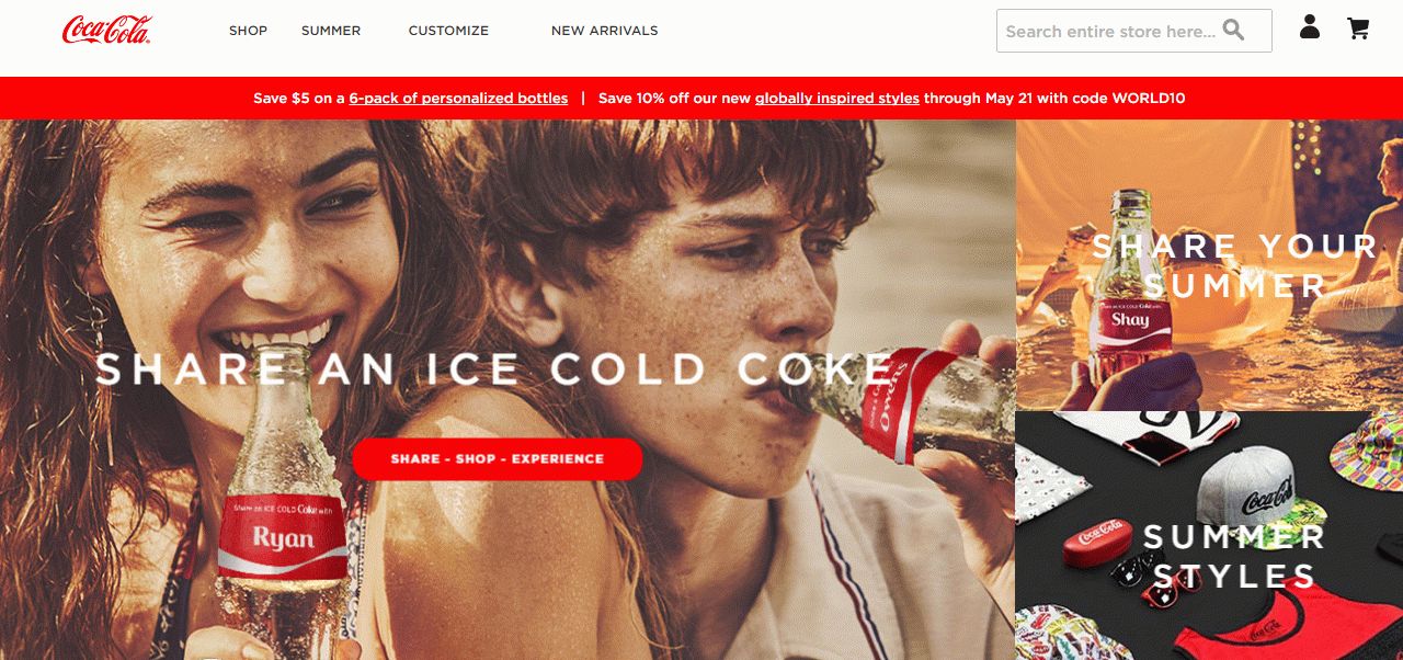
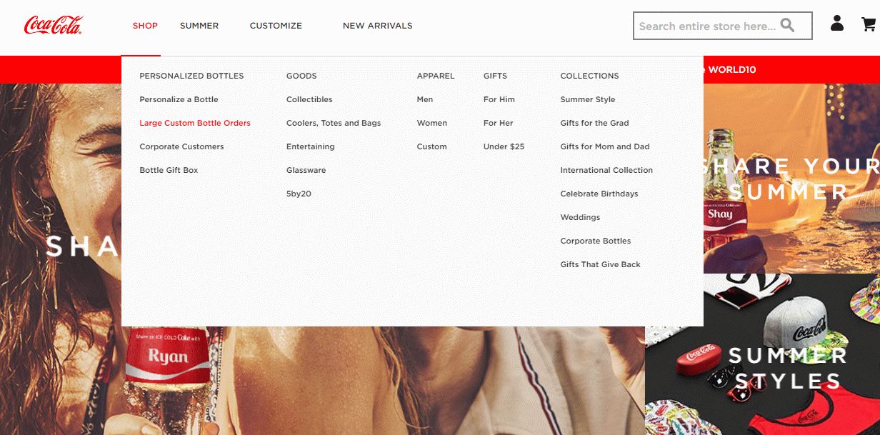
Coca-Cola is supposed to be the most recognizable brand and runs its own web store using Magento platform. Having added all necessary modern features on the web shop, the company did not forget about the menu placed in the site header. That’s why they’ve decided to apply the mega menu to follow trends. Mega menu is considered as a drop-down menu where a large variety of options are contained. They say it is a convenient way to place a wide number of categories. In spite of the benefit, there are more advantages of such a menu you should pay attention to.
The drop-down menu is supplied with submenus that are distinguished by categories. So the menu gets more comprehensible and clearer for a visitor. Besides, it is characterized by accessibility and user friendliness that help reach the needed goal in one click. Moreover, pictures of items can be added to the menu as well. Meanwhile, you don’t need to scroll down to scan the submenus, rather, it is appropriately sized that makes it easy to navigate. On the whole, the menu used on the Coca-Cola website is in compliance with up-to-date standards and looks rather modern.
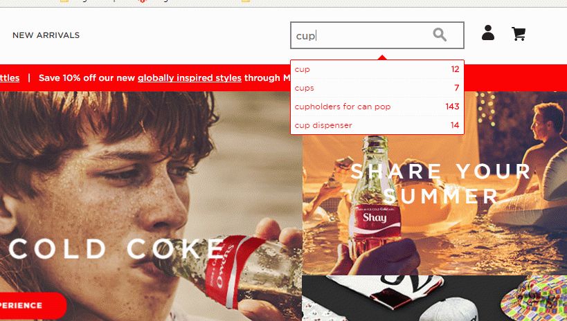
As for the search menu, it is quite well-designed. If needed to find a necessary item, a user should enter the name while pop-up tip appears containing the suggestions according to the query.
Moreover, the number of items with the similar names is shown as well. Actually, such search menu is considered as convenient one, as while query processing in the database, you receive intermediary results, that helps gain time before reaching the goal. All-in-all, the search menu represented on Coca-Cola website can meet customer expectations, but only partially. Would you like to know why? Go on reading the article and you’ll be able to find the answer.
Magento 2 Migration
Take your online store to the next level with BelVG Magento 2 Migration
Visit the pageShiekh
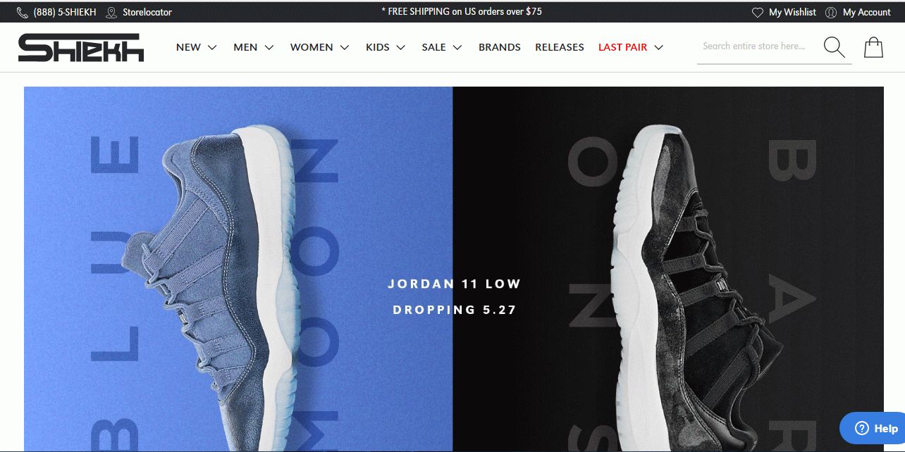
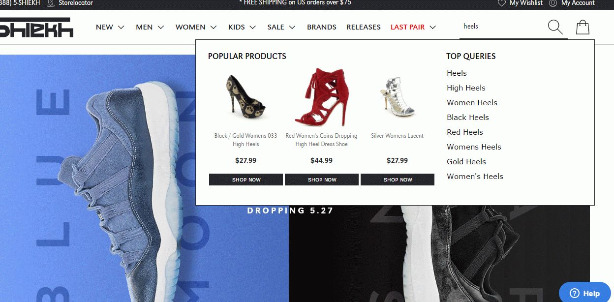
One of the most well-known shoes and clothes brand is Shiekh. Providing customers with the latest fashions, the company has focused on the web store that is run on Magento platform. On the one hand, it fits needs, on the other hands, it guarantees clients to have an amazing shopping experience. But Shiekh doesn’t stop upgrading after it has achieved satisfying results. The elements they’ve paid attention to were menu and search.
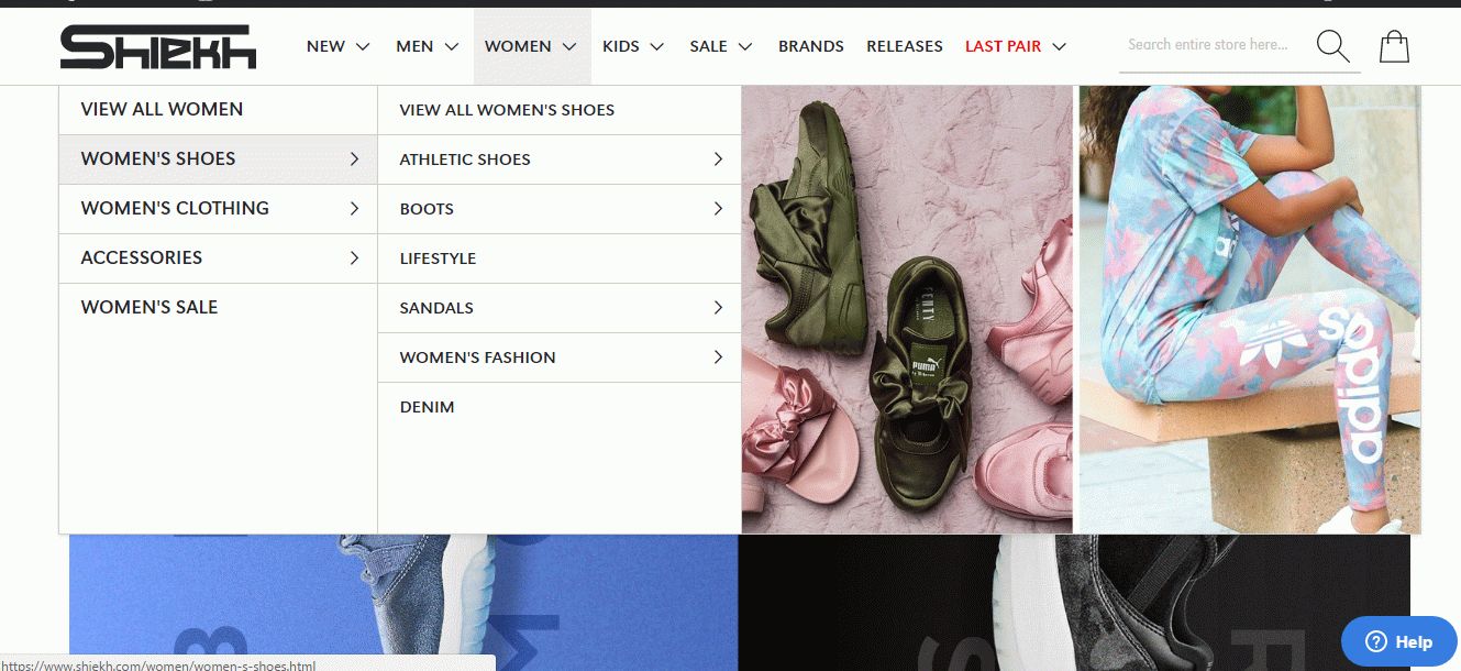
As you can see from the picture above, the menu is similar to the menu Coca-Cola has. This is a so-called mega menu that consists of drop-down menu with submenus and various categories. It is characterized by simplicity as well as ease of use that make the customer experience more pleasant. In fact, Shiekh menu is identical to Coca-Cola menu but there’re some differences. There’s no need to scroll down to scan the submenus, rather, it is appropriately sized that makes it easy to navigate. This benefit is believed to be the most significant. At the same time, Shiekh menu has more submenus with distinguished categories according to which you’re able to find a necessary item in double-quick time.
Besides, the company has decided to use possibilities at full capacity, that’s why pictures have been placed on the menu. It’s a proved fact that visual perception plays a major role, so it is not for nothing that Shiekh focuses on it.
One more remarkable thing is the variety of categories used in the menu. Except the main categories distinguished according to the gender and age, for example, “men”, “women”, “kids”, there are “sale”, “brands”, “releases” and “last pair”. In fact, it is a comprehensible menu that covers all necessary items while getting shopping experience satisfied.
As concerns the search menu, it’s rather up-to-date and convenient. The search is on-line and while entering a needed item, pop-up tips appear and propose you some products before you reach the ultimate result. Moreover, the intermediate result is represented not only by the list of items but also by categories where an item can be found as well as pictures with prices and links to shop. In general, if compare Shiekh search menu with Coca-Cola one, the choice is obvious: the best search menu that can meet all customer needs belongs to the Shiekh company.
Ford
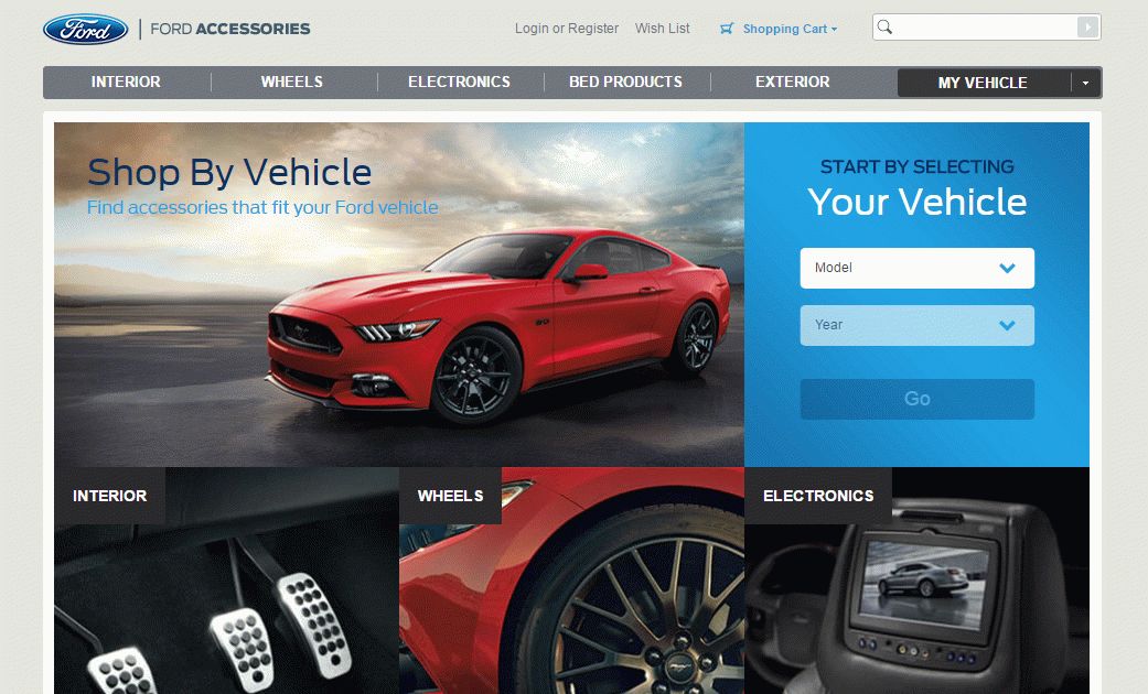
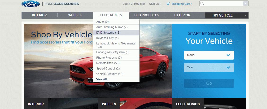
The web store of the well-known auto brand Ford is represented by three main colors that create the atmosphere of men’s territory. On the whole, an impression is rather pleasant, so let’s go deep into the details.
The menu header is partially similar to the previous menus described above. The menu is distinguished into some categories such as “interior”, “exterior”, “wheels”, “electronics”, “bed products” and contains submenus. When the category is chosen and open, there are a lot of subcategories that appear while clicking. In fact, they contain the data about the quantity of present items. But the challenge you may face is the menu is incomplete. There’s the line called “View All” that opens after clicking. Actually, such feature is supposed to be out of date and it’s hard to call it ease of use. Before finding a needed item, a user should carry out the set of actions. Moreover, there’s no separate category dedicated to sale or, for instance, last item. This significant feature produces an unfavorable impression.
All in all, it doesn’t encourage customers to have a pleasant shopping experience.
As for the search menu, it is considered as unusual. Since you click on the menu field to enter the name, but you can’t perform it, as the new window appears. It implies you should select the car model and vehicle manufacture year. After the process is completed, you are shown the items available for your car. As you can estimate, the search is quite narrow and reduces potential results. On the whole, the search menu doesn’t fit modern needs as well as it doesn’t provide an excellent shopping experience.
Bulgari
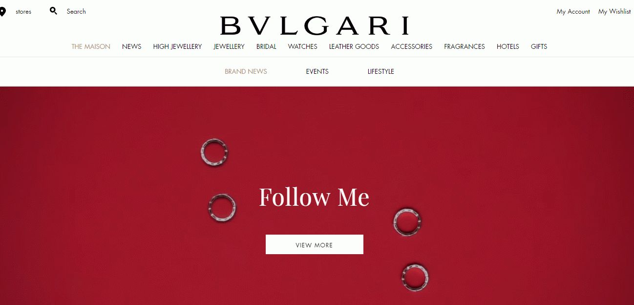
One of the most famous jewelry brand called Bulgari has held leading positions in the market for a long time. Focusing on the web store, the company is constantly upgrading the site appearance and providing customers with more conveniences. Let’s analyze it in details.
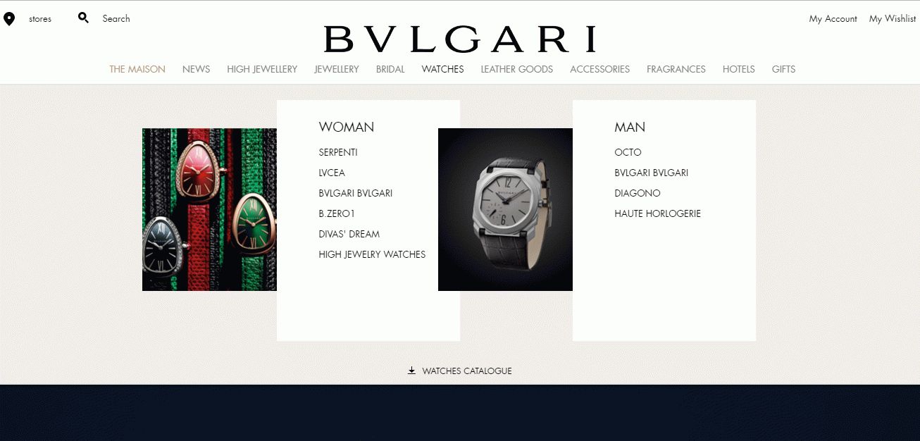
According to business particularity, there are eleven categories in the menu that can be chosen as one wishes. When clicking on the sections relating to products to purchase, the menu appears by click-through. It’s not like on previous websites where there are drop-down menus. Bulgari website menu implies clicking without going to the new window for such sections as “high jewelry”, “jewelry”, “bridal”, “watches”, “leather goods”, “accessories”, “fragrances” and “gifts”. When opening them, you can see subcategories distinguished according to collections, gender, product type. Besides, these menu sections are furnished with photos of products that makes it easier to perceive. As for the rest sections such as “new” and “hotels”, they open a new window after clicking. In general, the menu is characterized by ease of use, simplicity, comprehensibility and user friendliness. In fact, on the web stores that supply jewelry, the menu should be like this.
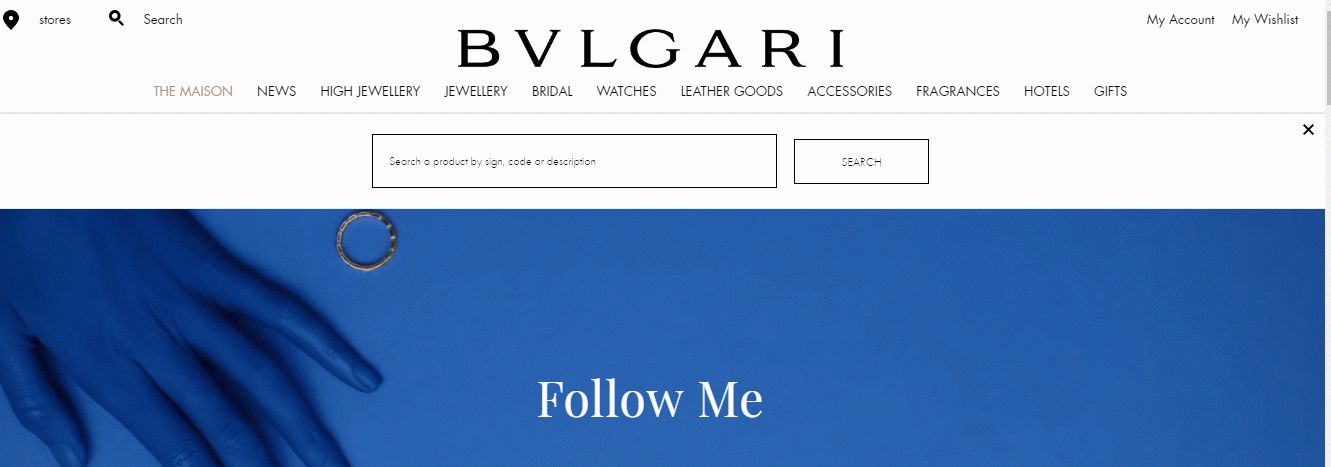
As concerns the search menu, it is placed at the top-left corner and seems so unseen, so it took a few seconds to find it. Probably, it has been designed to balance icons placed in the header. If you’d like to find any item on the site, you can search it sign, code or description. While entering, there are no popup tips. For reaching the ultimate result, you should wait a little bit and get the page with suggested items. On the whole, the search menu is not up-to-date and can’t meet client expectations.
Olympus
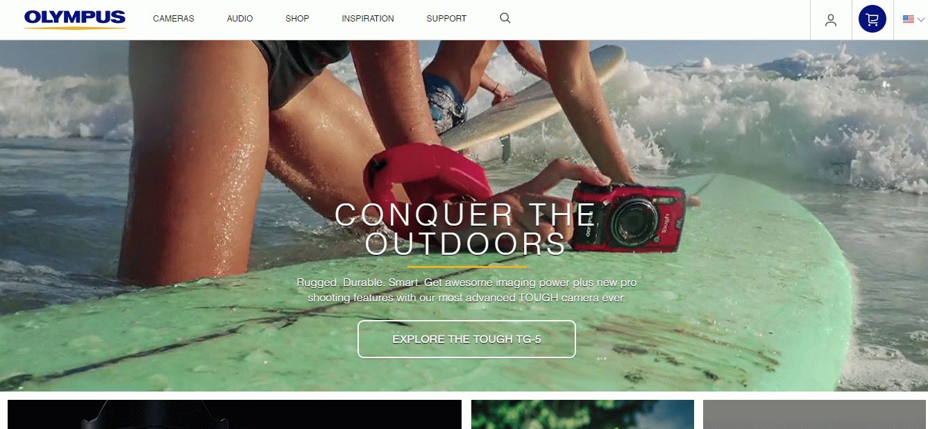
Olympus is considered to be one of the leading cameras producers in the world. The company increases exchanges yearly by pursuing the right policy. The key point for the company is web store where a lot of items are purchased by customers all over the world. That’s why it is necessary to focus on the web store and encourage a client to buy products.
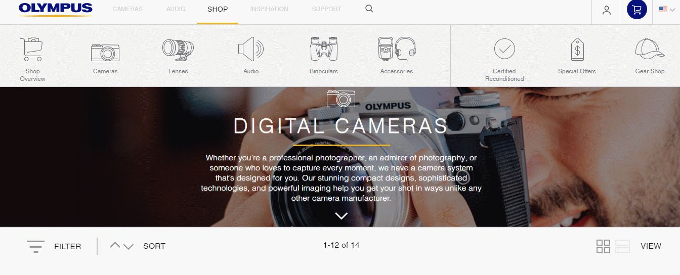
First off, the menu header should be overviewed. It consists of five sections every of which contains its own subsections. The most significant for us is the section called “Shop”. After mouseover, the drop-down menu appears having pictures of suggested items. It is used to simplify navigation and makes it easy to find a necessary item.
Only after clicking the chosen section “cameras”, “lenses”, “audio”, the page with the existing items that can be purchased is opened. On the whole, the menu is quite simple and easy of use. Moreover, it takes a little time to find a needed product and even a newbie can perform it in one click.
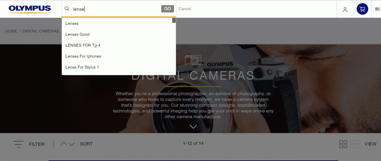
As for the search menu on the Olympus web store, it is placed at the top of the page and considered as apparent. To find any item, a user should enter the name of the item. While entering, pop-up tips appear that lightens the process.
After the process is completed, a user gets the ultimate result with existing products. Actually, the search menu is much worse if compare with the search menu the Shiekh web store has. All in all, Olympus search menu needs redesigning if the company wants to step up with the times.

Magento Custom Development
Take your online store to the next level with BelVG Magento Custom Development
Visit the page
