Re-usable pieces of markup repeat multiple times throughout the document: from <!DOCTYPE html> to </html> at the end. Lots of tricks can be used to make the work easier, including snippets and other editor possibilities, that allow putting all the closing </div> tags with two clicks instead of six. It saves our time.
As any other front-end developer, I have my preferred tools. For my work to have a smooth start I’ve developed my own template based on the default one. A personal adaptive template saves me a lot of time while starting with a new web store. It is created with a minimal implication of the .tpl files to avoid bugs after further updates and with making a maximum use of CSS and media query possibilities.
Let’s first find the folder with CSS and open the grid_prestashop.css file. After it we wrap everything into @media only screen and (min-width: 700px) { grid_prestashop.css }. This trick helps us avoid float cancelling in the mobile version and make the media query.css code, added later on, smaller. For the latest IE versions <script src=”http://css3-mediaqueries-js.googlecode.com/svn/trunk/css3-mediaqueries.js”></script> can be used.

PrestaShop Development
Take your online store to the next level with BelVG PrestaShop development
Visit the pageOur template now has the columns structure that can be used on mobile devices.
Next we create media-queries.css where styles for devices less than 700px are written. For devices with (min-width: 700px) and (max-width: 800px) I simply remove the right column – no big deal for the main content. I haven’t paid attention to such devices yet because most of the tablets have such a resolution. 480px and less devices are of interest.
I use hidden sidebars for them. Its content appears on click. Adaptive menus are also widely known. All this helps use the visible screen space effectively, not hiding any blocks. The user always has a possibility to expand the main menu or the sidebar of the store. Footer works the same way.
Prestashop slider changes its width after a page reload only. It encourages us to create a new, more flexible slider. The new one adapts to the width of our device and supports not only images but also text, so it’s SEO-friendly!
Grid and list view have been used in web stores for a long time now. These features are not default in Prestashop though; that’s why I’ve included them into my customized template-to-begin-with (the process will be detailed in the next posts).
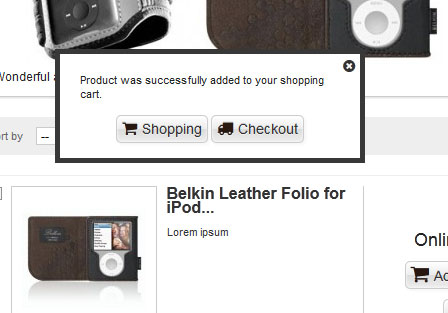
The next useful feature is a popup after adding the item to the shopping cart. In this popup, the user can either preceed the checkout or continue shopping. It’s essential for the mobile devices: the cart is not visible there as a rule.

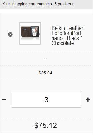
I’ve also modifies the ordering process. The cart had to be changed with div layout instead of the table one. The cart has visually changed on the desktop devices, however, on the mobile devices it’s now much more user-friendly and easy-to-use.

Another modification concerns icons. If you don’t want to waste time on the icon color and style, use font icons, as I did. I chose Font Awesome. They work perfectly on older IE versions and mobile devices and support retina. They also can be easily managed with CSS.

Our startup template is ready now. Use it to create your responsive masterpieces quickly and easily.


Hii Alex,
I wanted to know that can i convert an existing unresponsive website to a responsive website without creating any trouble for existing website if yes then how ?