Our portfolio became thicker with two Magento-based stores that recently went live. We have been working on these projects from scratch, providing full customization and developing & testing themes and functionality. We introduce their first online versions, henceforth, continuing to polish their performance and mentor their progress.
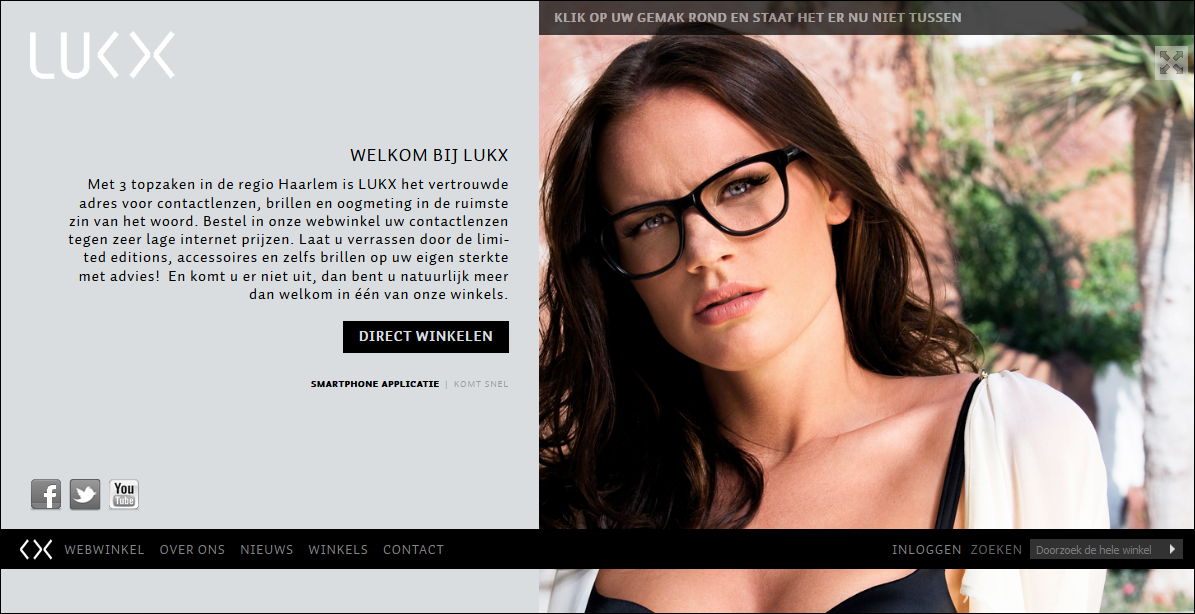
The Dutch marketplace www.lukx.nl promotes a luxurious lifestyle with glasses, contacts and accessories at reasonable prices. The biggest challenge (and the most interesting part of the work, for sure) was caused by non-standard layout structure. When you look at the screenshot, you will notice that the store is divided into two parts with menu navigation placed at the bottom of the page.
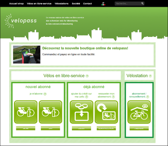
The second Swiss webstore shop.velopass.ch offers ecosystem support and better health maintenance by replacing cars with bikes. No need to buy a brand-new bike when it’s possible to rent the one.

What do you think of these webstores? Would you visit them and make a purchase? How do you find their usability? Let us know more by leaving your opinions below.


Dmitry,
I believe, I know why you like Lukx.nl the most. =)
I like the Lukx.nl store very much.