
So the default Magento 2.0 page is here for everyone to see. If you don’t have access to the demo and really anticipate what’s coming up this year – we’ll give you a sneak-peek of our own Magento 2.0 setup and tell you what’s on the frontend right now.
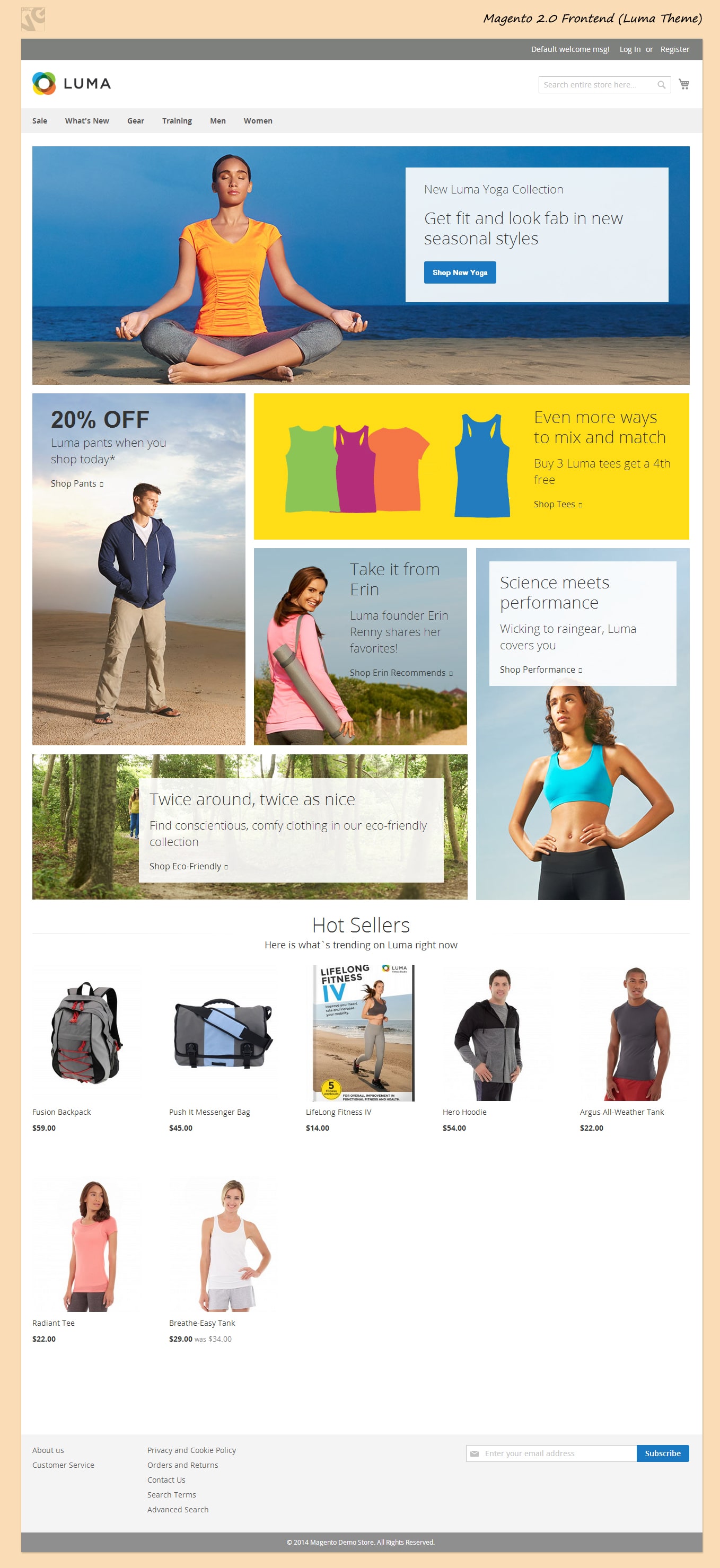
Login, register and welcome message block is moved to top and is visually separated from the rest of the page on a gray background. It is clean and noticeable for a client.
Search takes its place below as well as shopping cart button. In my opinion these is too much free space between search and the store logo. Looks a little sterile and my arms are itching to rearrange it a little, but alas, for a default setup it looks like it’s an amazing canvas. Also it works well for mobile devices.
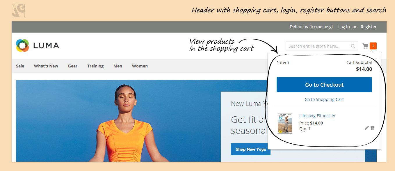
The next thing we have here is a nice multi-level dropdown menu. Which might look plain – but it works well even for a sizeable number of categories. For a default setup – looks allright.
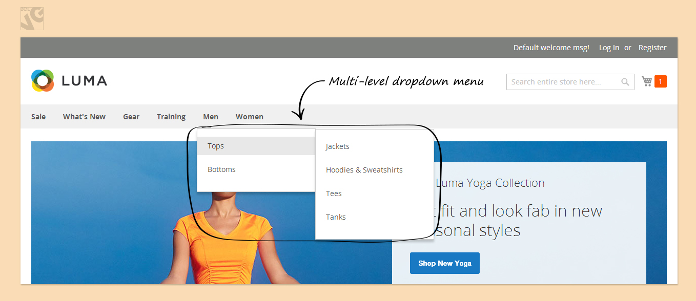
Then we see a banner… A huge one at that. Can work as a banner or as a slider, easily modifiable Pretty much is a go-to functional for a homepage, and for a good reason.
An assortment of promotional banners are in the middle, different sizes and different forms. All is good, lots to change and modify here.
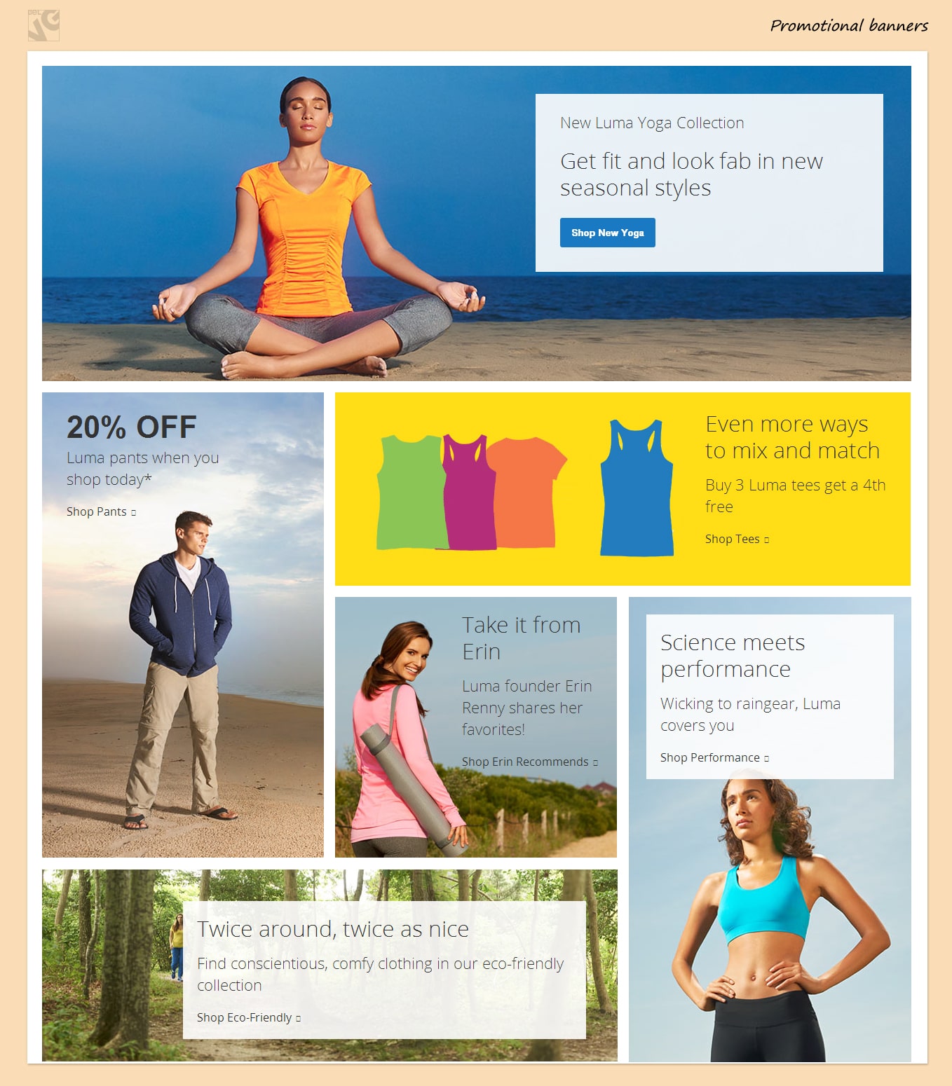
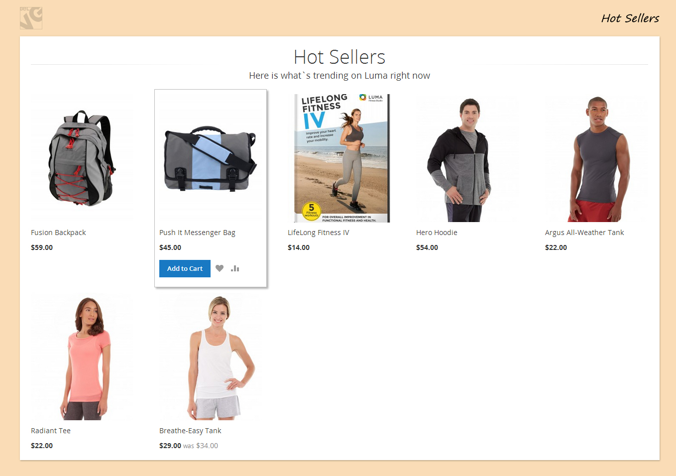
The products are looking well on plain white, especially the hover effect. Again, it is plenty of space to change and work with.
Footer is somewhat empty now, but for any real store it’ll be full with links and social networks buttons. We all know how it goes. Subscription box is there too! I would personally not count on a lot of people getting there. We all try to subscribe our customers in other ways anyway but it has to be there regardless.

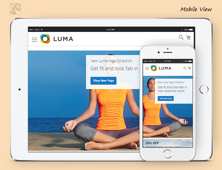
The theme is shaping up to look good on mobile devices which now is the holy cow of ecommerce development.
I would call this WIP template a canvas (and I already did) – it’s plain, it’s simple, it does its job but there’s a LOT to improve.


