
Navigation is one of the most important components of any store. Usually, to access the navigation menu on a website the user has to scroll up to the top of the page. But the sticky navigation menu is a much better and convenient solution.
Prestashop 1.6
In this article I will describe how to create such a sticky menu in the default Prestаshоp 1.6 theme on the basis of the default module Top horizontal menu (blосktоpmenu).

First we fix the visual part of the menu: we will set the menu width to 100% to completely fit the browser window. Then set the background, transparency, the lower border and then stick the menu, so when scrolling there will be added the .scroll class.

themes/default-bootstrap/css/modules/blocktopmenu/css/blocktopmenu.css
|
1 2 3 4 5 6 7 8 9 10 11 12 13 14 15 |
#block_top_menu { width: 100%; position: absolute; left: 0; bottom: 0; height: 59px; padding: 0; border-bottom: 3px solid #e9e9e9; background: rgba(246, 246, 246, 0.8); } .scroll { background: rgba(246, 246, 246, 0.8); position: fixed !important; top: 0; } |
You can adjust the color and transparency in this property to match the design of your website. background: rgba(246, 246, 246, 0.8);
To position the menu at the very edge of the browser window we need to modify this file: themes/default-bootstrap/css/global.css
|
1 |
header .row {position: static;} /*old style position: relative;*/ |
Make a top padding between header and the menu and also add the bottom padding:
themes/default-bootstrap/css/global.css
|
1 2 3 |
#header { padding-bottom: 79px; } |
The last thing is to remove the menu background because it already uses the page background. Then align the menu to the logo.
themes/default-bootstrap/css/modules/blocktopmenu/css/superfish-modified.css
|
1 2 3 4 |
.sf-menu { margin: 0 auto; background: none; } |
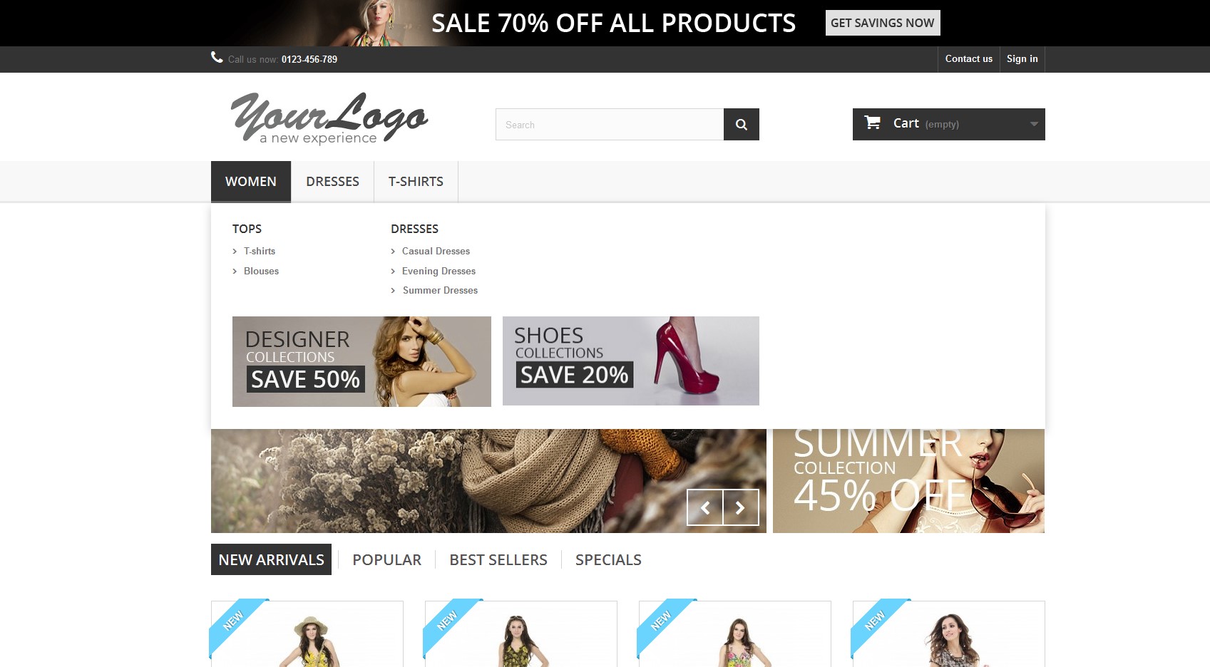
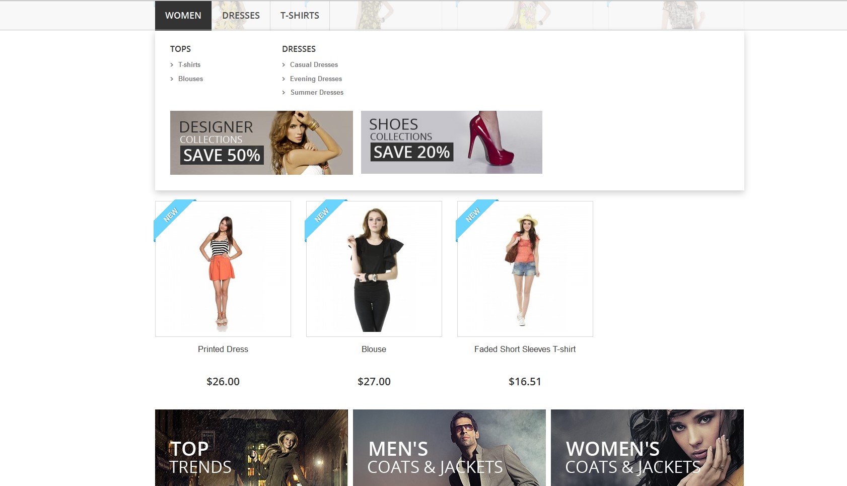
In the menu template add the class .container:
themes/default-bootstrap/modules/blocktopmenu/blocktopmenu.tpl
|
1 |
<ul class="sf-menu clearfix menu-content"> |
New:
|
1 |
<ul class="sf-menu clearfix menu-content container"> |
The last step is to connect a small script to let our menu move.
|
1 2 3 4 5 6 7 8 9 10 11 12 13 14 |
<script type="text/javascript"> $(document).ready(function(){ var start_pos = $('#block_top_menu').offset().top; $(window).scroll(function(){ if ($(window).scrollTop()>=start_pos) { if ($('#block_top_menu').hasClass()==false) { $('#block_top_menu').addClass('scroll'); } } else { $('#block_top_menu').removeClass('scroll'); } }); }); </script> |
The menu scrolling is also compliant with mobile devices and tablets.


The only thing is to add background to the dropdown menu for mobile
themes/default-bootstrap/css/modules/blocktopmenu/css/superfish-modified.css
|
1 2 3 4 5 |
@media (max-width: 767px) { .sf-menu{ background: #f6f6f6; } } |

You can also download the zip file with the modified default files.
You can check the demo here.
Prestashop 1.7
In Prestashop 1.7 header layout is different from Prestashop 1.6, that’s why the method described above will vary a little. But first things first. In order to get the menu fixed when scrolling, it’s necessary to add following styles in the file “/themes/classic/assets/css/theme.css”:
|
1 2 3 4 5 6 7 8 9 10 11 12 13 |
#_desktop_top_menu.scroll { width: 100%; padding: 10px 0 !important; position: fixed !important; top: 0; left: 0; right: 0; z-index: 10; background: rgba(246, 246, 246, 0.8); } #_desktop_top_menu.scroll .top-menu { margin-bottom: 0; } |
Moreover, the next script should be also added (for example, in the file “/themes/classic/assets/js/custom.js”):
|
1 2 3 4 5 6 7 8 9 10 11 12 13 14 |
$(document).ready(function(){ var start_pos = $('#_desktop_top_menu').offset().top; $(window).scroll(function(){ if ($(window).scrollTop()>=start_pos) { if ($('#_desktop_top_menu').hasClass()==false) { $('#_desktop_top_menu').addClass('scroll'); $('#_desktop_top_menu .top-menu').addClass('container'); } } else { $('#_desktop_top_menu').removeClass('scroll'); $('#_desktop_top_menu .top-menu').removeClass('container'); } }); }); |
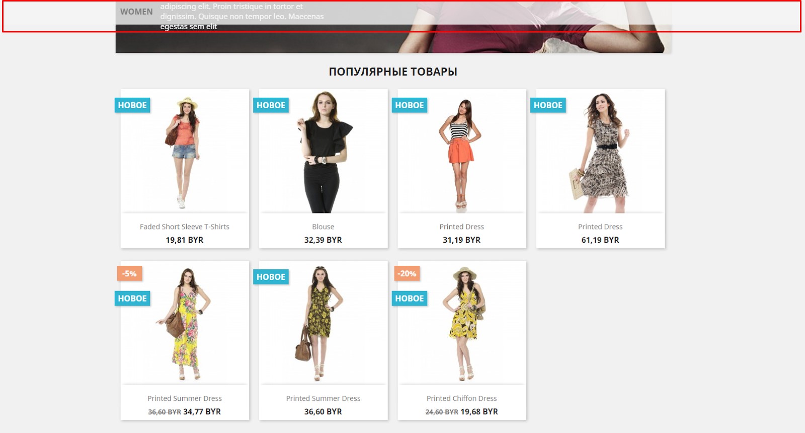
The result will be like this:
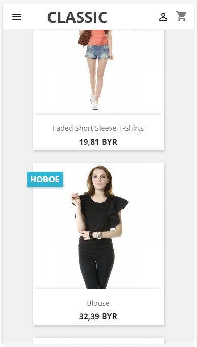
Actually, we’ve achieved our goal. But the menu will be scrolled only for resolution 768 pixels and more. In other words, on mobile devices, the menu will not be scrolled. It is connected with the fact that in Prestashop 1.7 there are two menu blocks: block with id=”_desktop_top_menu” which is for the menu on desktops and block with id=”_mobile_top_menu” which is for the menu on mobile devices. In order to make a menu fixed in the header when scrolling on mobile devices, we need to get the header fixed. For this reason, we should add following styles (similarly, in the file “/themes/classic/assets/css/theme.css”):
|
1 2 3 4 5 6 7 8 9 10 11 12 |
@media (max-width: 767px) { #header { padding-top: 60px; } #header .header-nav { position: fixed; top: 0; left: 0; right: 0; z-index: 10; } } |
As a result, on mobile devices it will look that way:





@Xaris, link was fixed, so you can download file now
hi Tatiana
the link for zip file have 500
Internal Server Error
If you can send me please email the zip
thanks
Hello.
I’m using prestashop 1.6.1.12 and all is working except that in mobile if you have a menu with lot of subcategories and you deploy all of them and the they go out of the screen in the bottom side, you can’t scroll the menu to see those other buttons.
i managed to move the menu down but still not scrolling. :(
Hello Tatiana,
i replaced the files with the ones from you but still not working the slide and the menu is too up, can you take a look please?
http://www.b-toys.ro
Thank You!
Thank you from Italy Tatiana :D
It works for me, you was very very useful for me!
Hello Tatiana
Its resolved.
Thanks a lot.
Regards
Hi Arshad,
Please try to flush the cache in Prestashop Admin Panel (Advanced Parameters > Performance)
Hi Tatiana
Thanks for your kind support.
I replaced the file blocktopmenu.tpl & all other recommended files with the downloaded file, but the issue is not resolved.
Regards
Arshad
Hi Arshad,
Everything should work properly. Could you please check the following points in the ..modules/blocktopmenu/blocktopmenu.tpl template:
1) There is a wrong class in menu of your website
, it’s necessary to replace sf-contener class name – http://prntscr.com/ecdoqa
2) js wrong placement – the script should be placed in
– http://prntscr.com/ecdptg
If you fix these issues, you will get this result – http://prntscr.com/ecdrge
Hi Tatiana
I used the code but issue is not resolved. After updating the files code is displaying on top menu bar.
Kindly help.
Regards
Arshad
eduard,
Link was fixed.
Hi Titianda,
thanks for share the solution.
I just need the files because the link is broked. Can you send it to me, please?
Thanks a lot!
Hi Tatiana,
can i recive the files through email, the link is not working.
Thank You!
Hi Tatiana,
Thanks for the code, it helped. But, I have a big logo and want to get rid of the logo when I scroll. How would I do?
Best regards,
Peter
Данное решение работает, можете посмотреть на демо для Prestashop 1.6.1.8: http://belvg.net/tatiana/prestashop/demo/menuscroll_1.6.8/index.php
Попробуйте очистить кэш в панели управления Prestashop в Advanced Parameters > Performance (Расширенные параметры > Производительность).
Спасибо огромное Вам за ответ.
Но есть одна проблема, я обновил мой магазин до версии 1.6.1.8 и это код перестал работать, сможете снова помочь в этом??? очень надеюсь на вас
andrewandrew,
Спасибо за интерес к моей статье! Убрать скролинг меню на мобильном устройстве, можно с помощью @mediа запросов. К примеру, можно определить устройство с максимальным разрешением 767px и для него установить определённое свойство. Медиа-запросы ограничивают ширину макета и при достижении этого значения уже применяется другой стиль.
В файле:
themes/default-bootstrap/css/modules/blocktopmenu/css/blocktopmenu.css
можно написать медиа запрос
Если ширина не будет превышать 767px, то меню будет оставаться статичным, а скролится уже на устройствах выше 767px.
Ребята! Как отключить это в мобильной версии??????
Помогите пожалуйста!!
Prestashop 1,6 works great!!
In prestashop 1.6.1.5 doesnt work. The menu items are completely at the left of the screen and the menu is not floating
Hi I am new to Prestashop. I am using the default bootstrap in prestashop and created a child theme for that. I also want to make my menu transparent and sticky same as this one but i cannot make it like that. What i did so far is to copy and paste the script mention here which it doesn’t work. I also tried putting the zip file in my child theme that you can download here and still it doesn’t work, and lastly I don’t know how to edit the menu width to 100%, background, transparency, .scroll class and etc. Please i need help. Thanks in advance.
Thanks!! that works!!
The js code goes in /theme-folder/js/global.js
$(document).ready(function(){
var start_pos = $(‘#block_top_menu’).offset().top;
$(window).scroll(function(){
if ($(window).scrollTop()>=start_pos) {
if ($(‘#block_top_menu’).hasClass()==false) {
$(‘#block_top_menu’).addClass(‘scroll’);
}
} else {
$(‘#block_top_menu’).removeClass(‘scroll’);
}
});
});
I followed every step but for some reason my menu is not scrolling along, it remains fixed.
Hello Tatiana,
I’m back with an observation : when I made changes regarding “header .row {position: static;} /*old style position: relative;*/”, there is a change of position on and is no longer fit the middle of the screen, but basically it appears in the top right corner of the screen. In this context practical results an unpleasant visual experience for the customer with a possible abandonment of orders. I noticed it a few weeks ago, also in your demo example and now I’m back with the request if it is possible to reposition this div.
(The link to demo example is now the broken: http://belvg.net/tatiana/prestashop/demo/index.php).
Many thanks in advance.
Liviu.
Hello, do you know how to do the same but only with the search bar, not the top menu ?
Thank you, it works very well. Do you have other things for PrestaShop 1.6?
hello mam,First I would like to thank you for your great Article. it’s really a wonder full expreiance to go with.but mam i have one question that it is possible if i want sticky effect only in desktop browsers but not on palm device like mobile,Tab. is there any code or something that can help beginners entrepreneurs who has doesn’t much money to buy such Modules.
Hello , Thanks Tatiana
I think i have the same problem as Liviu.
In Mobile mode when user click on category,the content outside the screen is not scrollable.
I fixed this problem with this change in blocktopmenu.css :
@media (max-width: 767px) {
.scroll { position: absolute !important; }
}
@media (min-width: 767px) {
.scroll { background: rgba(22, 78, 152, 0.8)!important; position: fixed !important; top: 0;}
}
Thank you
Thank you Tatiana for the files – it made my life very easy. I am new to prestshop and would like to keep in touch with you for future questions… please send me an email.
Liviu,
In the default mobile theme when you open the drop down menu the content is moved down, in this article the menu laid over the content.
Hello Tatiana,
I come with an observation: after adjustment described by you, for mobile version, when you click on “Categories” submenu that opens (Women, Dresses, T-Shirts etc.), practically covers slider and content of the site, which is not ok.
Normally, the “Top horizontal menu” should push below the entirety site starting with “Image slider for your homepage” and not cover them (as I mention … for mobile version).
You’ll notice this behaviour including in demo version posted by you. I use Chrome 43.0.2357.130 m, and I used Inspect element Device: iPhone 6 (375px width * height 667px).
What changes should be made so that “Top horizontal menu” push site content below and not cover it when the customer presses the “Categories”.
Many thanks in advance.
Have a nice day.
Liviu.
Hello Tatyana,
very useful your solution. Thanks for help.
Have a nice week.
Liviu.
HiTitiana,
Thanks a lot. It’s working perfect now.
Just want to ask you about “How to Add HOME link in Top Horizontal Menu”?
Cos I’ve tried via the admin panel but doesn’t work, I created “HOME” and on the link I put “localhost/prestashop” (as I still tried it in my local computer), but when I hover the HOME link, it is showing localhost/prestashop/localhost/prestashop
I am sorry for so many question.
Once again Thanks a lot
Simri,
Thanks a lot for your comment. I am very glad that my article helped you.
You need to add JS code to the file themes/default-bootstrap/modules/blocktopmenu/blocktopmenu.tpl after
You can find more details if you download the archive with example files and open blocktopmenu.tpl.
Hi Titiana,
That’s awesome. You saved my time. Been googling for ages and just found the way you do, how to make the Top Horizontal menu to become full width. It is working perfect for me.
Just one question, where to put this code:
$(document).ready(function(){
var start_pos = $(‘#block_top_menu’).offset().top;
$(window).scroll(function(){
if ($(window).scrollTop()>=start_pos) {
if ($(‘#block_top_menu’).hasClass()==false) {
$(‘#block_top_menu’).addClass(‘scroll’);
}
} else {
$(‘#block_top_menu’).removeClass(‘scroll’);
}
});
});
Cos my Horizontal menu doesn’t stop when I scroll to the top (I’m so sorry for my bad English)
Thanks