Magento 2.0 uses Flexbox (Flexible Box Layout Module) which lets you to control the size, order and alignment of elements by several axes, as well as distribute free space between elements and do many other things.
Main advantages of flexbox:
- As it appears from the name «flex», all blocks can easily become «responsive» and «flexible»: they can be shrunk or stretched to fit the required space in accordance with the given rules.
- Convenient vertical and horizontal alignment respective to the basic text line.
- The order and place of html elements does not have any importance. It can be modified via CSS.
- Elements can be automatically grouped into several lines/columns and fit all the free space.
- Flexbox supports RTL (right-to-left script) writing (which is used in many languages, for instance Arabic, Hebrew, Syriac scripts), unlike the traditional LTR (left-to-right script) writing. In general, the Flexbox interface does not have any notions for «left» or «right», but a block has only the beginning and the end options. This way browsers with the RTL text direction will automatically have all elements displayed in the reversed order.
- CSS syntax is really simple and can be easily learned.
Flexbox specs have been edited several times over the last couple of years. Recently W3C Candidate Recommendation have issued a new release of W3C Candidate Recommendation, 1 March 2016 (for more details check the official W3С site). You may check the types of browsers that support Flexbox on Can I Use section.

Let’s see where and how Flexbox is used in Magento 2.0.
In Magento 2.0 Flexbox is used to build a page layouts (1column.phtml, 2columns-left.phtml), alignment of blocks in adaptive design, responsive mobile interfaces — but this is not yet the full list of possibilities. All layout elements (child elements — flex-blocks), DIVs and columns are positioned on a page with the help of CSS. This lets you easily control the behavior and position of blocks.
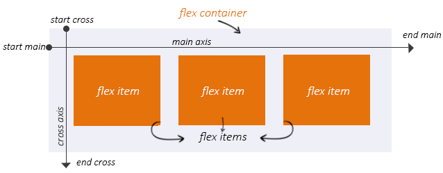
Flexbox defines the set of CSS-properties for a container — flex container and its child elements — flex items. Axis is one of the major concepts in the Fleхbox Layout Module. The image below demonstrates this major Flexbox concept — the usage of the main axis and cross axis. Flex-line follows the main axis and cross axis is vertical to the main axis. The names of the start and end points and also the directions of each axis:
- main start
- main end
- main direction
- cross start
- cross end
- cross direction
Let’s take the Luma theme to demonstrate how Flexbox is used in Magento 2.0.
Home Page uses one column layout (1column.phtml).

Magento Custom Development
Take your online store to the next level with BelVG Magento Custom Development
Visit the pageWe need to make the main block <div class=”page-wrapper“> become a flex container.
|
1 2 3 4 5 |
.page-wrapper { display: flex; flex-direction: column; /*…*/ } |
To enable the Flexbox is pretty simple: you need to assign the property display: flex (or inline-flex) to the container. The flex property transforms the container into a block-level element, while the inline-flex property makes it a line-level element. In our example we are using the property display: flex;
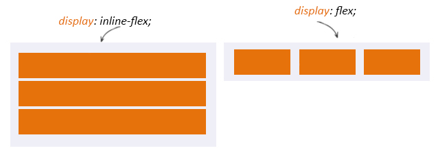
All blocks within the container .page-wrapper get transformed into «flex-items» and therefore start following new rules. Internal div blocks are placed along the axis as columns of the same height regardless their content.
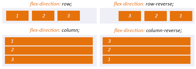
You can control the direction of axes with the help of the flex-direction css-property. By default flex-direction uses the value row. In this case flex-items are placed from right to left and from top to bottom. Our block <div class=”page-wrapper”> as the value column. This means that blocks will be placed vertically starting from top to bottom.
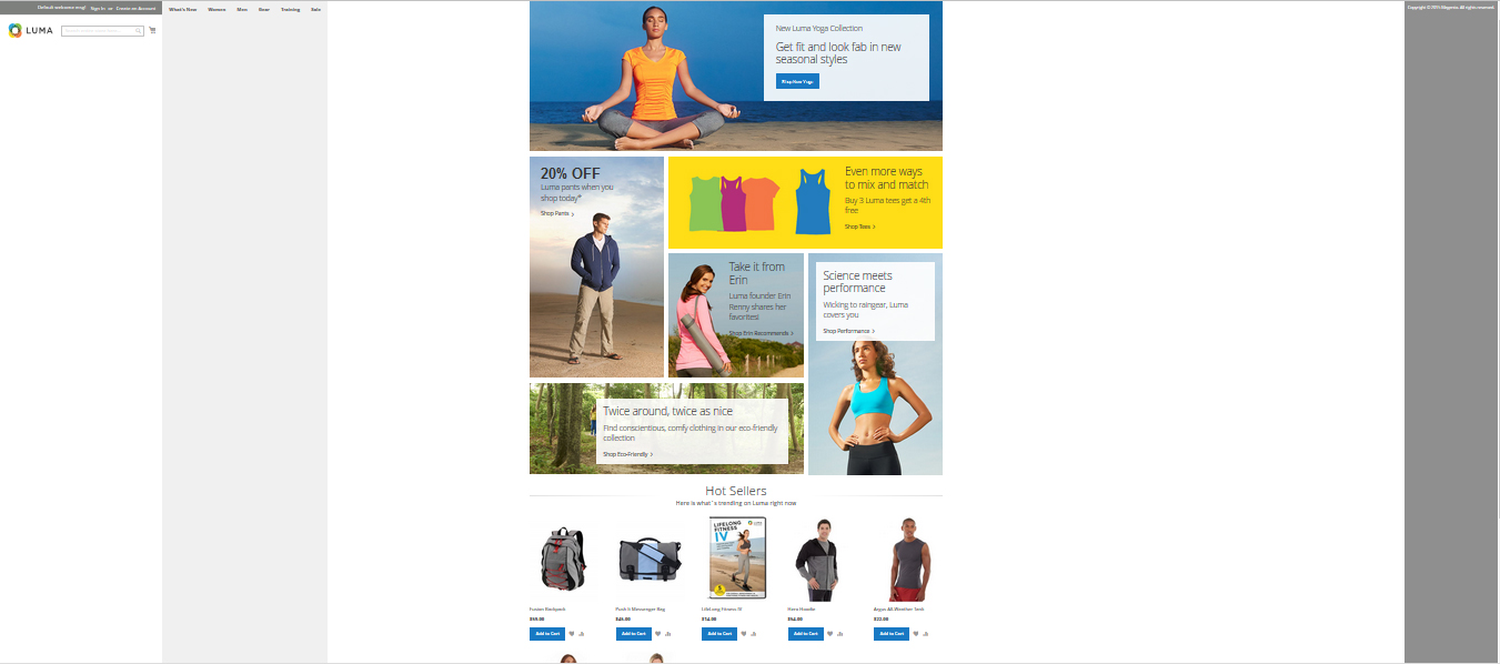
To demonstrate how this axis-positioning works, lets change the value for flex-direction: row (from left to right).
|
1 2 3 4 5 |
.page-wrapper { /*…*/ flex-direction: row; /*…*/ } |
The result you may see on the picture below. All flex-items are placed in a single row.
Other possible values for the flex-direction are:
- row (default value): from left to right (in rtl from right to left)
- row-reverse: from right to left (in rtl from left to right)
- column: from top to bottom
- column-reverse: from bottom to top
Let’s see what flexbox values can be applied to a navigation block.

|
1 2 3 4 5 |
.nav-sections { flex-shrink: 0; flex-basis: auto; /*…*/ } |
The property flex-basis lets you to set the basic width of a flex-element for the stretching. The property can be set in any available measurement units (px, em, %, …) or auto(used by default). If set as auto – then the width and height of a block is taken as basic, which may also depend on the size of the content, if not set specifically.
The property flex-basis is closely related to flex-shrink. By default the value of the property is 1. It can also define the factor by which the width of items should be changed in the reverse direction. This property is applied if the width of the container is less than the sum of the basic widths of the elements. If the value for flex-shrink is set to 0, then the element cannot shrink less than its basic width.
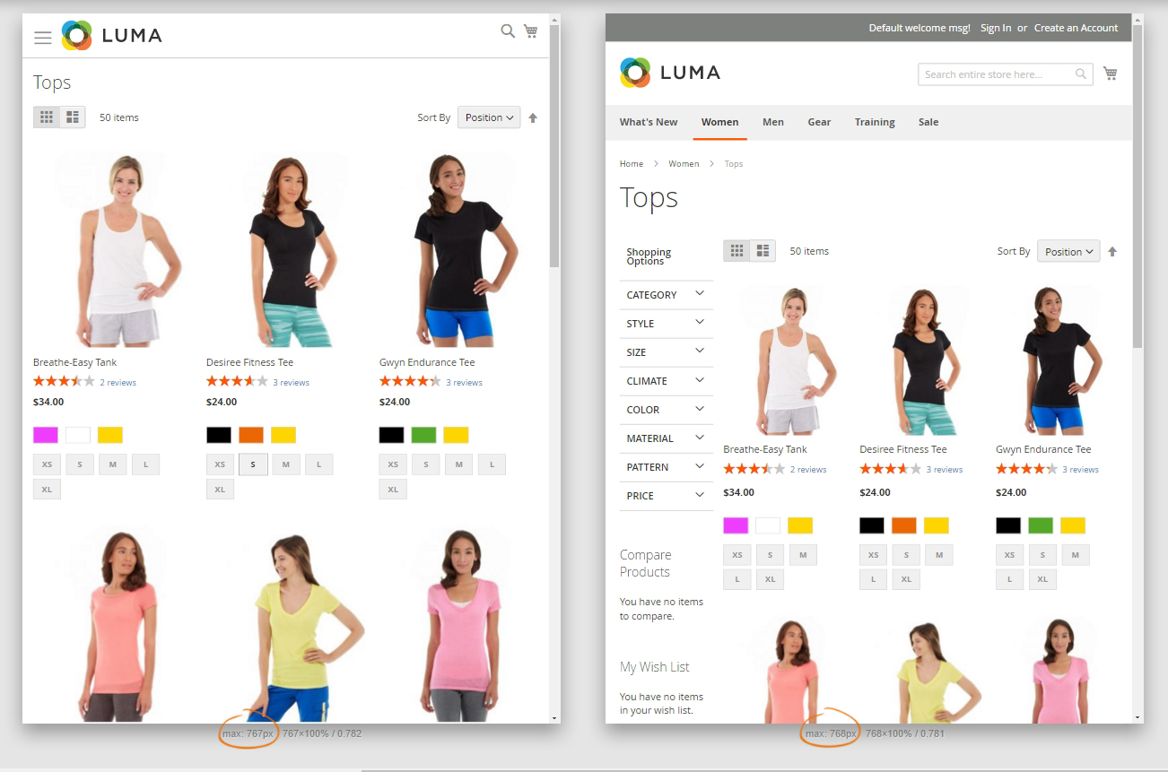
Catalog Page has a 2-column layout both for desktop and tablet (landscape orientation).
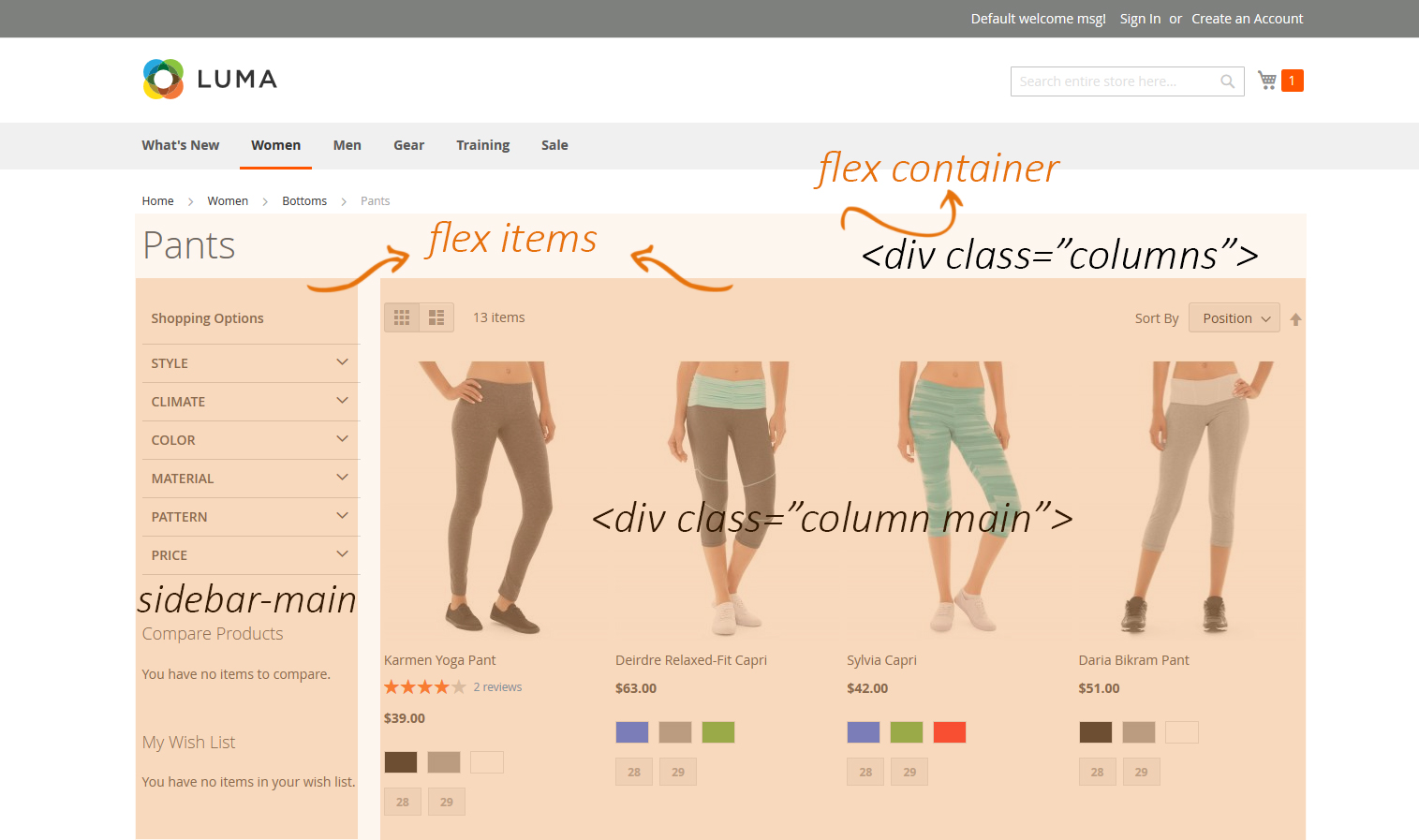
If the resolution of a screen is less than 768px, then the layout becomes flexible and transforms into the one-column layout.
|
1 2 3 4 |
.columns { display: flex; flex-wrap: wrap; } |
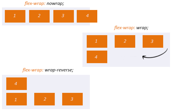
By default flex container always places all internal blocks in one row. But according to the specs the multi-row mode is also supported. This option is managed by the flex-wrap CSS-property. In our case it has the value wrap — so the blocks will break into the next line. Other possible values this property may have:
We have described the property for the parent flex container — in our example it is the block .columns, but now let’s check the properties of its child elements — flex-items:
|
1 2 3 4 5 6 7 8 9 10 11 12 |
.columns .column.main { flex-basis: 100%; flex-grow: 1; order: 1; /*…*/ } columns .sidebar-main { flex-basis: 100%; flex-grow: 1; order: 1; } |
The property flex-grow defines the width enlargement factor for a flex-element in relation to other flex-elements. It is defined by a whole number.
Flexbox lets you change the order of a flex-block inside a flex-container with the help of the property order. By default all blocks are placed one by one in the order defined by the layout. The value of the property order can be a whole number and by default is equal to 0.

Magento Webdesign
Take your online store to the next level with BelVG Magento Webdesign
Visit the pageLet’s see how the property order can be used on a Product Page on a mobile device.
The image below demonstrates the main page blocks.
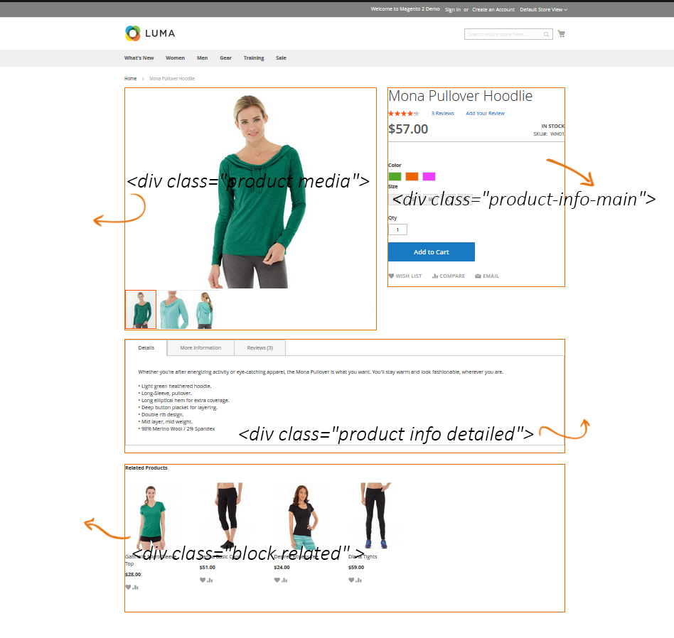
If the resolution of a screen reaches the maximum width of 768px, then the layout becomes flexible and transforms into the one-column layout. So you can change the order of any flex-block with the help of the order property:
|
1 2 3 4 5 6 |
@media only screen and (max-width: 767px) .catalog-product-view .product.media { -ms-flex-order: -1; -webkit-order: -1; order: -1; } |
The block <div class=”product media“> uses the property order: -1. But what does this mean? The value of this property should be a whole number, which defines the position of an element – the lower is the number the higher is the priority.
If you take a look at the image you will see that the block with a picture will take the first position.
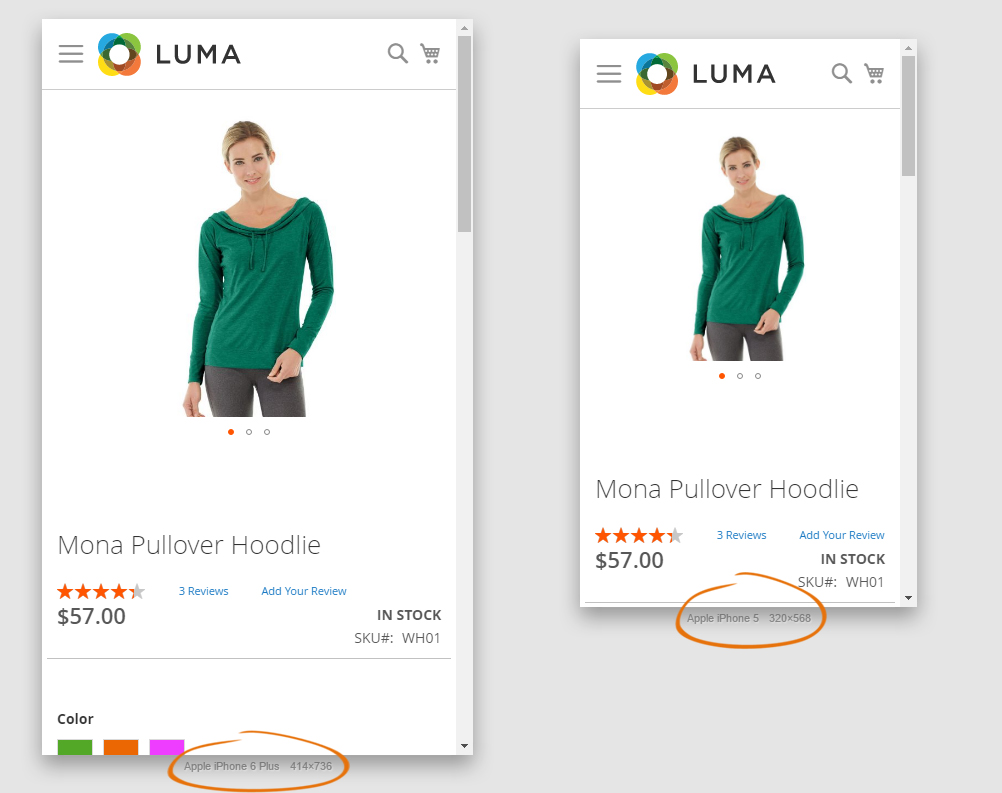
In the following example we will change the value of the order property for one of the flex items <div class=”product media“> from -1 to 0 and we will see how the order of the other flex-items will change. This is what happens:
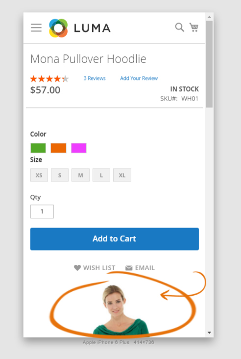
This property is useful when the output order of flex-items should differ from their order in HTML.
In this article we have described just a few usage cases of flexbox, but if you wish to learn this property in more details, you may visit the official website.
As you see, flexbox is a really powerful tool for building layout. It requires absolutely different approach to output blocks. I hope you found this article useful enough and you may already start experimenting with your own layouts by using the Flexible Box Layout Module.


Very cool Tatiana, I’m Lead Frontend at Webjump Magento Partner and I use flexbox in all stores Magento 1 and Magento 2, congratulations!