
This article may not be only helpful for designers but for clients as well. Full of ideas of a future project, they look forward to choosing the developer and entering World Wide Web not as users but as serious businessmen. So here I go.
Step 1
If the layout is not adaptive and has a fixed width, it should certainly be no more than 1000px. Yeah, I know about 1024px screen resolution, but 24px should be left for a vertical scrollbar, which appears if the page is too long. Otherwise you’ll get a useless horizontal scrollbar the client will not be happy to reveal.
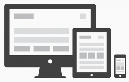
If design is adaptive, creating at least one adaptive page version would not be amiss. Make sure to talk over the order of blocks being displayed with the coder.
Step 2
Remember that except for a home page and basic design there are dozens of inner pages like Catalog – Product Cart – Bin – Info Pages – User Account Page. The latter is usually ignored. Do not leave it for the coder – his or her skills generally include CSS design but your tastes most likely differ.

Step 3
If you design for Prestashop or Magento now or worked with other platforms before, it would be good to explore store structure in the demo to understand its working principles and define the elements it consists of. All stores include catalogs, product carts, bins, etc. (no need to state the obvious), however knowing every single detail of how it works is the only way your job will be 101% done successfully.
For example:
You are creating a catalog page. You have customized it perfectly and the client of yours is happy. Hurry up to save it and proceed to product cart creation: the end is approaching. But wait! I hate to say that there are two catalog view modes – GRID and LIST. The client may now not notice that one of these is not working properly but he certainly will and this fact, by-turn, will distract you from the next project or whatever else you will be doing.

Magento 2 Webdesign
Take your online store to the next level with BelVG Magento webdesign
Visit the pageStep 4
You enjoy the project, develop new features and improve the existing ones. Aren’t we too fast though? The client is happy to know that you show enthusiasm but information on realization value may confuse and distress him. Talk over your initiatives!
For example:
The client asked you to design the Checkout page. You’ve created in the mind’s eye the layout and ready to develop it eagerly. Stop now! It differs from the one in the demo version. It may be easier for the client to check out the released modules and their prices. It’s reasonable to create new design based on the module picked rather than to develop the module according to design. The latter is money-losing – more expensive than released and tested solutions.
Step 5
Using unusual fonts is, of course, alright. Make sure the font is being displayed in the browser correctly though.
Some fonts you find on the Internet are not free. Why would you buy any of those if your colleague shared with you a great fonts collection not charging anything? I’ll tell you why. For the font to work correctly in all the browsers, it should be converted into all the required formats with the help of, for instance, cool and convenient fonts generator. Here is the message popping up after paid font is uploaded:
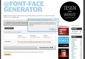
On the whole, it doesn’t convert the font and the coder has a new problem to face.
After converting the font in Font-Face generator check if the font displays correctly in the main browsers (don’t forget IE). It’s a very simple matter because the archive includes demo-file with different font sizes. Remember to check all the languages for the Multilanguage site. In order to do this use generator’s extended settings. Releasing the layout, don’t forget about the fonts or surprise the coder with the folder with generated fonts.
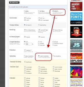
In addition to the above-mentioned generator, google-webfonts can be used. There are not so many fonts though.
Step 6
Have the goodness to optimize your layout by layers and follow layers hierarchy. Treat the coder and create folders of different colors for better orientation. Do not use several pages layouts in a single PSD. First of all, front end developer may simply not find or notice them. Second of all, personal notebook of this developer is not as fast as the one at work – there is always a chance that he or she is on a vacation now, run out of money and works to extend the recreation for a couple days, isn’t it?

Step 7
So what do we need for the project to be released successfully at the stage of PSD layout template transformation into code? Well, the question is the answer: save the source file in PSD format so that the coder could open it in Photoshop easily – there is a chance he or she doesn’t have fast and unlimited Internet access.

The coder will probably not know you did all the work for him or her but when everything comes to light, extremely cordial working relationship between you will be developed.

Ecommerce Development
Take your online store to the next level with BelVG ecommerce development
Visit the pageLooking for a reliable Magento custom development partner? Turn to BelVG!


