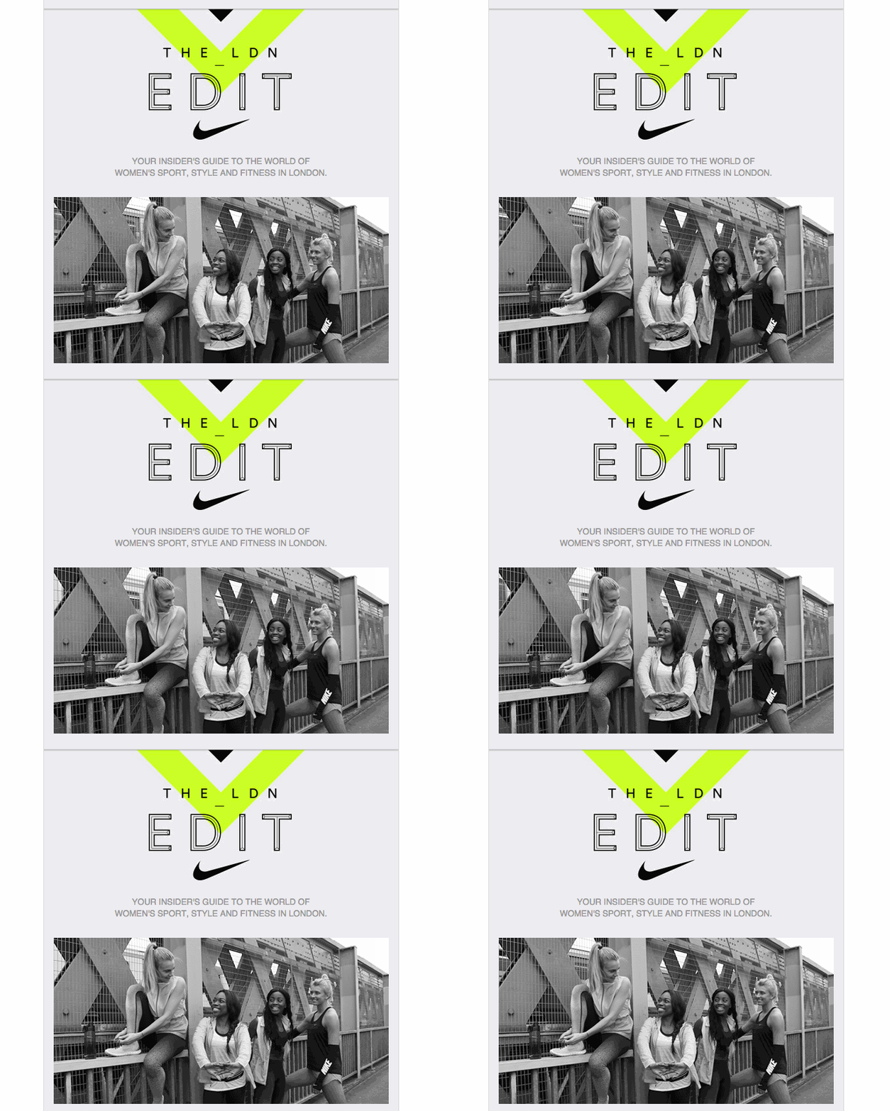
I have noticed, that this topic enjoys quite a popularity among our readers, so I have decided to expand a bit more about the latest trends in e-commerce design.
Cinemagraphs and the return of GIF
Animated GIF images have quite good chances to return back in 2017. Obviously, they will take a more moderate form offered by the Cinemagraph format. Cinemagraph is a common image or photo which uses a short repeated animation. Sort of a cyclic short-video clip. It does not look as obtrusive as a common GIF image (Ling’s Cars), but still can attract attention of a potential customer. Cinemagraphs can be used either as background images, category titles, ad banners on homepage or even as images on a product page.
However, time will show whether they can really improve your conversion rates or this is just another awful trick that exerts a repulsion. Example: amazon
High flexibility and bright colors
There are many more e-commerce design trends which we could include into this article, but this would make it really long to describe them all. That is why I have selected 2 most important ones which I would like to elaborate on.
The first one is high flexibility (adaptivity). Currenlty almost all web-stores try to adapt the content of their websites to fit the screen of users’ devices in the best possible way. But I think that in the nearest future this process may take a different path. The content of a website will be adapted according to such criteria as the age of a user, eyesight conditions, right-hand or left-hand grip and many other individual factors.
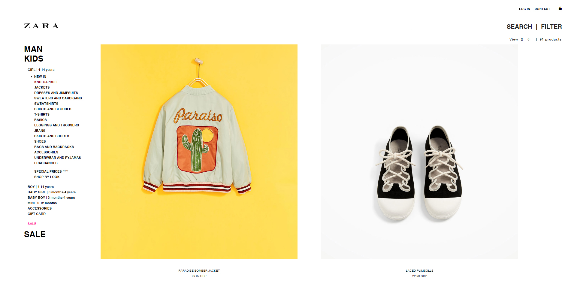
The second one is the possible boost of bright colors. Over the last several years the e-commerce design has been dominated by minimalistic approach, so we expect that in short period it will be replaced with overwhelming boom of bright colors. Example: Zara.
The left hamburger-menu
Small hamburger-menus is a pretty minor change if compared to other new tendencies. The recent trends tend to place this menu to the left side of a page. If a web-designer has been using Bootstrap and following Bootstrap 3 Navbar examples, then most probably he would place the hamburger-menu on the right side in all his projects.
There are plenty of websites and web-stores that are placing this menu exactly that way. However, Google and some other popular services have started placing the menu on the left side. This way they make the menu to be the first thing a user would see when visiting the website.
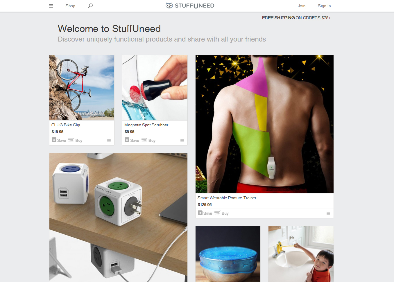
Such navigation makes the design look clean and neat. The hamburger icon lets users access the menu from any page without losing their time. Some famous companies, such as EBay, Reebok, Stella McCartney, Samsung and others have been already using this hidden menu on their e-commerce platforms to improve the quality of their online services. Example: www.stuffuneed.com
Infinite scrolls and loading “on the fly”
In certain cases it makes sense to use the infinite scroll effect for pages which are viewed via mobile devices – when new content is being loaded automatically as the user scrolls down the page instead of making customers switch to another page to access the rest of the content.
Try to use this solution. Ask your web-designers to create pages with infinite scrolls, so users could go down and down the same page and could view all the content without loading other pages of your site.
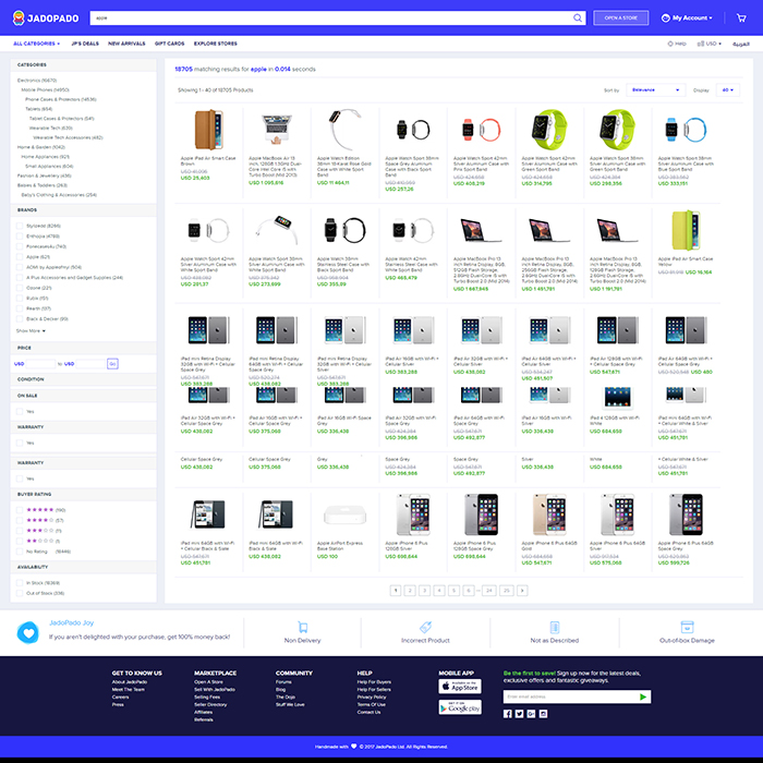
Product categories can be a perfect use-case for this effect. For instance, by default your category page would load only the first 12 items. Yet as the user scrolls down, another set of 12 or 6 or 3 items (up to your choice) will be automatically loaded to the page. As a result, customers will be able to view hundreds of your products without leaving the page.
Cards as a web-design trend
Cards have become one of the most popular web-design patterns, and we suspect that the tendency will remain in 2017 as well. First off, because cards are an inseparable part of material design. Secondly, a card-based layout can easily be adjusted to both small and wide screens.
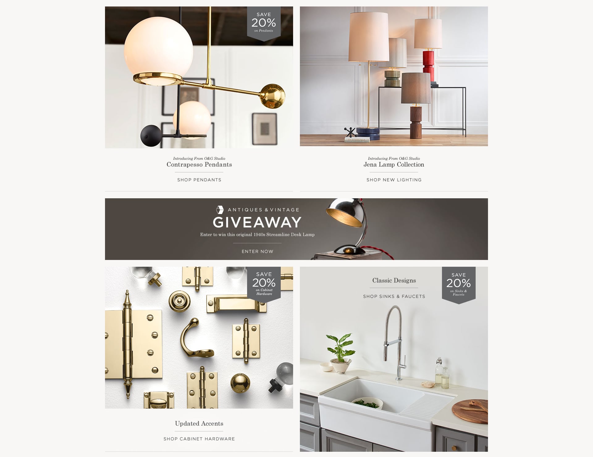
One of the main advantages of a card design is that it is very convenient and user friendly. Cards let you classify your products, group them and filter out items by different criteria, thus, not only letting your customers get all the necessary information at once but also let them consider similar products if the original item did not match their requirements. Card design is succesfully used in such websites as Rejuvenation and Lord & Taylor.
Dynamic search
Finally, the last trend I would like to draw your attention to is the dynamic search. It is expected that most e-commerce websites will start using ajax-based and AjaxScript search methods to provide dynamic search results. Such a method is specifically good for web-stores that have a wide selection of goods.
If you try to search for any product there, you will see that the list of results will dynamically change with each character that you input. Here is one more example of a website that uses this technology Stuart Weitzman.
Large flexible typographic
It is a common knowledge that content is the king, however, the way you present your content can also influence its importance. Following the past year tendencies, in 2017 large-scale adaptive layout will remain popular because it makes your site look perfect on difference devices, both on small and large screens.
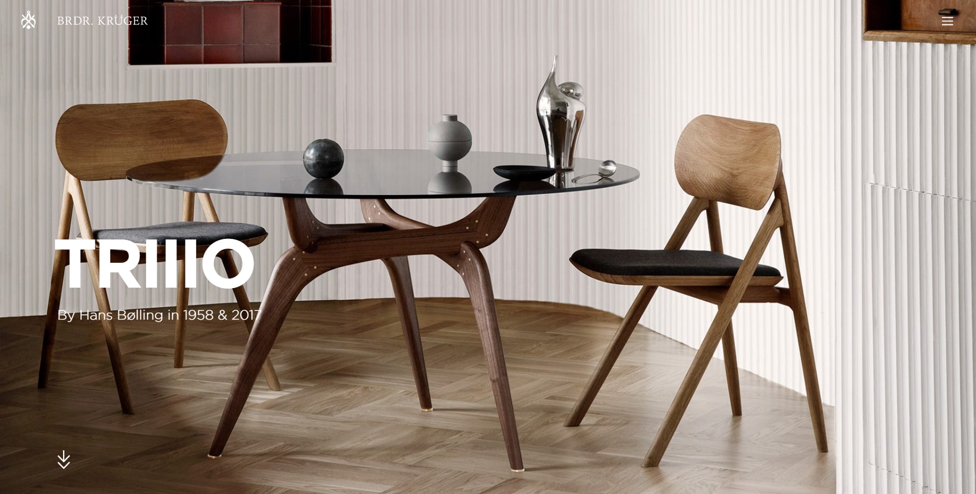
Typography plays a very important role in making visual presentation of a brand and in attracting more customers to your online store. That is why multiple web-stores pay such a big attention to the way how they web-pages look like. AYR,Nasty Gal and Brdr. Krüger use large flexible typography.

