Buttons are one of the most important design elements that facilitate the interaction of the user with an application or a web-page.
Buttons and controls are considered as the most crucial components in web-design projection system because they let you outline some specific area which the user can click and activate. Basically, these are specifically buttons in which we may apply various design attributes that later will influence other more complex application or web components. Below you may find a list of tips which I have compiled on the basis of my work experience with primary, secondary and other types of controls.
One of the major changes in design trends has become the shift from three-dimensional models to flat elements. The main concept of flat design is to represent digital world without attempts to imitate real physical environment. As a result, we get rid of bold lines and shadows that used to give us hints that an element can be clicked or utilized.
A tip: make your buttons look like buttons.
Primary buttons
№1. It is necessary to decide upon the general style of your system.
Controls serve as visual representation of your system.
To avoid confusion and help users easily recognize elements which are responsible for selection it is recommended to focus on their color and shapes.
It is also important to pay attention to spacing: internal padding (right and left from the text) and external margins (that may influence other elements). Creating buttons may even involve using attributes that add rounding (border-radius) and lifting (box-shadow) effects.
The best way to define a button is to use a set of variables for color, size, spacing etc. However, there are still different opinions among developers on the minimal recommended size for a clickable button.

№2. It is important to decide upon the layers style.
The text ‘Click here’ is no longer used in web-design, but there are still some questions left:
- What is the optimal text size for a button?
- Should we use simple constructions, such as («Save», «Close»)?
- Should we also include the object with such verbs as «Download», for instance “Download the pricelist”?
- Are there any preferable texts that describe most common actions? Should we connect brand names to buttons?
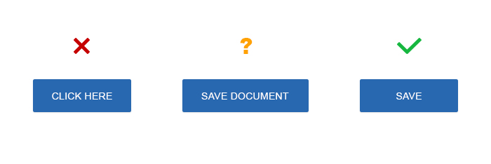
Remember, that a button name should not cause any confusion. If a name causes any doubt or makes users wonder – the name should be changed. A simple rule: try to name buttons with the words that describe actions that those buttons will perform. You may also add some simple description about what is going to happen if the button is clicked.
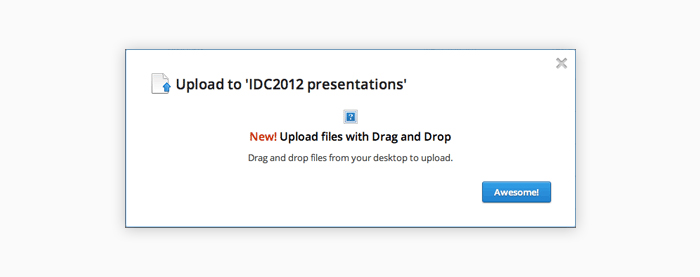
In the example above you may see a dialog window that pops-up when a user uploads a file to Dropbox through a web-application. The button uses the text “Awesome!” which is pretty confusing, because it does not tell us what exactly will happen once we click it.
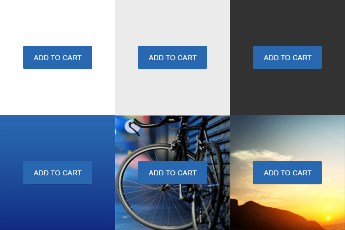
№3 Invert button colors if the background changes
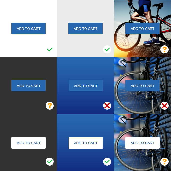
Most buttons use white background, but in some cases we may need to use some photo image or darker colors as our background. In this case we need to provide different variants of the same button against various backgrounds, so that if the default color changes the button would still be visible and noticeable.
Magento Custom Development
Take your online store to the next level with BelVG Magento Custom Development
Visit the pageOne has to test the button against various backgrounds and add alternative styles in case the background becomes darker (using alternative colors, transparency effect etc).
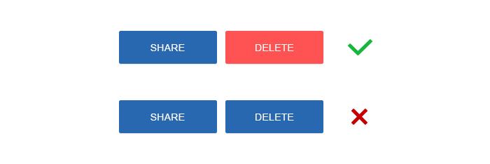
Use colors and contrast effects to help users properly see and understand the content of the application and easily interact with its elements.
In this example below we use red color for the button that launches some destructive action.
Secondary buttons
№4. Secondary button ≠ disabled button
Nobody likes greyed out controls. However, for a secondary button you may also use the same color as for the primary button, yet a bit more intense. It is not good to place two similar buttons close to each other, for instance, using green color to save data and blue color to upload data on server – neither you nor users may know which of these two colors is more important.
So, we have decided to use some neutral grey color and now the button looks like it is disabled. Moreover, if a primary button is really disabled it will also look grey. As a result you will have two grey buttons.
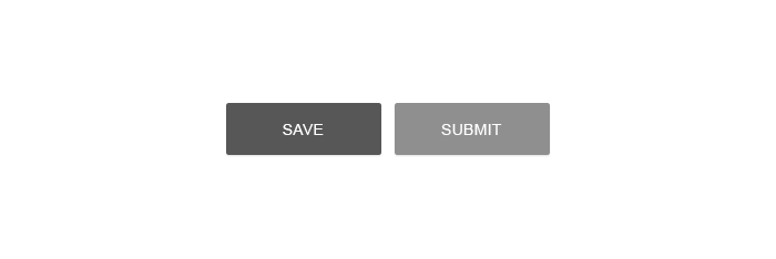
Conclusion: When deciding about colors for secondary and disabled buttons make sure that both variants match each other.
№5. Use transparent buttons carefully
As far back as 2014 it was quite trendy to use ghost buttons – transparent empty controls with simple shape, either square or rectangular. Quite often they might have been outlined just with a thin line and contain only text inside.
Ghost buttons contain only text and border lines of the same color and transparent background. But this may cause problems, because sometimes using bright colors or images on background can make the text look illegible.
Designers like ghost controls because they look completely different from other common buttons. But they are called ghost buttons for a good reason: they may disappear when testing website usability or users may not able to see and read any text on them. Such effects may completely destroy the usability of your controls.
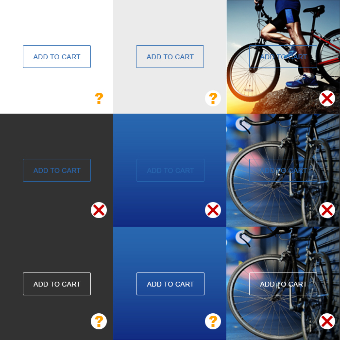
Tip: Use ghost buttons carefully. Make sure to test and place such buttons over some flat image or color.
№6. Click to action
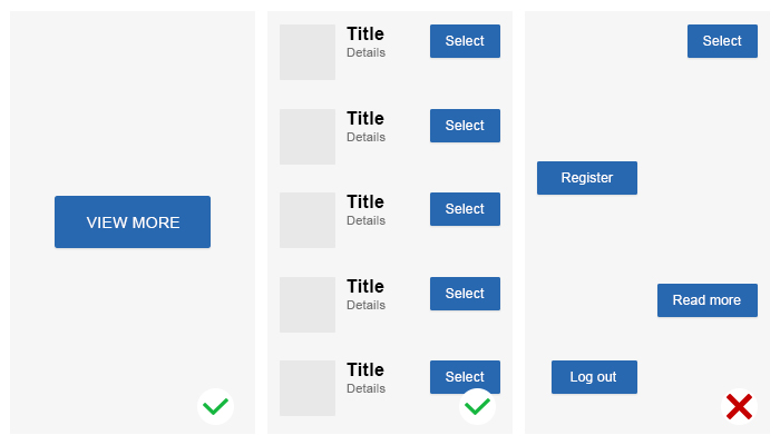
The main purpose of click to action controls is to encourage user for an action. Most often primary buttons are used to attract user’s attention to the most important action on the page. In some cases primary buttons can be a good solution: when you need to choose an object out of the list of equal objects (ex. a set of goods on the results page) or when selecting options for equal modules on the settings page.
It is necessary to understand when it is better to use only one primary button and when it makes sense to use more of them.

Magento Webdesign
Take your online store to the next level with BelVG Magento Webdesign
Visit the page№7. Make different variants to visualize the interaction with the controls
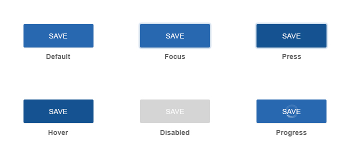
A button is a simple way to interact with an application. When you provide your web-designer with a new button design you should also think about the design for the same button in different conditions: default button view, clicked button view, the button view upon mouse hovering and other conditions. It would also be useful to provide animation for the progress bar and the ‘waiting’ status as well as create a separate gallery for all possible button conditions when a user does not need to interact with the controls.
№8. Make adaptive buttons to be able to apply any changes in the future
Adding some images helps users recognize and understand the meaning of your controls. It should not be a problem to add any new element (for instance, an icon or an image) to a button in the future. The result should still be visualized as a single entity, not just as a set of separate elements.
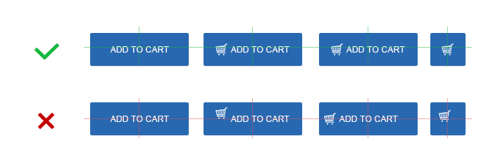
That is why it is necessary to make a button design in the way that will allow adding new elements into it in the future. It makes no difference whether new elements will be added through the code or via some web-design tool. You should think this over and leave the possibility to add new elements in the future without causing problems with spacing and alignments when the user decides to add any new images, texts or other objects to the controls. Your customer will definitely appreciate that!
№9. Make buttons of different sizes
Think about placing action targets on some problematic areas, for example, on a sidebar or on a card. Or vice versa, you may need to place a big button inside a screenwide photo.
Let your clients customize and change buttons from minimal to maximum size by simple modification of the style classes. Try to use class names that can be easily memorized, or instance, use names like Puffy, Micro not just Large and Small.

№10. Make clear distinctions between links and buttons.
In the era of flat design such systems as Material Design use mostly flat buttons in menus, dialog windows and along with texts. However, such controls may pretty much resemble links. But a button is not the same as a link, it may contain plenty of different conditions and actions.
Conclusion: If there are any flat buttons used in your system, make sure that their default view and behavior differs from the look and behavior of your links. Try to compare buttons and links by different conditions: padding, alignment, focus, hovering etc.

The main advantage of flat buttons is that they do not distract user’s attention from the content.
№11. Add more diversity to your controls.
When clicking separate buttons there may appear a pop-up window with an option to select different styles. Many systems have an option to select the style of the interface, in particular, the style for the menu elements (or dropdown list) or segmented buttons.
The button may either indicate the current choice or may open a list of independent options. Add an arrow icon to the right side of the button and you will have a double button: the first part will show the dropdown list while the second part will execute an action.
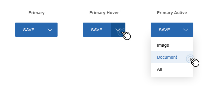
A tip: Use this feature carefully. Such buttons may be applicable for different cases, but they make the code more complicated. For simple websites it is better to avoid adding less popular button variants, because they will only distract and confuse users.
№12. Use option buttons
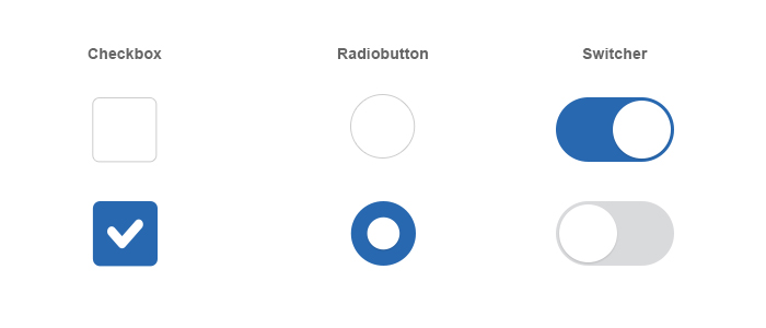
An option button lets the user switch between two or more conditions. Almost all option buttons are used as simple on/off controls.
You can also use option buttons to connect groups of united elements. But in general, the layout of the template should clearly indicate that these buttons belong to one and the same group of elements. There are some more conditions:
- A group should contain not less than three buttons.
- Buttons should display either text or an icon or both.
- It is better to use icons when the user can make a choice and then discard it, without any other options available. For instance, when you rate or remove a star from a product. Icons are usually placed either on the main application panel, tools panel, action or option buttons.
Use the <button> tag only for declaring buttons.
Conclusion: You need to study the rules of link declaration to better understand the rules and principles of declaring buttons.
Magento Extensions
Take your online store to the next level with BelVG Magento Extensions
Visit the store


