Prestashop Theme Development
Request a UX audit for your Prestashop site from our design team.
Get an AuditPrestaShop Development Company
PrestaShop strikes a balance between aesthetics and functionality for your webstore. BelVG’s team crafts themes that enhance your brand and simplify the customer journey. Backed by over a decade of experience, we deliver visually appealing and user-friendly solutions for your ecommerce needs. Choose PrestaShop for an efficient and tailored online experience.


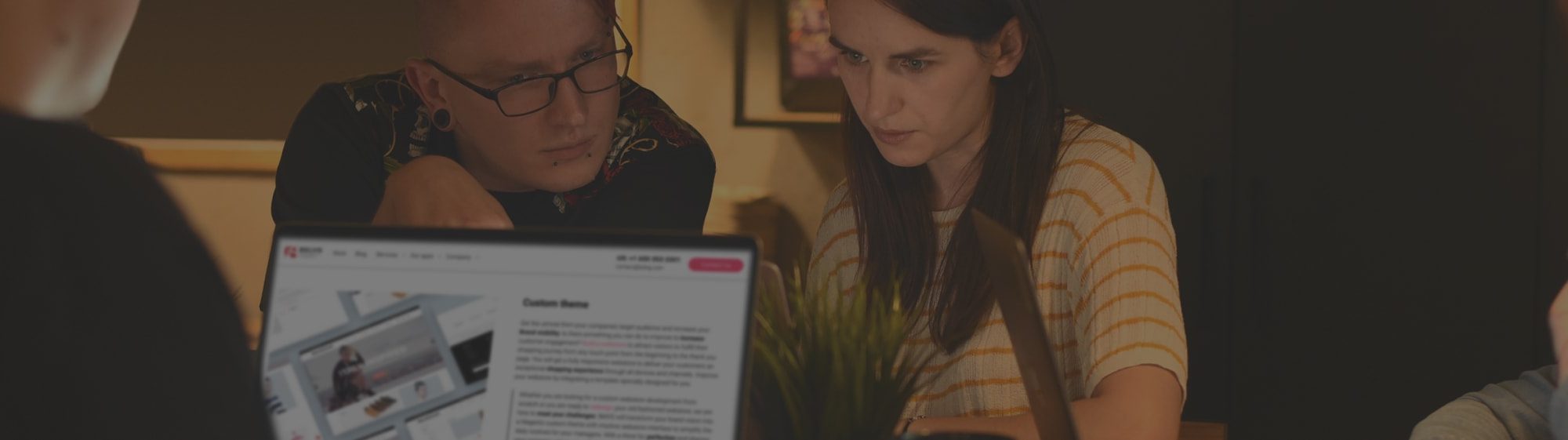
What clients say
Andy Scothern, Managing Director at eCommerceSense
“BelVG has done a great job, and they are
technically competent”
1 / 4 Reviews
What clients say
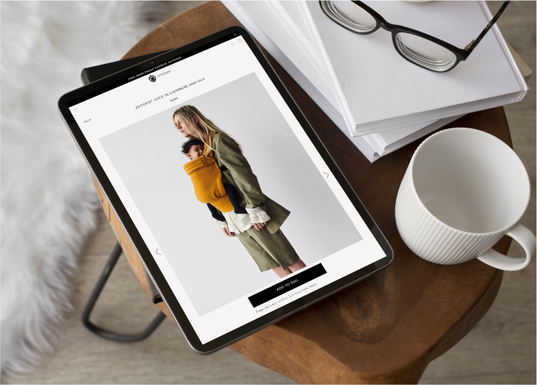
Floris van der Kooij, Owner, Artipoppe
“BelVG were able to solve some very specific
problems, that others find difficult.”
2 / 4 Reviews
What clients say
Consultant / Silent Disco King
“They got things right the first time around,
which is rare.”
3 / 4 Reviews
What clients say
Georg Schönleitner, owner of Blaha Gartenmöbel GmbH
“BelVG understands our business and Magento
development process”
4 / 4 Reviews
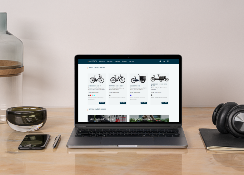
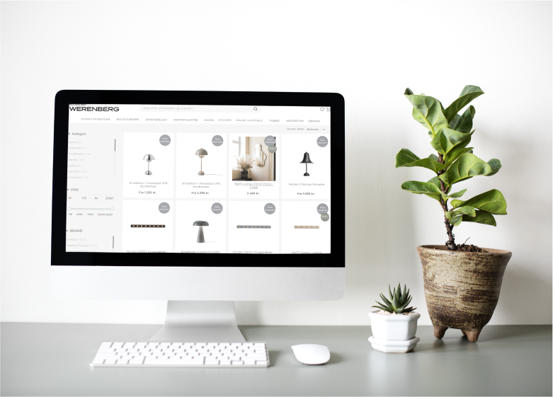
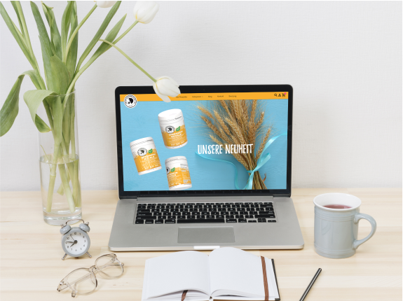
Custom PrestaShop Theme Development
Custom PrestaShop theme development sets your brand apart in ecommerce. Our team at BelVG crafts unique designs tailored to your vision, enhancing your online presence. With expertise across sport, jewelry, fashion, baby clothes, and other retail industries, as well as B2B websites, we transform concepts into high-converting PrestaShop themes. Embrace responsive web design to forge lasting connections with your customers.
Hummingbird PrestaShop Theme Setup
PrestaShop has introduced the Hummingbird theme, implementing upgrades such as Bootstrap version 5, restructuring the src Directory, and adopting lazy loading. Designed as a refreshed alternative to the Classic theme, Hummingbird significantly improves the default PrestaShop experience.The BelVG team is experienced in working with this theme, so we can seamlessly integrate it into your online store.
Making Hummingbird a default theme has broader implications for the ecosystem, so Prestashop is now evaluating the feasibility of this transition in the near future.
UI / UX Design for your PrestaShop Website
Your website should become a powerful ecommerce tool that works, converts and sells to stand out among other businesses. It is difficult to choose between vertical, horizontal, sticky, and dropdown menus and various navigation and checkout pages without an experienced team. We at BelVG optimize UI/UX to guide users seamlessly through checkout.
We can help you analyze competitors and your clients’ path, as well as select design recommendations to maximize the conversion of your online store.
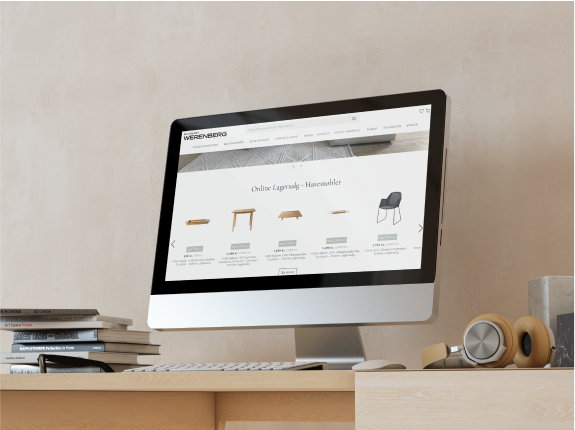
Customization of Third-party Theme
Choose a striking web design to reduce online promotion costs and amplify word-of-mouth referrals. Remember, website aesthetics are as vital as your offerings. Ensure seamless shopping experiences for visitors.
Our team assists in selecting and implementing fitting third-party PrestaShop themes. The BelVG designers customize PrestaShop themes for more refined designs that align with current trends. The BelVG team can make minor changes to suit your style, or remake the finished theme to match your brand. The website design can be yours, or we can help to make a new one.


Learn the price of your PrestaShop website
Contact us to calculate the website development cost.
The PrestaShop theme development process
Brief and project discussion
As the first step we propose our clients to fill in the brief and send the references that they like. It can be other websites or photos. Then we arrange a call with the designer to discuss all necessary information to display.
Research
We gather information from the brief and the meeting. Designers conduct competitor analysis in your region and research user flow.
Create a prototype
The process starts with a wireframe creation. We develop a prototype of your future website and discuss it with you. Make changes if needed.
Mockup Design
It is the step where lifeless design gets the style of your company. We apply color palettes, fonts, shapes. We start from the home page, then discuss it and create the RST of the website.
Convert mockup into a website
After the style is agreed on, the BelVG frontend developers join the game. They turn it into a working website connected with the backend.
Why us
Direct Communication with Developers
The client can communicate directly with the team via chats and calls. Developers provide daily comments, and GIT commits.
High Level of Expertise
We support over 100 online stores in more than 15 countries. Lead developers with 10+ years of experience supervise each project.
Accurate Estimate and No Prepayment
Our team will not exceed the maximum time estimate provided. The first payment is only required after two weeks of work.
Fast Response Time
The project manager responds within 1-2 working hours and is available at all times for urgent matters.

15+
Years in Ecommerce
80+
Employees
3
Offices in Poland, Latvia, and USA
50k
Websites using our extensions
28+
Reviews on Clutch
12+
Years of Team Lead experienceServices
Want to boost mobile ecommerce sales? Our UI/UX team specializes in crafting adaptable mobile designs for your online store. The specialists will check a ready-made theme on all mobile devices and fix any bags, or the team can make a customized theme suitable for mobile website version.
We design a comprehensive mockup containing all required pages and sections, utilizing advanced color choices to showcase your unique brand identity. The final step in our PrestaShop design process is converting the mockup into HTML. We use design tools such as Figma, Adobe XD, and Sketch for creating mockups, while working with Photoshop and Illustrator for editing images and graphics.
A professionally designed newsletter is a powerful asset for advancing your business. It serves as a visual representation of your company’s identity, crafted to resonate with both partners and customers, ultimately driving sales growth. This collection of graphical components, aligned with your corporate style, has the potential to elevate your brand and propel your business forward. Our BelVG team can help you set up and customize your newsletter and adapt it to your brand and website.
Taking into consideration the website components can help you to optimize key elements such as navigation bars, product displays, and checkout processes. Our BelVG team ensures seamless user experience, driving increased conversions, and enhancing brand credibility. Whether creating components from scratch or customizing existing ones, partner with us to enhance your online store with essential features, propelling it towards success in the competitive ecommerce landscape.
What is PrestaShop?
The most suitable platform for your ecommerce business should be functional, scalable, user-friendly, and secure. PrestaShop fits the requirements perfectly, offering a comprehensive business growth and support solution. Notable brands like Le Chocolat des Français, Bleu de Chauffe, Artipoppe, and Magimix have chosen PrestaShop for its robust features.
PrestaShop has led the ecommerce market in Europe since 2007, with nearly 300,000 online shops. As a free and open-source platform, PrestaShop allows users to establish and manage web stores regardless of business size or industry. Thanks to its compelling online store management features, users can easily access suitable modules or themes on the PrestaShop marketplace.
Key features of the platform include:
- strong SEO capabilities
- advanced navigation and search functions
- diverse payment methods
- compatibility with various add-ons and third-party integrations
- promotional tools for client engagement
These features position PrestaShop as the ideal solution for successful ecommerce ventures, facilitating customer satisfaction and engagement throughout the shopping journey.
Download Free Site Audit Template
Send download link to:
Advantages of Prestashop Web Development
Strong Localization
PrestaShop is suitable for scaling businesses that intend to sell in different regions. It supports about 70 languages and various currencies.

Ease of Use
PrestaShop has a user-friendly admin panel that doesn’t require an experienced administrator.
Customizability
The platform has a module structure that allows widening functionality for different business needs.

Multistore
PrestaShop allows you to launch several stores in different regions or for various customer groups and manage them from one admin panel.

Open Source
PrestaShop is free to download and use. You still need to pay for hosting and modules, but you can control this spending.
PrestaShop Community
PrestaShop has a wide range of experts and partners that develop and launch PrestaShop solutions.


Let’s connect
Have a project? Fill out the form and we’ll reach out to you. Get a free proposal now.